RangeControl
- 4 minutes to read
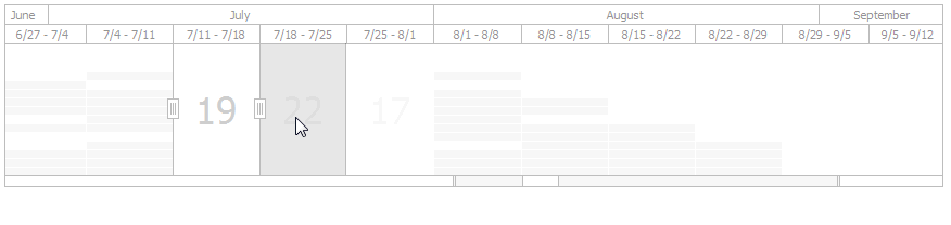
The picture below illustrates how a RangeControl looks when bound to a SchedulerControl on a form.

Viewport
Viewport - the visual area that represents the time range that is currently visible in the RangeControl. To change the visible time range in the viewport, do the following:
- Focus the viewport and use the mouse wheel or drag Viewport Scroll Thumb.
- Use Zoom Grips to stretch and reduce RangeControl scales, and change the visible range.
Scales
Scales - rulers with different time scales that are displayed at the top of RangeControl when it is bound to SchedulerControl. RangeControl scales specify a timeline to be used by end-users for navigating within the current view of the SchedulerControl. To specify scales to be visible in RangeControl, use the ScaleBasedRangeControlClientOptions.Scales property (SchedulerControl.OptionsRangeControl.Scales or RangeControl.ClientOptions.Scales). This property value is a collection of the TimeScale objects, each of which represents a particular scale. Use properties of these objects to specify the visibility and appearance for each scale.
A set of default scales (Year, Quarter, Month, Week, Day, Hour, 15 Minutes) is available. You can use these scales and create you own custom scales to redefine a Scales collection to be used in your scenarios.
Scale Caption - a string displayed within a scale header. To specify a format for scale captions, use the TimeScale.DisplayFormat property. Enable the ScaleBasedRangeControlClientOptions.AutoFormatScaleCaptions option to automatically adjust formats of scale captions when resizing or zooming the viewport.
Note
A set of visible scales is automatically specified depending on the scheduler active view, when the SchedulerOptionsRangeControl.AutoAdjustMode property is set to true.
Intervals
The most detailed scale divides the viewport area into intervals. Each interval shows information about appointment data contained within the corresponding time interval in the scheduler (appointment thumbnails or a label representing the number of appointments). Use the ScaleBasedRangeControlClientOptions.MinIntervalWidth property to specify the minimum interval width that can be reached when resizing or zooming the viewport.
Selected Range
Selected Range - the time span selected by an end-use. It is highlighted in the RangeContorl viewport and marked by Selection Thumbs.
There is two-way synchronization between the RangeControl selected range and the time interval that is visible in the SchedulerControl view. Changing the visible interval or active view of the scheduler automatically selects the corresponding range in RangeControl, and vice versa - selecting a time range in the RangeControl changes the scheduler’s visible interval and optionally switches an active view.
The currently selected range is specified by the RangeControl.SelectedRange property (when RangeControl is bound to SchedulerControl, the type of the RangeControlRange.Minimum and RangeControlRange.Maximum properties is DateTime).
Selected range can include a single or several time intervals defined by the most detailed scale. To limit the number of intervals that can be simultaneously selected in RangeControl, use the ScaleBasedRangeControlClientOptions.MaxSelectedIntervalCount property.
To navigate through the scheduler and change its visible interval, select a time range in RangeControl in the following ways:
- To select a single interval, click the required interval area.
- To select a time range, including several continuous intervals, click a start interval and move the mouse to an end interval while holing down a button.
- To resize the selected range in both directions, drag Selection Thumbs.
- To select another range by moving the currently Selected Range, drag the Selected Range area or Selection Scroll Thumb. Note that if the Selected Range is moved beyond the RangeControl viewport, it will be automatically scrolled to display the time range including the selected range.
- Clicking a scale header selects the corresponding time range.
Range
Range - a total range that is available in RangeControl. Its boundaries are specified by the ScaleBasedRangeControlClientOptions.RangeMinimum and ScaleBasedRangeControlClientOptions.RangeMaximum properties.
Zoom Scroll Bar
Zoom&Scroll Bar - indicates the visible and selected ranges within the total range of the RangeControl. Use the Zoom&Scroll Bar visual elements to scroll and zoom the visible range, and move the selected range.
- Selection Scroll Thumb - marks the selected range within the total range. Scroll it to move the selected range.
- Viewport Scroll Thumb - marks the visible range within the total range. Scroll it by dragging or resize it via the Zoom Grips to change the visible range.
- Zoom Grip - end parts of the Viewport Scroll Thumb. Use them to zoom in and zoom out the visible range.
Appointment Data
When bound to SchedulerControl, RangeControl displays appointment data in its viewport. Each RangeControl interval shows appointment thumbnails colored as appointment labels or the number of appointments contained in the corresponding time interval of the scheduler. To specify how appointments should be displayed in the RangeControl, use the ScaleBasedRangeControlClientOptions.DataDisplayType property.