DataNavigator.Buttons Property
Provides access to the navigator’s built-in and custom buttons.
Namespace: DevExpress.XtraEditors
Assembly: DevExpress.XtraEditors.v26.1.dll
Declaration
Property Value
| Type | Description |
|---|---|
| DataNavigatorButtons | A DataNavigatorButtons object which is the navigator’s buttons. |
Remarks
The Buttons property provides access to the navigator’s built-in and custom buttons.
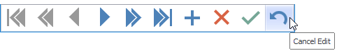
All built-in buttons are stored in the NavigatorButtonsBase.ButtonCollection inherited collection. These buttons can also be accessed individually with the properties exposed by the DataNavigatorButtons class, e.g., DataNavigatorButtons.First, DataNavigatorButtons.Next, DataNavigatorButtons.EndEdit, etc.
Custom buttons can be added using the NavigatorButtonsBase.CustomButtons inherited collection. By default, custom buttons are displayed after built-in buttons. To change the display order of custom buttons, use their NavigatorCustomButton.Index properties.
To respond to button clicks, handle the NavigatorBase.ButtonClick event.
Example
The following code creates a new DataNavigator control, binds it to a data source, and specifies custom images for control buttons at runtime. Custom images are stored in an ImageCollection object.
using DevExpress.XtraEditors;

private void CreateDataNavigator() {
    // Create a new DataNavigator control
    DataNavigator dataNavigator = new DataNavigator();
    Controls.Add(dataNavigator);
    dataNavigator.Height = 40;
    dataNavigator.Dock = DockStyle.Bottom;
    // Bind to a data source
    dataNavigator.DataSource = productsBindingSource;
    // Specify the ImageCollection that stores custom images for DataNavigator buttons
    dataNavigator.Buttons.ImageList = imageCollection1;
    for (int i = 0; i < dataNavigator.Buttons.ButtonCollection.Count; i++) {
        dataNavigator.Buttons.ButtonCollection[i].ImageIndex = i;
    }
    dataNavigator.ShowToolTips = true;
}