ComboBoxEdit Class
A text editor that allows a user to select predefined items (typically, strings) from a drop-down list. The drop-down item list cannot be populated from a data source. Use lookup editors to display data source items in the drop-down list—LookUpEdit, GridLookUpEdit, SearchLookUpEdit, and TreeListLookUpEdit.
Namespace: DevExpress.XtraEditors
Assembly: DevExpress.XtraEditors.v25.2.dll
NuGet Package: DevExpress.Win.Navigation
Declaration
[DXLicenseWinFormsEditors]
public class ComboBoxEdit :
    PopupBaseAutoSearchEdit,
IDxHtmlDesignerDataProviderRelated API Members
The following members return ComboBoxEdit objects:
Remarks
Note
ComboBoxEdit displays a static list of items in its drop-down window. The control cannot retrieve items from a data source. Use Lookup Editors if you need an editor that can be populated with items from a data source.
A combo box control combines the functionality of a single-line text editor with a drop-down window. The drop-down window displays a list of items that a user can select.
Populate Items
Use the RepositoryItemComboBox.Items property to specify the collection of items to display in the drop-down window.
Items in the RepositoryItemComboBox.Items collection can be of any type.
If items are of the String type, the item value and display text match. Otherwise, an item’s ToString method determines the item’s display text.
Note
To ensure that the editor works correctly, items in the RepositoryItemComboBox.Items collection must be unique objects.
Select Item
When a user selects an item from the drop-down window, the editor assigns a corresponding object from the Items collection to the ComboBoxEdit.SelectedItem property, and to the ComboBoxEdit.EditValue property.
To select a specific item in code, you can use the following techniques:
- Assign the target item’s index to the ComboBoxEdit.SelectedIndex property.
- Assign the target item to the ComboBoxEdit.SelectedItem property.
- Assign the target item to the editor’s ComboBoxEdit.EditValue property.
If the RepositoryItemButtonEdit.TextEditStyle property is set to TextEditStyles.Standard, a user is able to type any text in the edit box, which may not match an item in the drop-down list. To require the user to select only values from the drop-down list, set the RepositoryItemButtonEdit.TextEditStyle property to TextEditStyles.DisableTextEditor.
ComboBox Editor Features
- Auto-Complete Functionality
- Use the RepositoryItemComboBox.AutoComplete property to activate the auto completion feature, which enables a user to select items by typing initial characters in the edit box.
- Loop Through Items
- Use the RepositoryItemComboBox.CycleOnDblClick property to enable a user to loop through items on an edit box double-click.
- Specify Display Text When No Item is Selected
- You can display custom text within the editor’s edit box when no item is selected. To do this, handle the RepositoryItem.CustomDisplayText event. This event does not fire when the edit value is null. To display custom text when the editor’s value is set to
null, use the RepositoryItem.NullText property. - Specify Item Height
- The RepositoryItemComboBox.DropDownItemHeight property allows you to change the height of items in the drop-down list. Use the RepositoryItemComboBox.ItemAutoHeight property to calculate the item height automatically to fit the item’s contents.
Custom Display Text
Handle the CustomDisplayText event to display custom text within the edit box.

public Form1() {
    InitializeComponent();
    comboBoxEdit1.Properties.Items.AddRange(new object[] {
        "Alex White",
        "Mike Norton",
        "Ann Arnaz",
        "Terry Bradley"
    });
    comboBoxEdit1.CustomDisplayText += ComboBoxEdit1_CustomDisplayText;
}
private void ComboBoxEdit1_CustomDisplayText(object sender, DevExpress.XtraEditors.Controls.CustomDisplayTextEventArgs e) {
    e.DisplayText = String.Format("Employee: {0}", e.Value);
}
Tip
Handle the DrawItem event to paint items as needed.
HTML-CSS Templates
ComboBoxEdit can render its drop-down items from HTML and CSS-based templates. Templates allow you to display multiple text and image elements in each drop-down item.

Do the following to create an HTML-CSS template:
- Click the ellipsis button for the RepositoryItemComboBox.HtmlTemplates property in the Properties grid to open the Html Template Editor.
- Specify HTML code and CSS styles, and save the changes.

See the following demo to find the complete code that renders this UI:
Note
The HTML/CSS-aware controls and components support a limited set of HTML tags and CSS styles, listed in the following topics:
The main features of HTML-CSS templates include:
- Data binding
- The
${FieldName}syntax in HTML markup inserts field values of the control’s items. See the following topic for details: Data Binding. - Images
- The
<img>HTML tag allows you to add images. - Buttons
- The HTML-CSS markup allows you to add elements to emulate buttons.
- Mouse actions
ComboBox controls contain events to respond to mouse actions on HTML elements: RepositoryItemComboBox.HtmlElementMouseClick, RepositoryItemComboBox.HtmlElementMouseDown, and RepositoryItemComboBox.HtmlElementMouseUp.
You can also subscribe to mouse events for elements in HTML markup, and when using Fluent API.
- Dynamic item customization
- Handle the RepositoryItemComboBox.CustomizeItem event to change the visibility and appearance settings of individual template elements dynamically in combo box items.
- Multiple item templates
The first template in the RepositoryItemComboBox.HtmlTemplates collection becomes the default template. This template is initially used to render all items.
The Template Editor allows you to create multiple templates in a template collection, and apply them to different items, or in different situations.
To assign templates to items dynamically, handle the RepositoryItemComboBox.CustomItemTemplate event.
See the following topic for information about other controls that use HTML-CSS templates, and about supported HTML and CSS tags: HTML-CSS-based Desktop UI.
Examples
Create a ComboBoxEdit with items
The following code creates a ComboBoxEdit control, and adds three items to the control. Items are PersonInfo class objects. Each item stores a person’s first and last names.
The example uses the ComboBoxItemCollection.BeginUpdate and ComboBoxItemCollection.EndUpdate methods to prevent excessive updates when the item collection is changed.
The ComboBoxEdit.SelectedIndex property is set to -1 for demonstration purposes (the property is initially set to -1). This ensures that no item is selected on application startup.
  ComboBoxEdit combo = new ComboBoxEdit();
  ComboBoxItemCollection coll = combo.Properties.Items;
  coll.BeginUpdate();
  try {
    coll.Add(new PersonInfo("Sven", "Petersen"));
    coll.Add(new PersonInfo("Cheryl", "Saylor"));
    coll.Add(new PersonInfo("Dirk", "Luchte"));
  }
  finally {
    coll.EndUpdate();
  }
  combo.SelectedIndex = -1;

  Controls.Add(combo);


//...

  public class PersonInfo {
    private string _firstName;
    private string _lastName;

    public PersonInfo(string firstName, string lastName) {
      _firstName = firstName;
      _lastName = lastName;
    }

    public override string ToString() {
      return _firstName + " " + _lastName;
    }
  }
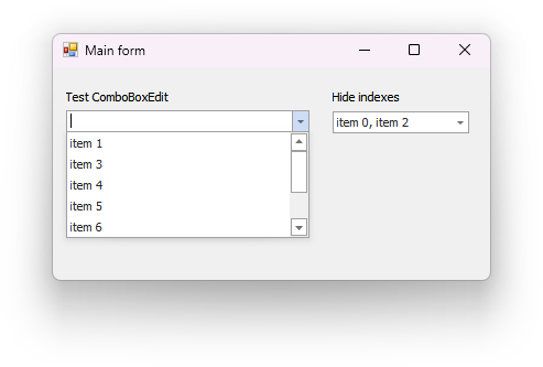
Hide Items
This example temporarily hides ComboBoxEdit items.