Included Controls and Components
- 10 minutes to read
- Editors (include related RepositoryItems and can be embedded in data-aware controls)
- Controls (contain no RepositoryItems and can be used in stand-alone mode only)
- Components (non-visual utility components)
Editors
Editors in this section can be embedded into data-aware controls (Data Grid, Tree List, Vertical Grid, and other EditorContainer class descendants). See the Cell Values, Editors, and Validation Data Grid help article for an example.
Tip
You can also use the RepositoryItemAnyControl item to embed non-editor controls (for example, Charts).
For text values
- TextEdit - a text box where users can enter string values. All editors with a text box are derived from this editor.
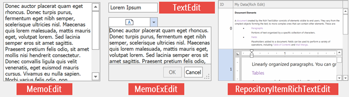
- MemoEdit - displays and allows users to edit multi-line text.
- MemoExEdit - a text box with a drop-down button that invokes a pop-up panel. The panel displays multi-line text and allows users to edit the text.
- RepositoryItemRichTextEdit - displays RTF data.
For numerical values
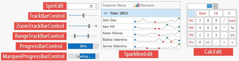
- SpinEdit - a text box with “Up” and “Down” buttons that allow users to increase or decrease the current value.
- CalcEdit - a text box with a drop-down button that shows a drop-down panel with a calculator.
- TrackBarControl - a scale with a thumb. A user can drag this thumb along the scale to change the current value.
- ZoomTrackBarControl - a TrackBarControl with “+” and “-“ buttons that allow users to move a thumb.
- RangeTrackBarControl - a scale with two thumbs that allow users to select an interval. Returns TrackBarRange class objects.
- SparklineEdit - displays multiple numeric values as a continuous graph.
- ProgressBarControl - displays the current operation’s progress (the MarqueeProgressBarControl plays its animation and displays an ongoing process).
For Boolean values
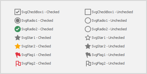
- CheckEdit - allows users to choose between checked, unchecked, and (optionally) undetermined states. Supports multiple styles that specify the editor’s appearance.
- ToggleSwitch - the animated On\Off slider.

For date and time values
Date and time editors support Masks that change the date\time format. To access mask settings, use the RepositoryItemTextEdit.MaskSettings property.
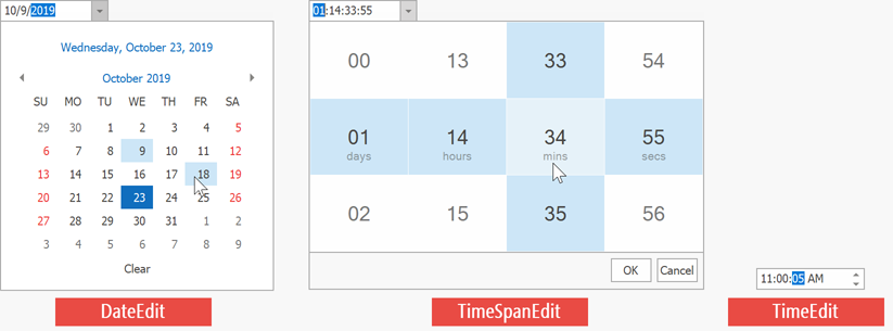
- DateEdit - a text box with a drop-down calendar.
- TimeEdit - a text box with two spin buttons. Supports Touch UI mode that replaces spin buttons with a drop-down time selector.
- TimeSpanEdit - a text box that displays time intervals.
For images
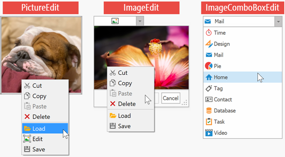
- PictureEdit - displays an image and allows users to modify it (crop, straighten, adjust brightness, and so on).
- ImageEdit - a text box with a drop-down panel that displays an image. Supports the same image edit functionality as the PictureEdit.
- ImageComboBoxEdit - allows users to select an image from a drop-down list.
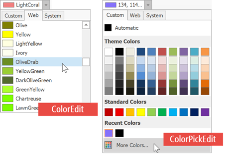
For colors
- ColorEdit - allows you to select a color from a drop-down panel.
- ColorPickEdit - an advanced color picker with multiple palettes (a predefined color palette, Web, Web-Safe, and System) to choose colors from.
Item selectors
Editors in this group allow users to select multiple items from a list. Each item has its own unique value. The editor’s EditValue property returns comma-separated values of all the selected items.
Most item selectors operate manually populated item lists and cannot retrieve values from a data source. If you need a data-aware editor, use one of Lookup Editors instead. To display items that show captions different from their internally stored values, use ImageComboBoxEdit.
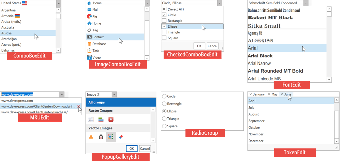
- ComboBoxEdit - a text box with a drop-down panel that displays items. Users can select a single item.
- ImageComboBoxEdit - an upgraded version of the ComboBoxEdit editor that supports item images.
- CheckedComboBoxEdit - similar to the ComboBoxEdit, but items display check boxes next to their captions. Users can check multiple items at a time.
- FontEdit - displays all system fonts found on a machine as a drop-down list.
- MRUEdit - similar to the ComboBoxEdit editor, but allows users to enter values that are currently not in the drop-down list. The editor validates these values, and adds them to the list in case they pass validation.
- PopupGalleryEdit - a text box with a drop-down panel that displays a gallery.
- RadioGroup - a panel with multiple radio buttons. Users can select only one radio button at a time.
- TokenEdit - a text box that transforms text blocks into tokens. Can function in two modes: allows users to enter text (entered text is then validated and valid pieces are dispayed as tokens), or stores a pre-defined token list that users can choose from.
Lookups
Lookups are data-bound editors that display data source records in their drop-down panels, but users can select only one item at a time. If you need a data-bound editor that allows multiple selection, use the CheckedComboBoxEdit, or create a PopupContainerEdit that stores a Data Grid.
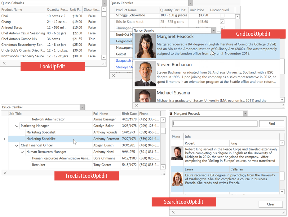
- LookUpEdit - a text box with a drop-down panel that displays data in a tabular format.
- GridLookUpEdit - the drop-down panel embeds the Data Grid control.
- TreeListLookUpEdit - the drop-down panel embeds the Tree List control.
- SearchLookUpEdit - a GridLookUpEdit with an embedded find panel. Unlike the GridLookUpEdit, this editor supports the Instant Feedback mode, but does not allow users to enter values into its text box.
Neither lookup editor allows users to edit data records in a drop-down panel. See this GitHub repository for an example on how to emulate an editable GridLookUpEdit.
All lookups have DisplayMember and ValueMember properties that allow you to process values of one data source field, but display values from another data field. For instance, if a record has ID and Name fields, the editor can process IDs while users see Names.
See the Which Lookup to Use in Your Next WinForms Project blog post for more information about different DevExpress lookup editors.
Interaction Editors

- ButtonEdit - a text box with custom buttons. You can hide the text box and leave buttons only (for instance, to display the “Remove” button in each Data Grid row).
- RatingControl - displays a set of identical icons (for example, stars) that allow users to rate the related content.
- HyperLinkEdit - displays a clickable hyperlink.
Other editors
- PopupContainerEdit - allows you to display custom content in the drop-down panel.
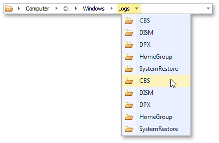
- BreadCrumbEdit - Microsoft Windows Explorer-inspired navigation bar that allows users to navigate through a hierarchical node tree.
Controls
Buttons and labels
- DropDownButton - The button that can be associated with a popup control or a context menu. It is possible to prevent the button from receiving focus on a click.
- CheckButton - A toggle button with checked and unchecked states that can be organized in mutually exclusive groups.
- LabelControl - The label that supports formatted text, images, multi-line text strings and HTML formatting.
- HyperlinkLabelControl - The label that supports displaying text or its portion as a hyperlink. Allows you to use HTML tags to format text.
- SimpleButton - A button that can display text and image. Supports DevExpress Application Skins.
- WindowsUIButtonPanel - Allows you to create Windows UI flat buttons.
Data controls
- CheckedListBoxControl - The checked list box control, in which each item can be checked, unchecked or set to the grayed state. The control can be populated with items from a data source.
- ControlNavigator - Provides a graphical interface for navigating data-aware controls that implement the INavigatableControl interface (this interface is implemented by all DevExpress data-aware container controls).
- DataNavigator - Displays a UI to navigate through records in a data source and perform data operations.
- ImageListBoxControl - The list box control that displays a list of items that a user can select. Can be populated with items from a data source.
- ListBoxControl - A control that displays a list of items that a user can select. This control can be populated with items from a data source.
Utility controls
- BarCodeControl - Displays a bar code.
- FilterControl - Allows users to build filter criteria and apply them to controls and data sources.
- FilterEditorControl - Allows users to build filter criteria and apply them to controls and data sources. Supports visual and text criteria edit modes.
- ImageSlider - The control that allows your end-users to browse through a collection of images using two navigation buttons. Supports animation effects when navigating between images.
- ProgressPanel - Represents a control showing an await message to a user.
- RangeControl - Supports range selection for any data.
- GalleryControl - The control displaying an image gallery, with the capability to categorize items into groups.
- CalendarControl - a calendar that allows users to select a date or date range(s).
- CameraControl - Displays a video stream captured from a video input device, such as a webcam.
- StepProgressBar - Visualizes a linear process and highlights its current stage.
- SearchControl - A control that allows a user to search and filter data in the attached control.
Layout Controls
- GroupControl - The panel with a title which can be aligned along the top, bottom, left or right edge.
- HScrollBar - The horizontal scrollbar.
- VScrollBar - The vertical scrollbar.
- PanelControl - The panel with or without a border.
- SplitterControl - Allows a user to resize controls docked to the splitter’s edges.
- SplitContainerControl - A control that consists of two panels separated by a splitter, which can be dragged by an end user to resize the panels.
- XtraScrollableControl - The skinnable panel with built-in auto-scroll functionality.
- XtraTabControl - Displays tabbed pages where you can place other controls.
- RoundedSkinPanel – A panel that supports rounded corners in the WXI skin.
- SidePanel – A panel with one-pixel borders that supports panel snapping and the overlay resize feature.
Components
Image collections
Many DevExpress controls provide an Images collection. Assign a DevExpress image collection to this property and use the ImageIndex property of the control’s child element to choose an image for this element. For instance, in the code below the “button1” BarButtonItem receives a third image from the “svgImageCollection1” storage.
//assign an image collection to a control with items
ribbonControl1.Images = svgImageCollection1;
//use the ImageIndex property to choose item images
button1.ImageOptions.ImageIndex = 2;
- ImageCollection -
The collection of Image objects to be used within DevExpress controls. The
ImageCollectionis also used as a part of the SharedImageCollection component. - SharedImageCollection - An image collection that allows you to share images between controls on multiple forms.
- SvgImageCollection - A collection of vector (SVG) images used in WinForms applications.
- DPIAwareImageCollection - Storage that serves as an external icon source for DevExpress controls. Automatically replaces default images with their larger counterparts at higher DPI settings.
Tooltips
- ToolTipController - A tooltip controller for individual UI controls.
- DefaultToolTipController - Manages tooltips for all DevExpress controls.
Notifications and data validation
- AlertControl - The component that supports displaying alert windows.
- ToastNotificationsManager - The component that displays Windows Modern UI-inspired toast notifications. See Toast Notification Manager.
- DXErrorProvider - Provides error management for DevExpress bound and unbound editors.
- DXValidationProvider - Provides data validation management for DevExpress bound and unbound editors.
Design and appearance
- SplashScreenManager - Allows you to create and show splash screens and wait forms.
- StyleController - Allows you to manage appearance settings and paint styles of multiple editors and controls in a centralized way. This component is deprecated.
- TransitionManager - Allows you to implement animated transitions between control states.
- WorkspaceManager - Manages layouts of all DevExpress controls in the application as one global workspace. Workspaces can be saved and restored to (from) a local storage or stream.
Others
- PersistentRepository - Stores repository items to be shared between container controls and components (GridControl, TreeList, RibbonControl, BarManager, etc).
- TaskbarAssistant - Provides methods to manipulate an application taskbar button, Jump List and thumbnail preview.