
DevExpress v24.2 Update — Your Feedback Matters

Our What's New in v24.2 webpage includes product-specific surveys. Your response to our survey questions will help us measure product satisfaction for features released in this major update and help us refine our plans for our next major release.

Take the survey Not interested

CalendarControl Class

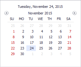
Displays a monthly calendar and allows an end-user to select a date or date range(s).

Namespace: DevExpress.XtraEditors.Controls

Assembly: DevExpress.XtraEditors.v24.2.dll

NuGet Package: DevExpress.Win.Navigation

#Declaration

public class CalendarControl :
    CalendarControlBase,
    IDateTouchCalendarControl,
    ITouchCalendarControl,
    IPickItemsContainer,
    IMouseWheelSupport

The following members return CalendarControl objects:

#Remarks

The calendar control displays one or multiple months simultaneously. An end-user can select a certain date, a date range or multiple dates/date ranges.

CalendarControl.png

To access selected dates, use the following properties:

The control’s main features include:

Feature

Members

Any number of months can be visible simultaneously.

CalendarControlBase.RowCount, CalendarControlBase.ColumnCount, CalendarControlBase.CalendarVerticalIndent, CalendarControlBase.CalendarHorizontalIndent

Ability to customize the appearance of the calendar’s various elements (cells corresponding to regular and special dates, headers, etc.)

CalendarControlBase.CalendarAppearance

CalendarControlBase.CellStyleProvider

CalendarControlBase.SpecialDateProvider

Ability to enter the time portion of a date

CalendarControlBase.CalendarTimeEditing, CalendarControlBase.CalendarTimeProperties, CalendarControlBase.CalendarDateEditing

Multiple views of the calendar control, including a touch-aware UI.

CalendarControlBase.CalendarView

Touch UI:

CalendarControl-TouchUI.png

Custom cell size

CalendarControlBase.CellSize

Ability to display context buttons in calendar cells. This allows you to mark certain date cells with custom text and images.

CalendarControlBase.ContextButtons and CalendarControlBase.ContextButtonOptions properties.

CalendarControlBase.ContextButtonCustomize, CalendarControlBase.ContextButtonClick, CalendarControlBase.CustomContextButtonToolTip and CalendarControlBase.ContextButtonValueChanged events.

Draw lines between cells

CalendarControlBase.DrawCellLines

Specify the first day of the week

CalendarControlBase.FirstDayOfWeek

The minimum and maximum dates shown

CalendarControlBase.MinValue and CalendarControlBase.MaxValue

Single or multiple date selection

CalendarControlBase.SelectionMode, CalendarControlBase.SelectionBehavior, CalendarControlBase.DateTime, CalendarControlBase.SyncSelectionWithEditValue, CalendarControlBase.SelectedRanges

Displaying week numbers

CalendarControlBase.ShowWeekNumbers, CalendarControlBase.WeekNumberRule CalendarControlBase.CustomWeekNumber

Disabling certain dates

CalendarControlBase.DisableCalendarDate

CalendarControlBase.DisabledDateProvider

Custom date painting

CalendarControl.CustomDrawDayNumberCell

#Tooltips

DevExpress controls support regular and super tooltips. Enable the ShowToolTips option to display tooltips when the mouse pointer hovers over the control.

Customize Regular Tooltip Text

Use the following properties of the target control to specify regular tooltip text and title:

API

Description

ToolTip

Specifies tooltip text. You can use line breaks in regular tooltips.

AllowHtmlTextInToolTip

Specifies whether to parse HTML tags in text.

ToolTipTitle

Specifies the tooltip title. If you do not specify tooltip text, the tooltip is not displayed even if you specify the title.

The following code snippet specifies tooltip text and title for a TextEdit editor:

public Form1() {
  InitializeComponent();
  textEdit1.ShowToolTips = true;
  textEdit1.ToolTipTitle = "Name";
  textEdit1.ToolTip = "Please enter your name";
}

WinForms - Customize a Regular Tooltip, DevExpress

Assign an Image to Regular Tooltips

Use the control’s ToolTipIconType property to assign a predefined icon. The ToolTipController.IconSize property specifies icon size.

Assign a custom image as follows:

  1. Create a ToolTipController and assign it to the control’s ToolTipController property.
  2. Create an image collection and assign it to the ToolTipController.ImageList property.
  3. Handle the ToolTipController.BeforeShow event. Use the e.ImageOptions parameter to assign a raster or vector image to the tooltip.

Note

The ToolTipIconType property has priority over e.ImageOptions. If you assign a custom image, set ToolTipIconType to None.

The following code snippet assigns a custom image to the TextEdit tooltip:

Note

textEdit1, toolTipController1, and svgImageCollection1 were created at runtime.

public Form1() {
  InitializeComponent();
  textEdit1.ShowToolTips = true;
  textEdit1.ToolTipTitle = "Name";
  textEdit1.ToolTip = "Please enter your name";
  textEdit1.ToolTipController = toolTipController1;
  toolTipController1.ImageList = svgImageCollection1;
  toolTipController1.BeforeShow += ToolTipController1_BeforeShow;
}

private void ToolTipController1_BeforeShow(object sender, ToolTipControllerShowEventArgs e) {
  ToolTipController controller = sender as ToolTipController;
  if (e.ToolTip == textEdit1.ToolTip)
    e.ImageOptions.SvgImage = (controller.ImageList as SvgImageCollection)["personalCard"];
}

WinForms - Assign a Custom Image to a Tooltip, DevExpress

Display a Super Tooltip

Use the control’s SuperTip property to assign a super tooltip. If you wish to use HTML tags in a super tooltip, enable the SuperToolTip.AllowHtmlText property.

Setting the ToolTipController.ToolTipType property to SuperTip converts existing regular tooltips to super tooltips.

WinForms - Convert Regular Tooltips to Super Tooltips, DevExpress

Tip

Read the following help topic for information on how to customize super tooltips: Hints and Tooltips.

See Also