BarButtonItem Class
A button command in the Ribbon UI, toolbar, or popup menu.
Namespace: DevExpress.XtraBars
Assembly: DevExpress.XtraBars.v26.1.dll
Declaration
Related API Members
The following members return BarButtonItem objects:
Remarks
A bar item contains settings that specify the default behavior and appearance of its links (commands displayed in Ribbon UI, toolbars, and popup menus). The bar button item can have multiple links (BarButtonItemLink). The BarButtonItemLink class contains settings that allow you to customize a certain link.

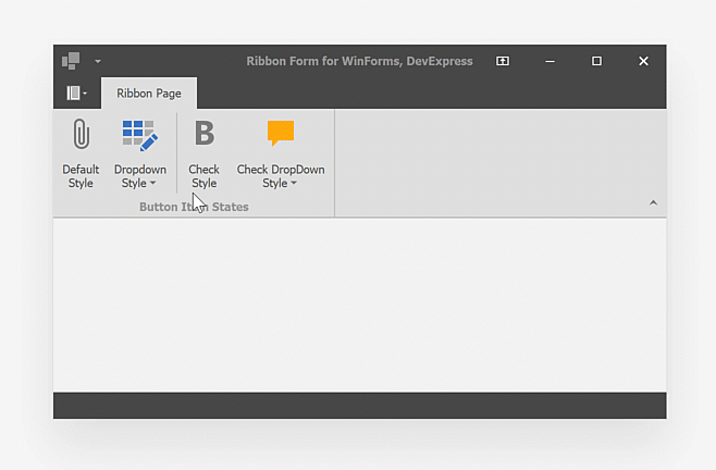
Button Style
Use the ButtonStyle property to specify the style and look & feel of button item’s links. Available styles include:
| Button Style | Description |
|---|---|
Default |
A push button. |
DropDown |
A push button with the dropdown. Use the DropDownControl property to specify a dropdown control (for example, a popup menu). |
Check |
A checked button. Use the Down property to check/uncheck the button item. |
CheckDropDown |
A checked button with the dropdown. Use the DropDownControl property to specify a dropdown control (for example, a popup menu). |
Button Image
Use the ImageOptions property to specify an image and customize image settings. You can display a raster (PNG) or vector (SVG) image. You can specify you own image or choose the image from the DevExpress Image Collection that ship as part of the DevExpress WinForms UI Library. The DevExpress Image Collection is packed with thousands of high-quality vector and raster icons both in color and grayscale forms. Vector images can change colors based on your application theme/skin.

Note
Button Items (BarButtonItem) do not support large images when displayed in toolbars. Use Large Button Items (BarLargeButtonItem) to display large images in toolbars. Use the ImageOptions property to specify image settings.
Read the following article for general information on how to specify images in DevExpress UI controls for WinForms:
Create Bar Items in Code
Important
If you create a bar item in code, associate the bar item with the BarManager or RibbonControl.
Use the constructor with the BarManager parameter. To display the bar item within the Ribbon Control, pass the RibbonControl.Manager object as the BarManager parameter.
The following code shows how to create bars and bar items in code.
In the example two bars are created - a main menu (a bar that is stretched to match the form’s width), and a regular bar. The main menu will contain three sub-menus (File, Edit and View), each having its own bar items. The second bar will display the Output button, which is also available via the View submenu of the first bar:
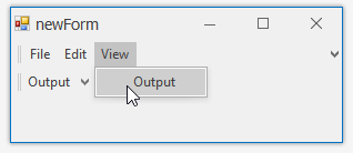
Bars are added to the BarManager.Bars collection. Bar items are added to bars via the Bar.AddItem and Bar.AddItems methods.
To avoid flickering while adding and customizing bars and bar items, the code that performs the customization is enclosed with the BarManager.BeginUpdate and BarManager.EndUpdate method calls.
To respond to clicking bar items, the BarManager.ItemClick event is handled.
using DevExpress.XtraBars;

private void Form1_Load(object sender, EventArgs e) {
    BarManager barManager = new BarManager();
    barManager.Form = this;
    // Prevent excessive updates while adding and customizing bars and bar items.
    // The BeginUpdate must match the EndUpdate method.
    barManager.BeginUpdate();
    // Create two bars and dock them to the top of the form.
    // Bar1 - is a main menu, which is stretched to match the form's width.
    // Bar2 - is a regular bar.
    Bar bar1 = new Bar(barManager, "My MainMenu");
    Bar bar2 = new Bar(barManager, "My Bar");
    bar1.DockStyle = BarDockStyle.Top;
    bar2.DockStyle = BarDockStyle.Top;
    // Position the bar1 above the bar2
    bar1.DockRow = 0;
    // The bar1 must act as the main menu.
    barManager.MainMenu = bar1;

    // Create bar items for the bar1 and bar2
    BarSubItem subMenuFile = new BarSubItem(barManager, "File");
    BarSubItem subMenuEdit = new BarSubItem(barManager, "Edit");
    BarSubItem subMenuView = new BarSubItem(barManager, "View");

    BarButtonItem buttonOpen = new BarButtonItem(barManager, "Open");
    BarButtonItem buttonExit = new BarButtonItem(barManager, "Exit");
    BarButtonItem buttonCopy = new BarButtonItem(barManager, "Copy");
    BarButtonItem buttonCut = new BarButtonItem(barManager, "Cut");
    BarButtonItem buttonViewOutput = new BarButtonItem(barManager, "Output");

    subMenuFile.AddItems(new BarItem[] { buttonOpen, buttonExit});
    subMenuEdit.AddItems(new BarItem[] { buttonCopy, buttonCut});
    subMenuView.AddItem(buttonViewOutput);

    //Add the sub-menus to the bar1
    bar1.AddItems(new BarItem[] {subMenuFile, subMenuEdit, subMenuView });

    // Add the buttonViewOutput to the bar2.
    bar2.AddItem(buttonViewOutput);

    // A handler to process clicks on bar items
    barManager.ItemClick += new ItemClickEventHandler(barManager_ItemClick);

    barManager.EndUpdate();
}

void barManager_ItemClick(object sender, ItemClickEventArgs e) {
    BarSubItem subMenu = e.Item as BarSubItem;
    if (subMenu != null) return;
    MessageBox.Show("Item '" + e.Item.Caption + "' has been clicked");
}