Form Layout Managers and Containers
- 3 minutes to read
This topic gives an overview of the advanced layout managers and simple layout containers that ship as part of the DevExpress WinForms Subscription.
Layout Managers
The DevExpress Layout Managers allow you to develop and maintain applications faster. Designed to simplify and speed up the design of responsive data forms, the layout managers eliminate the need to use manual/pixel-based control alignment. They automatically arrange, align, and space all UI controls within your data forms with great precision.
Layout Control
The Layout Control automatically aranges UI controls, aligns them, and enables proportional resizing.
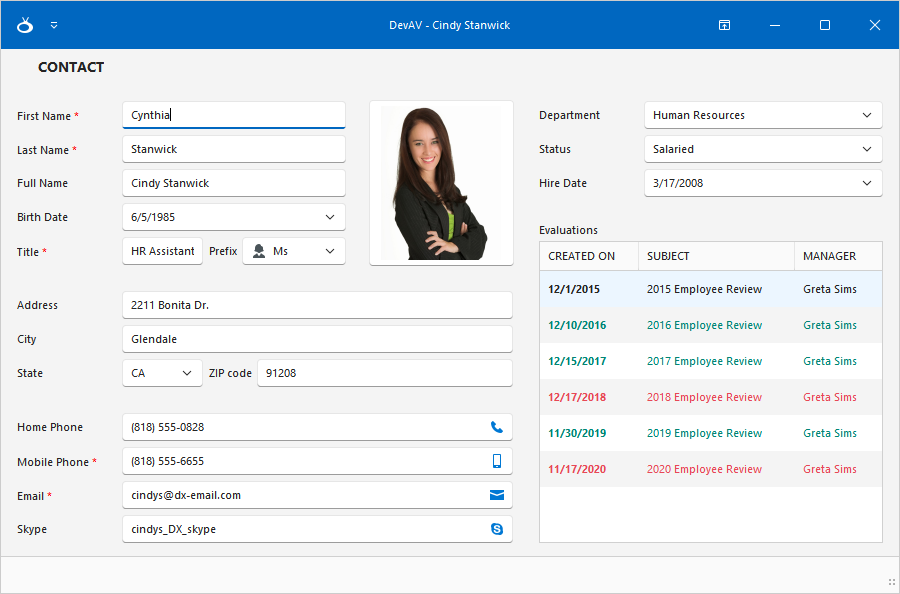
The advanced features include:
- Automatic Alignment of UI Controls
- Ability to Set Size Constraints
- Keyboard Navigation and Shortcuts
- Predefined Layout Items
- Flow and Table/Grid Layouts
- Tabbed Groups
- Reusable Layout Templates (Sign In Form, Address Form, Tabbed Group, etc.)
- End-User Layout Customization
- Layout Tree View
- Convert Regular Data Forms to Automatic Form Layout
- Save and Restore Layout
- Print and Export
- AI-powered Smart Paste
Data Layout Control
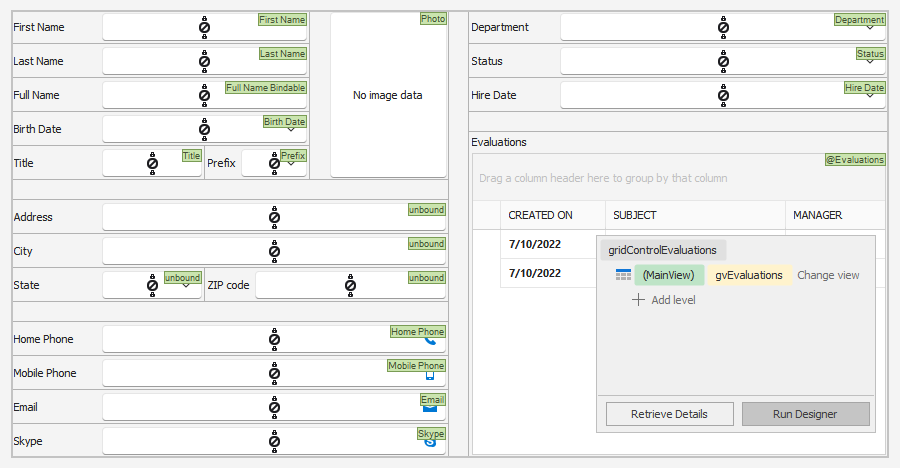
The Data-Driven Layout Control extends the capabilities of the Layout Control. It allows you to generate complex layouts from your data sources. The Data Layout Control automatically creates the data editors and binds them to the corresponding data source fields. It also adds label captions for field names.
The advanced features include:
- Data Binding Wizard
- Data Annotation Attribute Support
- Arrange Nested Objects in Groups
Tabbed MDI Manager
The Tabbed MDI Manager renders MDI child forms as tabs. Its features include:
- Reorder Tab Headers
- Configure Tab Header Position: Top, Bottom, Left, Right
- Horizontal/Vertical Orientation of Tab Headers
- Next, Previous, and Close Buttons
- Multi-Line Tabs
Note
Use the Application UI Manager to create advanced tabbed and Windows 10-inspired UIs.
Wizard Control
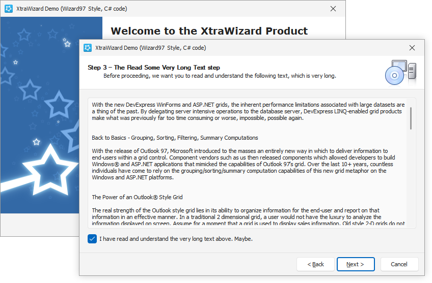
The Wizard Control allows you to transform your complex data-entry forms easily into a multi-step wizard dialog with pixel-perfect element layout.
Tip
Use the NavigationFrame control to create the advanced wizards.
Stack and Table Panels
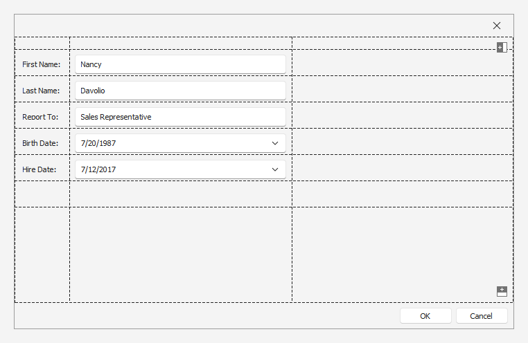
Stack and Table Panels are lightweight layout containers that allow you to arrange controls in a directional flow or position controls into rows and columns.
Side Panel
The Side Panel allows you to break down your data form or user control into resizable regions divided by one-pixel splitters.
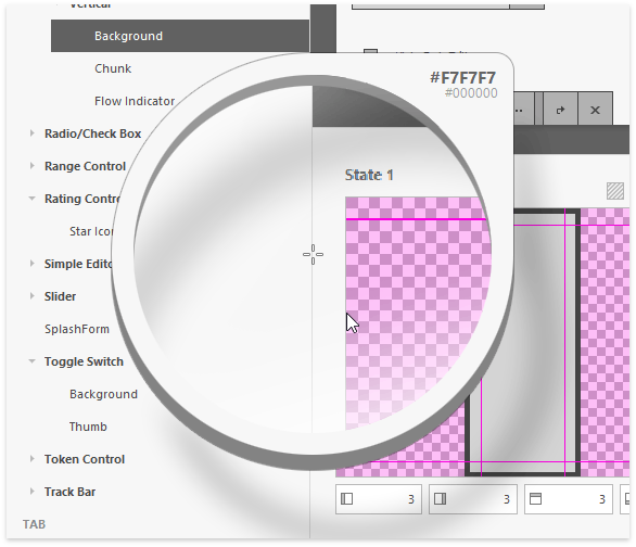
Group and Panel Controls
The PanelControl is a simple container that supports DevExpress Skins.
The GroupControl is a container that can display a caption (header). You can align the caption along the group’s top, bottom, left, or right side. The group’s caption can display a title, an image, and custom buttons.
The Group control supports the following data presentation views:
- Title View
- Card View
- Light View
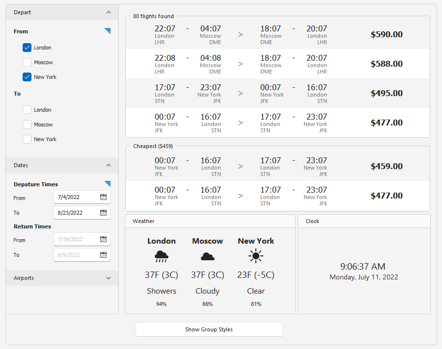
Tab Control
The Tab Control allows you to organize UI controls into relevant sections with straightforward navigation. Its features include:
- Horizontal/Vertical Tab Header Orientation
- Configurable Tab Header Location
- Multi-Line Tabs and Auto Fill
- Tab Header Image
- Tab Header Navigation Buttons (Prev/Next)
- Smooth Transition (Animation)
- Right to Left Layout
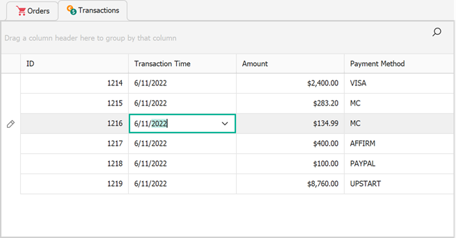
Workspace Manager
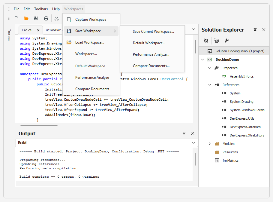
Most DevExpress WinForms controls support runtime UI customization. The Workspace Manager allows you to save layout information of the entire application, and then restore it. You can save the layout to an XML file or a stream.
Tip
The Workspace Manager includes a submenu command (BarWorkspaceMenuItem) that can be added to a Ribbon UI or Command Bar.