Image Slider
- 2 minutes to read
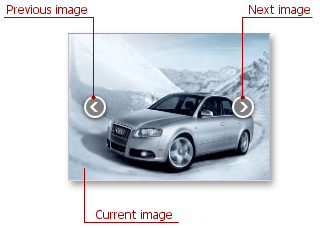
The ImageSlider is an image-browsing control with two clickable navigation elements that become visible when hovered.

The following are the main members the control provides:
ImageSlider.Images - Stores images displayed by the ImageSlider.
The ImageSlider also supports dynamic image loading. See the Virtual Mode topic to learn more.
- ImageSlider.LayoutMode - Gets or sets the way an image is aligned within the ImageSlider container.
- ImageSlider.CurrentImage - Gets a currently displayed image within the ImageSlider object.
- SliderBase.SlideNext and SliderBase.SlidePrev - Navigate through the control’s images in code.
SliderBase.AnimationTime - Gets or sets the time required to switch to another image.
Note
If the WindowsFormsSettings.AnimationMode global setting is adjusted to DisableAll, the image sliding animation effect is disabled.
The ImageSlider control provides support for touch-input devices.
Pager Navigation
The RadioGroup and WindowsUIButtonPanel can be used as a pager for the following controls:

The pager automatically splits the target control’s content into pages, and displays navigation buttons to scroll to corresponding pages. The pager navigation functionality is implemented as a Behavior and can be added to your controls using the BehaviorManager component.
Example
The example demonstrates how to create and customize an ImageSlider control.
using DevExpress.XtraEditors.Controls;

ImageSlider mySlider = new ImageSlider();
mySlider.Parent = this;
mySlider.Size = new Size(240, 200);
//Populate ImageSlider with images
mySlider.Images.Add(Image.FromFile(@"c:\Images\im1.jpg"));
mySlider.Images.Add(Image.FromFile(@"c:\Images\im2.jpg"));
mySlider.Images.Add(Image.FromFile(@"c:\Images\im3.jpg"));
mySlider.Images.Add(Image.FromFile(@"c:\Images\im4.jpg"));
//Increase image sliding animation duration (default is 700 ms)
mySlider.AnimationTime = 1200;
//Display images at the center of ImageSlider in their original size
mySlider.LayoutMode = DevExpress.Utils.Drawing.ImageLayoutMode.MiddleCenter;
//...
//Slide to the next image
mySlider.SlideNext();