TcxCustomInplaceEditContainer.PropertiesClass Property
Specifies a reference to the editor properties class that corresponds to the active in-place editor type.
Declaration
property PropertiesClass: TcxCustomEditPropertiesClass read; write;Property Value
| Type | Description |
|---|---|
| TcxCustomEditPropertiesClass | The class-reference to the editor properties class that corresponds to the active in-place editor type. Refer to the Remarks section for the full list of available in-place editor types. |
Remarks
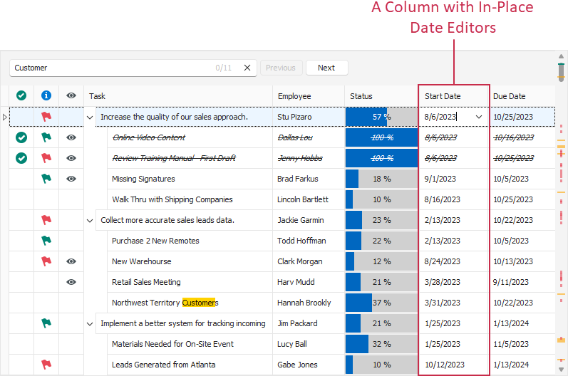
A data item in a container control can use any editor shipped with the ExpressEditors Library as an in-place editor for cell edit operations. An in-place editor exists (and, therefore, has its own WinAPI handle) only when a data item cell is being edited. Otherwise, the data item displays a static editor image for resource usage optimization.
Use the PropertiesClass property to switch between available in-place editors if the RepositoryItem property is unspecified.
To configure the active in-place editor, use the Properties property.
Available In-Place Editors
| PropertiesClass Value | In-Place Editor | Description |
|---|---|---|
| TdxBarCodeProperties | TdxBarCode | A barcode control without user input functionality. |
| TcxBlobEditProperties | TcxBlobEdit | A Binary Large Object (BLOB) editor. |
| TcxButtonEditProperties | TcxButtonEdit | A single-line text editor with embedded buttons. |
| TcxCalcEditProperties | TcxCalcEdit | A single-line editor with a drop-down calculator window. |
| TcxCheckBoxProperties | TcxCheckBox | A check box editor with support for three states. |
| TcxCheckComboBoxProperties | TcxCheckComboBox | A combo box editor that can display items with check boxes. |
| TcxCheckGroupProperties | TcxCheckGroup | An editor designed to display a set of check boxes. |
| TcxColorComboBoxProperties | TcxColorComboBox | A color combo box editor. |
| TdxColorEditProperties | TdxColorEdit | An editor designed to select a color in a color gallery embedded into a drop-down window. |
| TcxComboBoxProperties | TcxComboBox | A general-purpose combo box editor. |
| TcxCurrencyEditProperties | TcxCurrencyEdit | A numeric editor for currency values. |
| TcxDateEditProperties | TcxDateEdit | A date editor with a drop-down calendar. |
| TdxDateTimeWheelPickerProperties | TdxDateTimeWheelPicker | A date/time wheel picker editor. |
| TcxExtLookupComboBoxProperties | TcxExtLookupComboBox | A lookup editor that displays a Data Grid View in a drop-down window. |
| TcxFontNameComboBoxProperties | TcxFontNameComboBox | A combo box that allows users to switch between font typefaces. |
| TdxFormattedLabelProperties | TdxFormattedLabel | A formatted label editor without user input functionality. |
| TcxHyperlinkEditProperties | TcxHyperLinkEdit | A hyperlink editor that can execute custom commands. |
| TcxImageProperties | TcxImage | An editor designed to display images. |
| TcxImageComboBoxProperties | TcxImageComboBox | A combo box whose items can display text and images. |
| TcxLabelProperties | TcxLabel | An unformatted label editor without user input functionality. |
| TcxLookupComboBoxProperties | TcxLookupComboBox | A lookup combo box populated with values from a data source. |
| TdxLookupSparklineProperties | TdxLookupSparklineEdit | A lookup sparkline editor. |
| TcxMaskEditProperties | TcxMaskEdit | A single-line text editor with support for input masks. |
| TcxMemoProperties | TcxMemo | A multi-line editor for plain text. |
| TcxMRUEditProperties | TcxMRUEdit | A single-line text editor that displays a list of most recently used (MRU) items in a drop-down window. |
| TdxNumericWheelPickerProperties | TdxNumericWheelPicker | A numeric value wheel picker editor. |
| TdxOfficeSearchBoxProperties | TdxOfficeSearchBox | A search box that suggests Ribbon or Toolbar UI elements based on user input. |
| TcxPopupEditProperties | TcxPopupEdit | A text editor that can embed a control in a drop-down window. |
| TcxProgressBarProperties | TcxProgressBar | A progress bar. |
| TcxRadioGroupProperties | TcxRadioGroup | A container for radio buttons. |
| TdxRangeTrackBarProperties | TdxRangeTrackBar | A track bar editor with two sliders for value range selection. |
| TdxRatingControlProperties | TdxRatingControl | A rating control. |
| TcxRichEditProperties | TcxRichEdit | A multi-line rich text editor. |
| TcxShellComboBoxProperties | TcxShellComboBox | An editor that combines a combo box and a Shell Tree View control. |
| TdxSparklineProperties | TdxSparklineEdit | An editor that visualizes data as lightweight charts without axes and labels. |
| TcxSpinEditProperties | TcxSpinEdit | A general-purpose numeric spin editor. |
| TcxTextEditProperties | TcxTextEdit | A simple single-line text editor. |
| TcxTimeEditProperties | TcxTimeEdit | A spin editor for time values. |
| TdxToggleSwitchProperties | TdxToggleSwitch | A toggle switch editor. |
| TdxTokenEditProperties | TdxTokenEdit | A token editor. |
| TcxTrackBarProperties | TcxTrackBar | A track bar editor with one slider. |
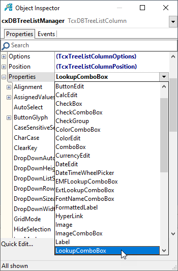
Editor Selection at Design Time
At design time, you can use the Object Inspector to select any available in-place editor. Click a data item’s Properties node and select the required editor from the invoked drop-down list.
Property Setter Behavior
The PropertiesClass property setter updates Properties and PropertiesClassName property values according to the selected in-place editor type.
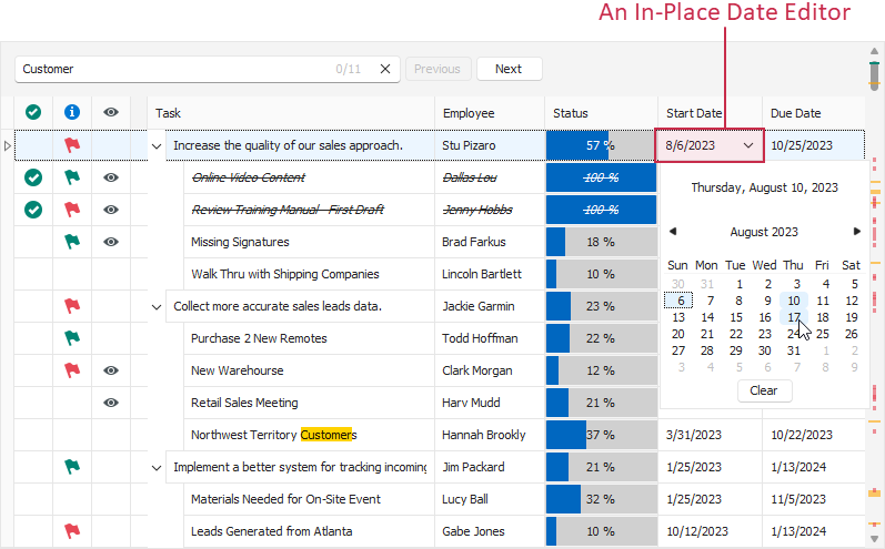
Code Example: Create an Unbound Column and Configure Its In-Place Editor
The following code example creates a tree list column, assigns an in-place date editor with a drop-down calendar, and customizes its settings:
uses cxCalendar;
// ...
var
  AColumn: TcxTreeListColumn;
  ADateEditProperties: TcxDateEditProperties;
begin
  AColumn := cxTreeList1.CreateColumn;  // Creates a new unbound column
  AColumn.DataBinding.ValueType := 'DateTime'; // Changes the column value type to "DateTime"
  AColumn.PropertiesClass := TcxDateEditProperties; // Assigns an in-place spin editor
  ADateEditProperties := AColumn.Properties as TcxDateEditProperties;
  ADateEditProperties.ShowToday := False; // Hides the "Today" link
  ADateEditProperties.DateButtons := [btnClear, btnToday]; // Adds the "Today" button
end;
Important Limitations
- If an editor has unbound and data-aware versions, you can use only its unbound version as an in-place editor.
- If the RepositoryItem property is specified,
PropertiesClass, Properties, and PropertiesClassName property values are ignored.
Important
Do not change PropertiesClass, PropertiesClassName, and Properties property values in OnGetEditProperties and OnGetEditingProperties event handlers. Otherwise, drawing errors and access violations may occur.
To change the active editor and modify its settings safely within these event handlers, use the RepositoryItem property and TcxEditRepositoryItem class descendants. Refer to OnGetEditProperties and OnGetEditingProperties event descriptions for detailed information and code examples.
Default In-Place Editors
A data item in a container control uses the default in-place editor if Properties, PropertiesClass, PropertiesClassName, and RepositoryItem properties are unspecified. The container control item uses one of the following in-place editors as default depending on DataBinding.ValueType and DataBinding.ValueTypeClass property values:
| ValueType[1] Value | ValueTypeClass[1] Value | Default Editor |
|---|---|---|
Boolean |
TcxBooleanValueType | TcxCheckBox |
Currency |
TcxCurrencyValueType | TcxCurrencyEdit |
DateTime |
TcxDateTimeValueType | TcxDateEdit |
FMTBcd |
TcxFMTBcdValueType | TcxCurrencyEdit |
SQLTimeStamp |
TcxSQLTimeStampValueType | TcxDateEdit |
| Any other value | Any other value | TcxTextEdit |
-
DataBinding.ValueType and DataBinding.ValueTypeClass property values define the default in-place editor for the container control item regardless of the active data access mode.