VCL ExpressEditors Library
- 12 minutes to read
The VCL ExpressEditors Library includes multiple data editor, UI and utility controls designed for different usage scenarios. Most data editors can be used as standalone editors or embedded into Data Grid, Tree List, Ribbon, menus, and other UI controls.
- Related Compiled Demo (Data Editors and Controls)
Data Editors are designed to display and edit individual values. Different editors are designed for different data types and usage scenarios. This section lists the following editor types:
- Barcode Editors
- BLOB Editors
- Calculator Editors
- Check Boxes and Check Groups
- Color Editors
- Color Galleries
- Combo Boxes
- Currency Editors
- Date Editors
- Date/Time Wheel Pickers
- Formatted Labels
- Hyperlink Editors
- Image Editors
- Lookup Combo Boxes
- Memo Editors
- Numeric Wheel Pickers
- Office Search Box
- Pop-up Editors
- Progress Bars
- Radio Groups
- Range Track Bars
- Rating Controls
- Rich Text Editors
- Single-Line Text Editors
- Sparkline and Lookup Sparkline Editors
- Spin Editors
- Time Editors
- Toggle Switches
- Token Editors
- Track Bars
UI Controls are advanced DevExpress alternatives to standard controls included in the Embarcadero RAD Studio IDE, plus unique controls designed for specific usage scenarios:
Utility Components allow you to implement additional UI-related functionality in your application:
Shell Components allow you to add shell navigation functionality to your application:
Related Compiled Demo
To see data editor, UI, utility and shell components in action, run the Data Editors and Controls demo in the VCL Demo Center installed with compiled DevExpress VCL demos. Click different items in the sidebar on the left to switch between dedicated editor and UI control demos.
Tip
You can find full source code for the installed compiled Data Editors and Controls demo in the following folder:
%PUBLIC%\Documents\DevExpress VCL Demos\MegaDemos\Product Demos\ExpressEditors\
Data Editors
The ExpressEditors Library includes over 40 editor types you can use as standalone controls or in-place editors in container controls (Data Grid, Tree List, Vertical Grid, Pivot Grid, Ribbon, menus, etc.). The majority of editors in this category are shipped in unbound and data-aware versions.
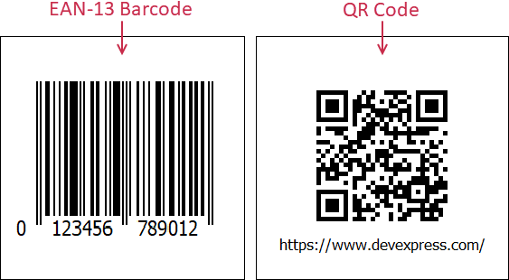
Barcode Editors
- TdxBarCode | TdxDBBarCode
Read-only editors designed to generate and display a barcode or QR code from a source text string. Barcode controls support 13 barcode types.
BLOB Editors
- TcxBlobEdit | TcxDBBlobEdit
A BLOB (Binary Large Object) editor can display an image or text in a drop-down window.
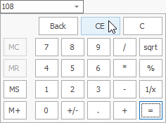
Calculator Editors
- TcxCalcEdit | TcxDBCalcEdit
A calculator editor is a numeric editor with a pop-up calculator.
Check Boxes and Check Groups
A check box corresponds to an option, and can be in checked, unchecked, and grayed states. You can use a check group if it is possible to interpret the target edit value as a set of options.
- TcxCheckBox | TcxDBCheckBox
- A standalone check box editor with support for an intermediary value.
- TcxCheckGroup | TcxDBCheckGroup
- A group of check box editors. Each check box state combination corresponds to a single edit value.
Color Editors
- TdxColorEdit | TdxDBColorEdit
A color editor allows users to pick a color from a color gallery embedded into a drop-down window.
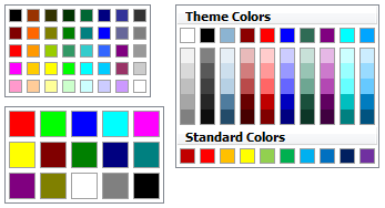
Color Galleries
- TdxColorGallery | TdxDBColorGallery
A color gallery displays a palette where users can pick a color. This gallery ships with a number of built-in palettes, including those found in Microsoft Office®.
Combo Boxes
A simple combo box allows users to select an option in a drop-down list. A check combo box enables users to select multiple options simultaneously.
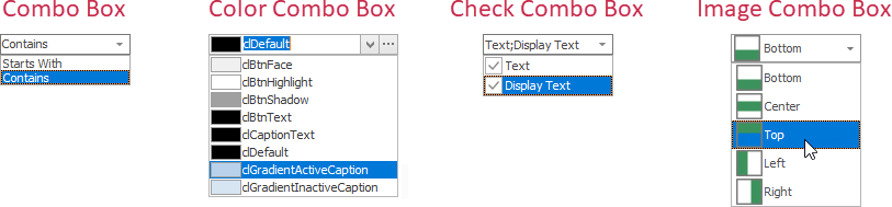
- TcxComboBox | TcxDBComboBox
- A simple combo box editor.
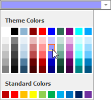
- TcxColorComboBox | TcxDBColorComboBox
- A combo box editor designed for color selection.
- TcxImageComboBox | TcxDBImageComboBox
- A combo box designed to work with images.
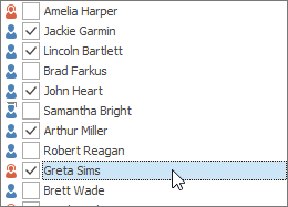
- TcxCheckComboBox | TcxDBCheckComboBox
- A hybrid editor that combines combo box and check box functionality. A check combo box is designed to selected multiple values simultaneously.
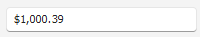
Currency Editors
- TcxCurrencyEdit | TcxDBCurrencyEdit
A currency editor is a simple numeric editor designed to work with monetary values.
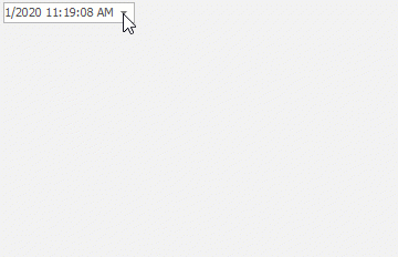
Date Editors
- TcxDateEdit | TcxDBDateEdit
- A date editor is an edit control with a drop-down calendar. The editor also allows users to adjust time in addition to the date selection functionality.
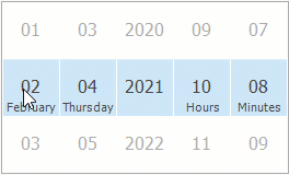
Date/Time Wheel Pickers
- TdxDateTimeWheelPicker | TdxDBDateTimeWheelPicker
A date/time wheel picker is a touch-friendly editor that can display and change a TDateTime value.
Formatted Labels
- TdxFormattedLabel | TdxDBFormattedLabel
A static label with support for BBCode-inspired markup tags. You can use the built-in Formatted Label Editor to specify markup code.

Hyperlink Editors
- TcxHyperlinkEdit | TcxDBHyperlinkEdit
A hyperlink editor is a single-line text editor that displays its content as a hyperlink. The editor can start the default system browser to open a hyperlink when a user clicks it.
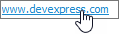
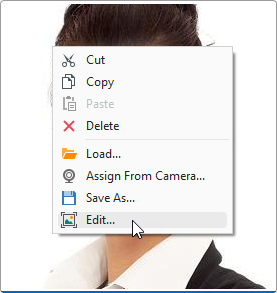
Image Editors
- TcxImage | TcxDBImage
An image editor is designed to store and display an image. Users can open a context menu to manage and edit images.
Lookup Combo Boxes
A lookup combo box combines the functionality of a lookup grid and a combo box.
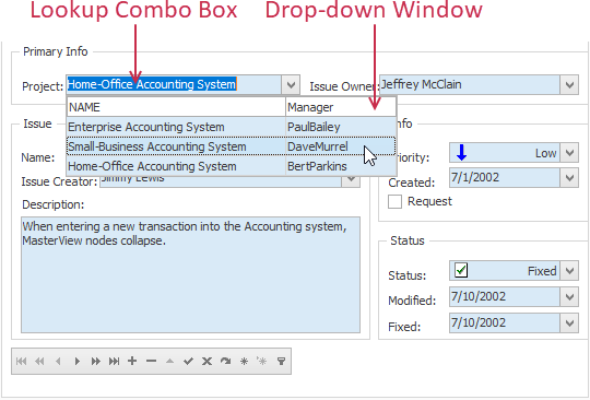
- TcxLookupComboBox | TcxDBLookupComboBox
- A simple lookup combo box.
- TcxExtLookupComboBox | TcxDBExtLookupComboBox
- An extended lookup combo box designed to display a Data Grid View in a drop-down window.
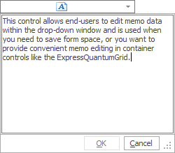
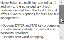
Memo Editors
Numeric Wheel Pickers
- TdxNumericWheelPicker | TdxDBNumericWheelPicker
A numeric wheel picker is a touch-friendly spin editor for integer values.
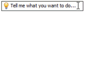
Office Search Box
The Office Search Box editor is an auxiliary UI element inspired by the Tell Me search box found in Microsoft Office® applications. The Office Search Box simplifies command search in a complex Ribbon or Toolbar UI. You can use a TdxOfficeSearchBox editor as a standalone UI element or embed the editor into a toolbar item container (TcxBarEditItem).
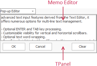
Pop-up Editors
- TcxPopupEdit | TcxDBPopupEdit
A pop-up editor is a single-line text editor that allows you to embed other controls into a pop-up window. Users can work with embedded controls in the same way as with standalone controls.
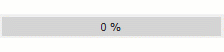
Progress Bars
- TcxProgressBar | TcxDBProgressBar
- A progress bar gradually fills from left to right or from bottom to top, depending on its orientation.
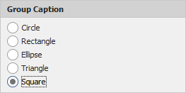
Radio Groups
A radio group is a container for radio buttons that allow users to switch between available options.
Radio Group Classes
- TcxRadioGroup | TcxDBRadioGroup
- A radio group container.
- TcxRadioGroupItem
- An individual radio button.
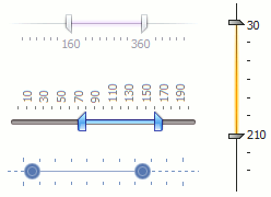
Range Track Bars
- TdxRangeTrackBar | TdxDBRangeTrackBar
A range track bar editor is a track bar editor designed to select a value range using two sliders.
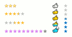
Rating Controls
- TdxRatingControl | TdxDBRatingControl
A rating control allows users to rate content. Rating controls support custom element images.
Rich Text Editors
- TcxRichEdit | TcxDBRichEdit
Rich text editors allow users to view and edit Rich Text Format (RTF) documents.
Tip
The DevExpress VCL Subscription ships with a separate Rich Edit Control that allows you to create fully functional word processing applications.
Single-Line Text Editors
Single-line text editors (text box editors) allow users to edit a non-formatted string value. Different single-line editor types offer additional functionality, such as input masks, extra buttons, etc.

Text Box-Based Editor Components
- TcxButtonEdit | TcxDBButtonEdit
- A button editor.
- TcxMaskEdit | TcxDBMaskEdit
- A mask editor.
- TcxMRUEdit | TcxDBMRUEdit
- A text box editor with a list of most recently used (MRU) items.
- TcxTextEdit | TcxDBTextEdit
- A basic text box editor.
Sparkline and Lookup Sparkline Editors
A sparkline is a small line, point, area, or bar chart designed to visualize data as a condensed graph without axes and additional inscriptions. Sparklines are particularly useful as in-place editors if you need to display trends in a container control.
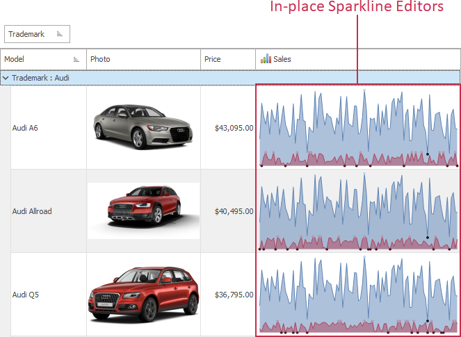
- TdxSparklineEdit | TdxDBSparklineEdit
- A simple sparkline editor.
- TdxLookupSparklineEdit | TdxDBLookupSparklineEdit
- A lookup sparkline editor.
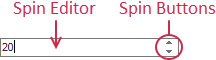
Spin Editors
- TcxSpinEdit | TcxDBSpinEdit
A spin editor allows users to enter a numeric value directly or adjust it with spin buttons. The Up and Down spin buttons increment and decrement the edit value by a specified amount.
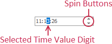
Time Editors
- TcxTimeEdit | TcxDBTimeEdit
A time editor allows users to change the selected time value digit directly or adjust a time value with spin buttons. The Up and Down spin buttons increment and decrement the time value at the input caret position.
Toggle Switches
- TdxToggleSwitch | TdxDBToggleSwitch
A toggle switch is a touch-friendly version of a check box. The thumb position corresponds to the check state.

Token Editors
- TdxTokenEdit | TdxDBTokenEdit
Token editors validate user input and convert matching words (substrings) into tokens (clickable boxes designed to display a caption and an image).

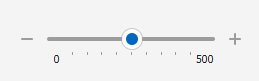
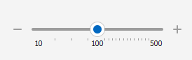
Track Bars
Track bars display a thumb that users can drag within the scale to select a numeric value within a specific range. All DevExpress track bar editors support multiple mouse/touch and keyboard-based user interaction options.
Simple Track Bars
- TcxTrackBar | TcxDBTrackBar
Simple track bar editors.
Zoom Track Bars
- TdxZoomTrackBar | TdxDBZoomTrackBar
Advanced track bar editors with two different scales for more granular positioning (similar to a zoom slider found in Microsoft Office® applications).
UI Controls
This section lists advanced versions of standard controls and unique controls that are not available in the default RAD Studio toolbox.
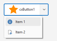
Button
TcxButton is an advanced DevExpress counterpart of the standard TButton component shipped with the VCL library. TcxButton supports multiple usage scenarios:
Standard Button Mode
The TcxButton component can display both a caption and a glyph as well as execute an associated command on a click (in Standard and Command Link modes):

Drop-Down Button Modes
Alternatively, the button can display an associated drop-down menu (in any of the three supported drop-down modes):
Speed Button Mode
In addition, you can use the SpeedButtonOptions.GroupIndex property to define a button as part of a TcxButton group (similar to the standard TSpeedButton component shipped with the VCL library):

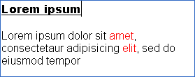
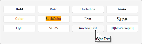
Support for BBCode-Inspired Markup
Caption and Description properties support text formatting using BBCode-inspired markup tags:
Camera Control
The camera control allows you to capture a video or an image from a built-in or connected camera. The camera control displays the selected camera’s feed.

Refer to the following topic for details: Camera Preview Dialog.
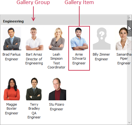
Gallery Control
The gallery control displays a set of items categorized into groups and arranged into columns.
Refer to the following topics for details:
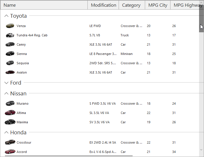
List View Control
The List View control allows a user to display items vertically or horizontally and arrange them in groups and columns. Each item can show its caption, subitems, images, check box, and hint. The control supports look & feel settings common to all DevExpress VCL controls. These settings allow you to keep application appearance consistent for all UI elements.
Range Control
A range control is designed to help users select intervals and data ranges. The range control supports the following data range models:
- Numeric
Allows users to select ranges of integer, float, or currency values.

- Date/Time Model
Allows users to select value ranges on a single predefined scale with formatted TDateTime values.

- Date/Time Header Model
Allows users to select TDateTime value ranges on various predefined scales in different measurement units.

- Scheduler Model
Allows users to select and display ranges of TDateTime values in the TcxScheduler control associated with the range control.
Refer to the following topics for details:
Tree View Control
The Tree View control allows a user to display data in nodes with customizable captions, images, check boxes, and hints. The control supports look & feel settings common to all DevExpress VCL controls. These settings allow you to keep applications appearance consistent for all UI elements.
Wheel Picker
A wheel picker is a touch-friendly multi-choice editor.
Refer to the following topic for details: Wheel Picker Editors.
Utility Components
This section lists non-visual components that help you enhance an application’s UI.
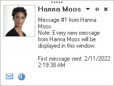
Alert Window Manager
The Alert Window Manager is a non-visual component that arranges alert windows on screen, and sets their timing, animations, and look & feel settings. Use this component to display on-screen notifications such as those from messenger and e-mail clients.
Refer to the following topics for details:
UI Adorner Manager
The UI adorner manager is a non-visual component designed to display the following adorner layers on top of the target form:
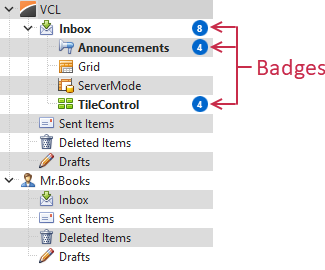
- Badge Layer
Displays custom marks anchored to specific UI elements.
- Guide Layer
Highlights specific UI elements or regions. Users can navigate between outlined regions called guides. The currently selected guide removes the darkening effect from the target UI element:
Shell Components
This section lists components that allow you to add the shell navigation functionality to your application.
Shell Combo Boxes
A shell combo box allows users to specify file paths and browse folder structure. Users can type the path within the editor box or display the editor’s drop-down window to display the folder tree:
Shell Combo Box Components
- TcxShellComboBox
- A Shell Combo Box editor.
- TcxDBShellComboBox
- Represents the data-aware version of the shell combo box control.
Shell Breadcrumb Editors
A shell breadcrumb editor offers the shell navigation functionality out-of-the-box. You can use this editor to complement shell combo box editors.

Shell Breadcrumb Editor Components
- TdxBreadcrumbEdit
- Implements the virtual breadcrumb control.
- TdxDBBreadcrumbEdit
- Implements the data-aware breadcrumb control.
- TdxShellBreadcrumbEdit
- A Shell Breadcrumb control.
Shell Dialogs
The ExpressEditors Library ships with the following set of skinnable counterparts for standard VCL shell dialog components:
| DevExpress Component | Standard Component | Description |
|---|---|---|
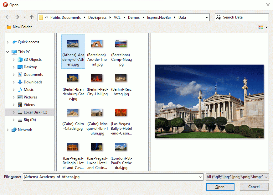
| TdxOpenFileDialog | TOpenDialog | An Open dialog component. |
| TdxSaveFileDialog | TSaveDialog | A Save As dialog component. |
| TdxOpenPictureDialog | TOpenPictureDialog | An Open dialog component for image files. |
| TdxSavePictureDialog | TSavePictureDialogs | A Save As dialog component for image files. |
You can use these components to keep your application appearance consistent for all UI elements, including shell dialogs:
Note
All DevExpress controls with the built-in Windows shell navigation functionality (such as Spreadsheet and Rich Edit controls) use skinnable shell dialogs. If you prefer standard system dialogs, set the dxUseStandardShellDialogs global constant to True.
Skinnable Message Dialog Boxes
All DevExpress products use the TdxMessageDialogForm class to display message dialog boxes with support for skins and BBCode-inspired markup tags:
The ExpressEditors Library includes multiple global methods that display skinnable message boxes. Refer to the following topic for a full list of available methods and their standard counterparts: Message Dialog Boxes.