TcxImage Class
An unbound image editor.
Declaration
TcxImage = class(
    TcxCustomImage
)
Remarks
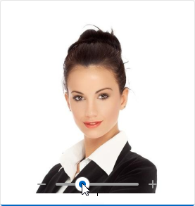
The TcxImage control stores and displays an image. Context menu items include clipboard operations, open/save file commands, and a shortcut to the Image Editor Dialog.
Supported Image Formats
- BMP | EMF | GIF | JPEG | PNG | TIFF | WMF
- Support for these image formats relies on corresponding native encoders from the Windows Imaging Component (WIC).
- SVG
- DevExpress controls use our own SVG engine implementation. Refer to the following topic for detailed information on supported SVG elements and their attributes: SVG Image Support.
Tip
The TcxImage editor can use different TGraphic class descendants as image containers. To switch between available image container types, use the Properties.GraphicClass property.
We recommend that you set the Properties.GraphicClass property to TdxSmartImage to ensure that the TcxImage editor supports all image formats available to other DevExpress VCL components.
End-User Commands
Context Menu
To display the context menu, right-click the editor. Alternatively, you can press Shift + F10 or Menu while the editor has focus. The image editor context menu lists the following items:
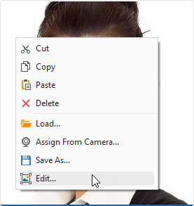
- Cut | Copy | Paste
Execute corresponding clipboard operations with images.
Alternatively, you can use standard Ctrl + X, Ctrl + C, and Ctrl + V key combinations.
- Delete
- Deletes the displayed image.
- Load
- Allows you to load a supported image from the file system.
- Assign From Camera…
- Displays the Camera Preview dialog. This option is enabled only if at least one camera is available to the camera manager.
- Save As…
- Displays the Save As… dialog.
- Edit…
- Displays the Image Editor Dialog.
To manage context menu items, use the Properties.PopupMenuLayout.MenuItems property. Refer to the property description for detailed information and code examples.
Zoom Functionality
Set the Properties.FitMode property to ifmNormal to enable zoom functionality.
In this mode, the editor displays a zoom track bar when the mouse pointer is within the editor boundaries. In addition, users can rotate the mouse wheel while holding the Ctrl key to zoom the displayed image in or out.
Image Editor Dialog
The TcxImage editor can display a modal Image Editor dialog that allows users to perform simple image edit operations, such as cropping, rotation, and color adjustment.
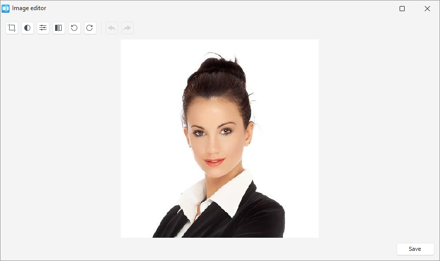
A user can click the Edit… item in the image editor’s context menu to display the Image Editor dialog.
UI Automation/Accessibility Support
The TcxImage editor is mapped to a node in the UI Automation tree when the global UI Automation flag (dxUIAutomationEnabled) is enabled.
UI Automation Settings
The TcxImage editor uses the Properties.Caption property value[1] as the default name of the corresponding UIA node.
Use Automation.Name and Automation.Description properties to explicitly specify the editor name and add optional information that are then used to clarify editor purpose for users who rely on third-party assistive tools (such as Microsoft Narrator).
Refer to the TdxAutomationElementSettings class description for detailed information on all available options.
Main API Members
The list below outlines key members of the TcxImage class.
Appearance Settings
- ParentColor
- Specifies if the image editor uses its parent color to fill the background area when no image is displayed.
- Style | StyleDisabled | StyleFocused | StyleHot | StyleReadOnly
Allow you to define individual appearance settings for different editor states.
Tip
To apply the same style settings to multiple editors, use a TcxEditStyleController component. If you need to apply the same style settings to all editors in your application, you can use a TcxDefaultEditStyleController component.
- Styles
- Provides access to individual styles applied to the image editor in different states.
- Transparent
- Specifies if the image editor is transparent in GDI render mode
Content-Related API Members
- AnimationOptions
- Provides access to GIF animation settings.
- ClipboardFormat
- Specifies the active clipboard image format.
- CopyToClipboard | CutToClipboard | PasteFromClipboard
- Allow you to perform clipboard operations.
- LoadFromFile
- Displays the Open dialog that allows users to load a supported image file.
- Picture
- Provides access to the editor’s image container and allows you to configure its settings.
- SaveToFile
- Opens the Save As dialog that allows users to save the displayed image to a file.
- ShowImageEditor
- Displays the modal Image Editor dialog that allows users to perform simple image edit operations.
- ZoomingOptions
- Allows you to zoom the displayed image in or out and customize zoom-related settings.
Editor Settings and Repository Items
- ActiveProperties
- Provides access to the current image editor settings regardless of their source. This property set does not allow you to customize image editor settings.
- GetPropertiesClass
- Returns the editor settings type.
- Properties
- Allows you to customize image editor settings directly if the editor does not have an assigned repository item.
- RepositoryItem
- Specifies a repository item as an external source of editor settings. A repository item has priority over other editor settings.
General-Purpose API Members
- AutoSize
- Specifies if the standalone image editor automatically adjusts its size to fit the displayed image.
- Enabled
- Specifies if the image editor is enabled.
- ShowHint
- Specifies if the standalone image editor can display hints. To enable hints for an in-place image editor in a container control, set its
OptionsBehavior.CellHints[2] property toTrue. - Width | Height
- Allow you to explicitly define image editor dimensions when the AutoSize property is set to
False(default).
Repository Item Class
You can create a TcxEditRepositoryImageItem component in an edit repository to define an unbound image editor, store image editor settings, and share them between multiple image editors.
Related Compiled Demo
To see the TcxImage editor in action, run the Data Editors and Controls demo in the VCL Demo Center installed with compiled DevExpress VCL demos. Click the Image Editor item in the sidebar to run the corresponding demo.
Compiled DevExpress demos ship with source code installed in the Public Documents folder (%PUBLIC%) for all users (default). You can find all project and source code files for the Data Editors and Controls demo in the following folder:
%PUBLIC%\Documents\DevExpress VCL Demos\MegaDemos\Product Demos\ExpressEditors\
Tip
Project and source code files for all compiled DevExpress VCL Demos are maintained in a public repository hosted on GitHub:
Inheritance
-
If the Properties.Caption property is unspecified, the editor uses the Hint property value as the default UIA node name.
-
Set the following behavior properties to
TrueorFalseto enable or disable in-place image editor hints in corresponding container controls:- A Data Grid Table View’s OptionsBehavior.CellHints property.
- A Tree List control’s OptionsBehavior.CellHints property.
- A Vertical Grid control’s OptionsBehavior.CellHints property.