TcxTrackBar Class
A simple track bar editor.
Declaration
TcxTrackBar = class(
    TcxCustomTrackBar
)
Remarks
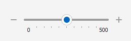
A simple track bar editor (TcxTrackBar/TcxDBTrackBar) uses a thumb to specify a numeric value.
You can arrange a track bar editor horizontally or vertically, flip the scale direction, and customize the appearance of scale, thumb, tick marks, and other track bar elements.
How to Use TcxTrackBar
At design time, you can add a TcxTrackBar using the Component Palette in your RAD Studio IDE. To create and use TcxTrackBar components in code, add the cxTrackBar unit to the uses clause of your project (in Delphi) or include the cxTrackBar header in the source code file (in C++Builder).
End-User Options
Track bar editors (TcxCustomTrackBar descendants) support multiple mouse/touch and keyboard-based user interaction options.
Track Click & Thumb Drag Operations
Users can drag the thumb to modify the edit value.
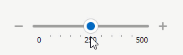
In addition, a click on the track bar before or after the thumb changes its position in increments specified by the Properties.PageSize property value. If the Properties.ThumbStep property is set to cxtsJump, a click on the track bar moves the thumb directly to the target position.
Supported Keystrokes
If the track bar editor has focus, the following keys increment or decrement the edit value (depending on the Properties.ReverseDirection property value):
- Page Up | Page Down
- Increment/decrement the edit value by Properties.PageSize.
- → | ↑ | ↓ | ← | + | -
- Increment/decrement the edit value by Properties.LineSize. These keys correspond to change buttons.
Mouse Wheel Support
Users can rotate the mouse wheel to increment/decrement[1] the editor value when the following conditions are met:
- The track bar editor has focus
- The mouse pointer is within the editor client area
- The Properties.UseMouseWheel property is set to
True(default)
Main API Members
The list below outlines key members of the TcxTrackBar class. These members allow you to configure track bar editors.
Appearance Settings
- Style | StyleDisabled | StyleFocused | StyleHot | StyleReadOnly
Allow you to define individual appearance settings for different track bar editor states.
Tip
To apply the same style settings to multiple editors, use a TcxEditStyleController component. If you need to apply the same style settings to all editors in your application, you can use a TcxDefaultEditStyleController component.
- Styles
- Provides access to individual styles applied to the track bar editor in different states.
- Transparent
- Specifies if the track bar editor is transparent in GDI render mode.
Content-Related APIs
Editor Settings and Repository Items
- ActiveProperties
- Provides access to the current track bar editor settings regardless of their source. This property set does not allow you to customize editor settings.
- Properties
- Allows you to customize track bar editor settings directly if the editor does not have an assigned repository item.
- RepositoryItem
- Specifies a repository item as an external source of track bar editor settings. A repository item has priority over other editor settings.
General-Purpose API Members
- AutoSize
- Specifies if the track bar editor automatically adjusts its size to fit all visible UI elements in full.
- Enabled
- Specifies if the editor is enabled.
- CanModify
- Identifies if the editor is in read-only mode.
- ShowHint
- Specifies if the standalone track bar editor can display hints. To enable hints for an in-place editor in a container control, set its
OptionsBehavior.CellHints[2] property toTrue. - Width | Height
- Allow you to explicitly define editor dimensions.
Repository Item Class
You can create a TcxEditRepositoryTrackBar component in an edit repository to define an unbound track bar editor (TcxTrackBar), store track bar settings, and share them between multiple track bar editors.
Related Compiled Demo
To see the TcxTrackBar editor in action, run the Data Editors and Controls demo in the VCL Demo Center installed with compiled DevExpress VCL demos. Click Track Bar in the sidebar on the left to activate the corresponding demo.
Tip
You can find full source code for the installed compiled editor demo in the following folder:
%PUBLIC%\Documents\DevExpress VCL Demos\MegaDemos\Product Demos\ExpressEditors\
Other Track Bar Editor Types
Unbound Editors
- TdxRangeTrackBar
- An unbound range track bar editor.
- TdxZoomTrackBar
- An unbound zoom track bar editor similar to the zoom slider found in Microsoft Office.
Data-Aware Editors
- TdxDBRangeTrackBar
- A data-aware range track bar editor.
- TdxDBZoomTrackBar
- A data-aware zoom track bar editor similar to the zoom slider found in Microsoft Office.
Inheritance
-
To flip the direction of mouse wheel rotation, you can set the Properties.ReverseMouseWheel property to
True. -
Set the following behavior properties to
TrueorFalseto enable or disable in-place editor hints in corresponding container controls:- A Data Grid Table View’s OptionsBehavior.CellHints property.
- A Tree List control’s OptionsBehavior.CellHints property.
- A Vertical Grid control’s OptionsBehavior.CellHints property.