TdxToggleSwitch Class
An unbound toggle switch editor.
Declaration
TdxToggleSwitch = class(
    TdxCustomToggleSwitch
)
Remarks
A toggle switch is a touch-friendly equivalent of a check box. Three available thumb positions in a toggle switch editor correspond to checked, unchecked, and intermediate states of a check box editor.
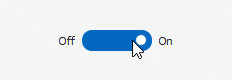
Users can drag the thumb, click the editor, or press the Space character when the editor has focus to switch between available check states.
Main API Members
The list below outlines key members of the TdxToggleSwitch class. These members allow you to configure toggle switch editors.
Appearance Settings
- Style | StyleDisabled | StyleFocused | StyleHot | StyleReadOnly
Allow you to define individual appearance settings for different editor states.
Tip
To apply the same style settings to multiple editors, use a TcxEditStyleController component. If you need to apply the same style settings to all editors in your application, you can use a TcxDefaultEditStyleController component.
- Styles
- Provides access to individual styles applied to the editor in different states.
- Transparent
- Specifies if the editor is transparent in GDI render mode.
Editor State-Related APIs
- Checked | State
Specify the toggle switch editor’s state.
Note
The intermediate editor state is available only if the Properties.AllowGrayed property is set to
True.- EditValue
- Specifies the edit value.
- OnEditing
- Allows you to prevent users from activating the editor.
Editor Settings and Repository Items
- ActiveProperties
- Provides access to the current editor settings regardless of their source. This property set does not allow you to customize editor settings.
- GetPropertiesClass
- Returns the actual editor settings type.
- Properties
- Allows you to customize editor settings directly if the editor does not have an assigned repository item.
- RepositoryItem
- Specifies a repository item as an external source of editor settings. A repository item has priority over other editor settings.
General-Purpose API Members
- Enabled
- Specifies if the editor is enabled.
- CanModify
- Identifies if the editor is in read-only mode.
- IsEditValidating | IsHiding | IsPosting
- Allow you to identify the current operation in the editor.
- ShowHint
- Specifies if the standalone editor can display hints. To enable hints for an in-place editor in a container control, set its
OptionsBehavior.CellHints[1] property toTrue. - Width | Height
- Allow you to explicitly define editor dimensions.
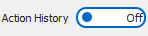
Code Example: Configure Toggle Switch State Indicators
The following code example configures state indicators of an existing unbound toggle switch editor:
  dxToggleSwitch1.Caption := 'Action History';
  dxToggleSwitch1.Properties.StateIndicator.OffText := 'Off';
  dxToggleSwitch1.Properties.StateIndicator.OnText := 'On';
  dxToggleSwitch1.Properties.StateIndicator.Kind := sikText;
  dxToggleSwitch1.Properties.StateIndicator.Position := sipInside;
Repository Item Class
You can create a TcxEditRepositoryToggleSwitchItem component in an edit repository to define an unbound toggle switch editor, store editor settings, and share them between multiple toggle switch editors.
Inheritance
-
Set the following behavior properties to
TrueorFalseto enable or disable in-place editor hints in corresponding container controls:- A Data Grid Table View’s OptionsBehavior.CellHints property.
- A Tree List control’s OptionsBehavior.CellHints property.
- A Vertical Grid control’s OptionsBehavior.CellHints property.