TcxButtonEditProperties Class
Stores button editor settings.
Declaration
TcxButtonEditProperties = class(
    TcxCustomButtonEditProperties
)
Remarks
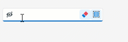
A button editor is a single-line text editor with one or more embedded buttons and support for masked input.

Main API Members
The list below outlines key members of the TcxCustomButtonEditProperties class. These members allow you to configure button editors and manage their embedded buttons.
Appearance Options
- Alignment | UseLeftAlignmentOnEditing
- Specify content alignment.
- Images
- Specifies the image source for editor button glyphs.
- OnButtonGlyphDrawParameters
- Allows you to customize the appearance of editor button glyphs.
User Interaction Options
- Automation
Provides access to UI Automation and accessibility-related settings.
Tip
Use Automation.Name, Automation.Description, and other API members to specify information visible to third-party assistive tools as UIA node properties.
- AutoSelect
- Specifies if the editor automatically selects content when input focus moves to the editor.
- Buttons | ButtonsViewStyle
- Allow you to manage and configure embedded editor buttons
- ClearKey | ClickKey
- Allow you to associate keystrokes with basic user actions.
- OnButtonClick
- Allow you to execute custom code when a user clicks embedded editor buttons.
- ReadOnly
- Enables or disables read-only mode. You can use the editor’s Style.ReadOnly and StyleReadOnly properties to customize editor appearance in read-only mode.
Text Editor Settings
- EchoMode
- Allows you to switch between normal and password input modes.
- EditFormat | DisplayFormat | UseDisplayFormatWhenEditing
- Specify text format patterns in different editor states.
- HideCursor
- Specifies if the caret is visible when the editor has focus.
- HideSelection
- Allows you to disable the highlight effect for text selection when the editor loses focus.
- ImeMode | ImeName
- Allow you to configure the input method editor (IME) for the text box.
- LookupItems | LookupItemsSorted | OnNewLookupDisplayText
Allow you to configure automatic completion for user input.
Note
These settings have no effect if a user input mask is defined for the editor.
- Nullstring | UseNullString
- Allow you to specify display text for the Null edit value.
User Input Limitations
- IsMasked
- Identifies if a user input mask is applied to the editor.
- EditMask | MaskKind
- Allow you to configure a user input mask (with support for regular expressions).
- MaxLength
- Limits the length of an input string.
- MaxValue | MinValue
- Limit the range of valid numeric values.
Edit Value Validation
- BeepOnError
- Allows you to play the standard system sound when a validation error occurs.
- ErrorIcon | ValidationErrorIconAlignment
- Specify and position an error icon.
- ValidateDisplayValue | ValidateOnEnter | CanValidate | OnValidate | IsEditValueValid
- Allow you to validate user input.
- ValidationOptions
- Specifies validation option flags.
General-Purpose API Members
- AssignedValues | RestoreDefaults
- Allow you to track the state of individual editor-specific settings and reset them.
- BeginUpdate | EndUpdate | LockUpdate | DoUpdate | Update | Changed | ChangedLocked | DataChanged
- Allow you to manage editor updates and avoid excessive redraw operations during batch editor setting changes.
- GetButtonsClass | GetContainerClass | GetStyleClass | GetViewInfoClass
- Return editor property value types.
Code Example: Create Embedded Buttons with Custom Functionality
The code example below demonstrates OnButtonClick and OnCreate event handlers.
The application form’s OnCreate event handler creates two additional embedded buttons in a TcxButtonEdit control and configures the appearance and behavior of all embedded buttons. The OnButtonClick event handler associates all created buttons with the editor’s functionality.
Note
This example uses a TcxImageList component with three SVG icons as a source of glyphs for the created buttons.
procedure TMyForm.cxButtonEdit1PropertiesButtonClick(Sender: TObject;
  AButtonIndex: Integer);
var
  AEditor: TcxButtonEdit;
begin
  AEditor := Sender as TcxButtonEdit;
  if AButtonIndex = 0 then  // The first button clears the editor
    AEditor.Clear
  else if AButtonIndex = 1 then  // The second button selects content
    AEditor.SelectAll
  else if AButtonIndex = 2 then  // The third button hides or reveals content
  begin
    if AEditor.Properties.EchoMode = eemNormal then
      AEditor.Properties.EchoMode := eemPassword
    else
      AEditor.Properties.EchoMode := eemNormal;
  end;
end;

procedure TMyForm.FormCreate(Sender: TObject);
var
  AProperties: TcxButtonEditProperties;
  I: Integer;
begin
  cxButtonEdit1.ShowHint := True;  // Enables hints for the editor
  AProperties := cxButtonEdit1.Properties;
  AProperties.BeginUpdate;  // Initiates the following batch change
  try
    AProperties.Images := cxImageList1;  // Assigns the source of button glyphs
    // Create two additional buttons
    AProperties.Buttons.Add;
    AProperties.Buttons.Add;
    // Specify common button settings
    for I := 0 to AProperties.Buttons.Count - 1 do
    begin
      AProperties.Buttons.Items[I].Kind := bkGlyph;  // Changes the button content type to "glyph"
      AProperties.Buttons.Items[I].ImageIndex := I;  // Specifies image indexes in the source list
      AProperties.Buttons.Items[I].HotTrackMode := TcxEditButtonHotTrackMode.Editor;
    end;
    // Specify unique button settings
    AProperties.Buttons.Items[0].Hint := 'Clear';
    AProperties.Buttons.Items[1].Hint := 'Select All';
    AProperties.Buttons.Items[2].Hint := 'Hide/Reveal';
    AProperties.Buttons.Items[2].LeftAlignment := True;
    AProperties.Buttons.Items[2].Transparent := True;
  finally
    AProperties.EndUpdate;  // Calls EndUpdate regardless of the batch operation's success
  end;
end;
Direct TcxButtonEditProperties Class References
The following public API members reference a TcxButtonEditProperties object:
- TcxButtonEdit.ActiveProperties
- Provides access to active button editor settings.
- TcxButtonEdit.Properties
- Provides access to button editor settings.
- TcxDBButtonEdit.ActiveProperties
- Provides access to active button editor settings.
- TcxDBButtonEdit.Properties
- Provides access to button editor settings.
- TcxEditRepositoryButtonItem.Properties
- Provides access to stored button editor settings.