VCL Ribbon, Toolbars, and Menus
- 5 minutes to read
The ExpressBars Library allows you to build command bars and Microsoft Office-inspired interfaces: Ribbon UI, Toolbars and Menus, Tabbed MDI interfaces, and so on.

Review the following topics for more information about the basic building blocks of the ExpressBars Library:
Bar Manager
Use the TdxBarManager component to create, customize, and store items (commands). You can create multiple item links so that the same command can appear within different controls - toolbars, status bars, menus, and Ribbon UI.
The following topics contain detailed information about this component:
- Bar Manager
- Bar Manager Options
- Customization Form – All Commands Page
- Customization Form – Toolbars Page (at Design Time)
- Customization Form – Toolbars Page (at Runtime)
- Customizing Popup Menu (at Design Time)
- Customizing Popup Menu (at Runtime)
- Creating Toolbar Items and Item Controls
- Using the Customization Form (at Runtime)
- Accessing Ribbon UI and Bar Elements
Ribbon
Use the TdxRibbon control to integrate the Ribbon UI into your application.

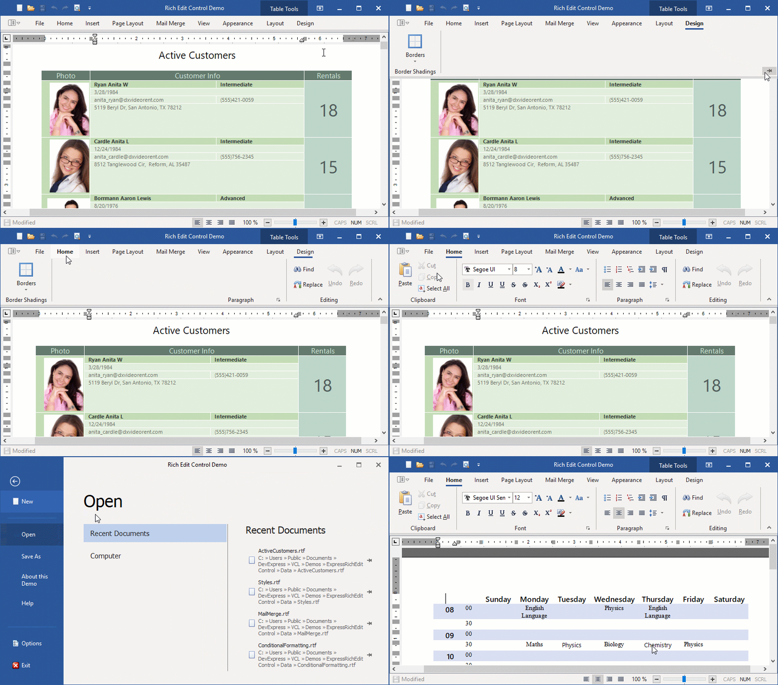
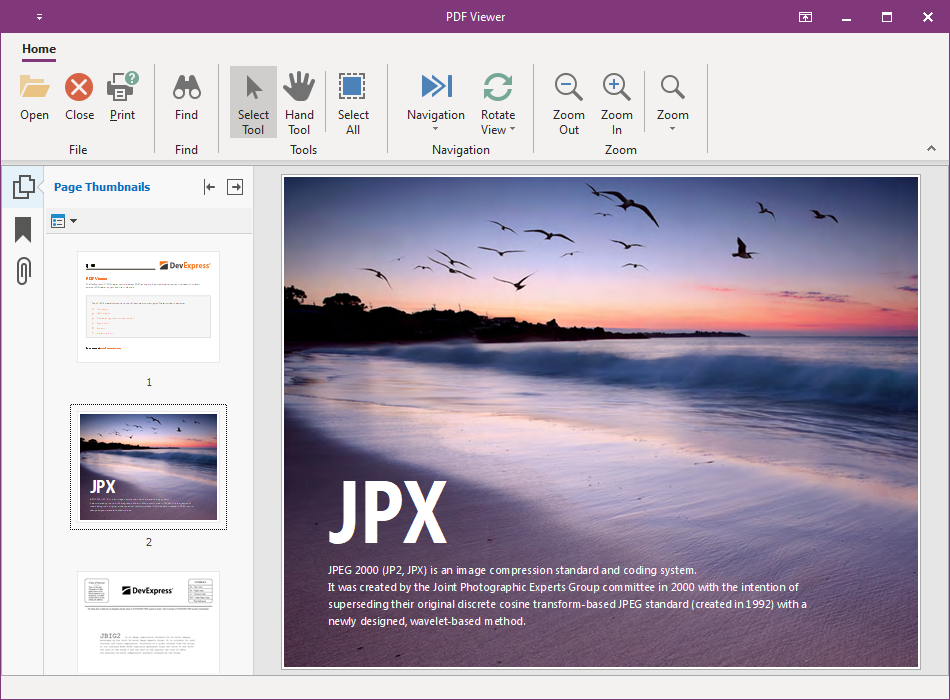
Office-inspired controls, such as Spreadsheet or Rich Text Editor, require an accompanying Ribbon or Toolbar UI with standard commands. The ExpressBars Library allows you to create such predefined interfaces. Please see the following topics for details:
- Spreadsheet-based Application
- Rich Edit-based Application
- PDF Viewer-based Application
- Scheduler-based Application
Ribbon Form
The Ribbon Form is a form that supports skins and integrates the Ribbon control as a part of non-client areas.

We recommend that you use this form if you create a Ribbon-based application. All Ribbon-related elements (the Ribbon control, status bar, and Backstage View) operate correctly only with this form.
Contextual Tabs
The Ribbon UI groups commands into multiple tabs to simplify user interaction with an application. The Ribbon control also supports contextual tabs that appear in response to user actions (for instance, text selection or a table insert operation).

Refer to the following topics for details:
Application Menu/Office Backstage View
The Ribbon control can display the Application Button that a user can click to invoke the menu that contains the most common application commands.
Use the Ribbon control’s ApplicationButton.Menu property to link the Application Button to any of the following menus:
- Ribbon Application Menu
Place the TdxBarApplicationMenu component onto the form and link it to the button.

- Office Backstage View
This menu style corresponds to the Office 2019 Ribbon, Office 2016 Ribbon, Office 2016 Tablet Ribbon, and Office 2013 Ribbon paint styles.

Place the TdxRibbonBackstageView component onto the form and link it to the button.
Galleries
You can add any of the following galleries in a ribbon toolbar:
- In-Ribbon Gallery
This gallery displays its items in a Ribbon control.

- Dropdown Gallery
This gallery displays its content in a drop-down menu.

- Skin Chooser Gallery
This gallery allows users to switch between different skins at runtime.

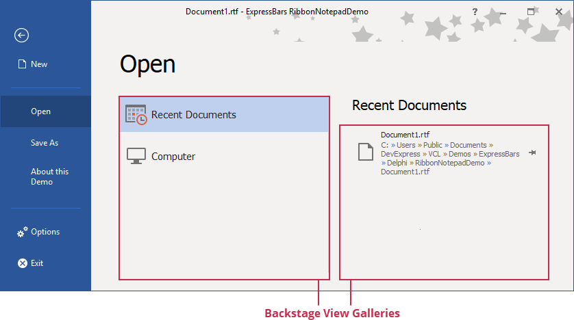
- Backstage View Gallery
This gallery uses the Ribbon control’s color scheme to paint its content and allows you to pin items.

Refer to the following topics for details:
KeyTips
A user can press the Alt + any key shortcut to activate the corresponding item within the Ribbon.

The following elements support key tips:
- Tabs
- Tab groups
- Item links within tab groups, the Quick Access Toolbar, and Tab Area Toolbar
- Application Button
- Application Menu elements
- Radial menu elements
- Toolbar title buttons
Refer to the following topic for details: Ribbon KeyTips.
Toolbars
The ExpressBars Library allows you to build the traditional toolbar UI that was commonly used in earlier versions of Microsoft Office. Note that our implementation fully supports runtime toolbar customization, just like in Office applications.

You can pin a toolbar to an application form’s edge, and create floating bars and a main menu.
Refer to the following topics for more information about toolbars:
Status Bars
Use the TdxRibbonStatusBar or TdxStatusBar control to display status information in your application.

You can use any of the following panel styles:
Toolbar panel (available only for the Ribbon status bar)
To apply the Ribbon style to the Ribbon status bar, link the bar to the Ribbon control. Refer to the control’s ColorSchemeName and Style property descriptions for details.
Radial Menu
Use the TdxRibbonRadialMenu component to create a menu where commands are arranged into a wheel. This layout UI emulates the mobile version of Microsoft Office and works best in applications that need to support touch gestures.

Tabbed MDI
The TdxTabbedMDIManager component allows you to display MDI child forms as tabs.

In-Place Editors
A toolbar item container (TcxBarEditItem) allows you to use any editor from the ExpressEditors Library as you would other container controls, such as Data Grid, Tree List, and Vertical Grid.

Refer to the TcxBarEditItem class description for detailed information and code examples on in-place editor management in a Ribbon or Toolbar UI.