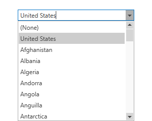
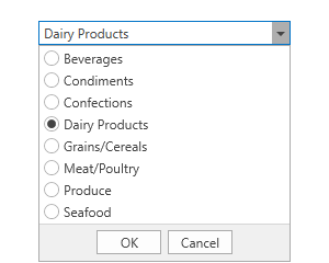
ComboBoxEdit Class
A combobox editor.
Namespace: DevExpress.Xpf.Editors
Assembly: DevExpress.Xpf.Core.v25.2.dll
NuGet Package: DevExpress.Wpf.Core
Declaration
Related API Members
The following members return ComboBoxEdit objects:
Remarks
Tip
The ComboBoxEdit class inherits its features from the LookUpEditBase class.
Refer to the LookUpEditBase class description for information on derived features and API.
Create a ComboBoxEdit
Use the ComboBoxEdit.Items property to add items. This property is marked with the ContentPropertyAttribute, so you can add elements to the group between the start and end ComboBoxEdit tags in XAML.
<Window ...
    xmlns:dxe="http://schemas.devexpress.com/winfx/2008/xaml/editors">

<dxe:ComboBoxEdit>
    <dxe:ComboBoxEdit.Items>
        <dxe:ComboBoxEditItem>Item1</dxe:ComboBoxEditItem>
        <dxe:ComboBoxEditItem>Item2</dxe:ComboBoxEditItem>
        <dxe:ComboBoxEditItem>Item3</dxe:ComboBoxEditItem>
    </dxe:ComboBoxEdit.Items>
</dxe:ComboBoxEdit>
...
Bind to Data
Use the ItemsSource property to bind the ComboBoxEdit to an IEnumerable source.
Bind to the List of Simple Objects
<dxe:ComboBoxEdit ItemsSource="{Binding Items}" />
using System;
using System.Collections.Generic;
using System.Windows;

namespace ComboBoxSample {
    public MainWindow() {
        InitializeComponent();
        this.DataContext = new MainViewModel();
    }

    public class MainViewModel : ViewModelBase {
        protected List<String> _Items = new List<string>(Enumerable.Range(0, 10).Select(c => $"Item {c}"));
        public List<String> Items {
            get { return this._Items; }
            set { this.SetProperty(ref this._Items, value, "Items"); }
        }
    }
}
Bind to the Collection of Objects (Lookup Mode)
To bind the ComboBoxEdit to the collection of objects, use DisplayMember and ValueMember properties.
The DisplayMember property specifies a source field name whose values are used as item display text.
The ValueMember property specifies a source field name whose values are used as actual item values. If this property is not specified, the ComboBoxEdit returns the source object.
<dxe:ComboBoxEdit
    ItemsSource="{Binding}"
    DisplayMember="Name"
    ValueMember="Id"/>
using System;
using System.Collections.Generic;

namespace ComboBoxSample {
    public partial class MainWindow : Window {
        public MainWindow() {
            InitializeComponent();
            this.DataContext = new ObservableCollection<Customer>(){
                new Customer(){ Id = 1, Name = "Gregory S. Price" },
                new Customer(){ Id = 2, Name = "Irma R. Marshall" },
                new Customer(){ Id = 3, Name = "John C. Powell" }
            };
        }
    }
    public class Customer {
        public int Id { get; set; }
        public string Name { get; set; }
    }
}
Note
When the DisplayMember and ValueMember properties are specified, the ComboBoxEdit allows users to enter only the values from its ItemsSource.
Bind to Enumeration Values
You can bind the ComboBoxEdit to enumeration values in any of the following ways:
- Use the SetupComboBoxEnumItemSource<T, DataType>(LookUpEditBase) method.
- Use the EnumItemsSourceBehavior.
Edit Value and Display Text
The ComboBoxEdit value is specified by the EditValue property. To respond to edit value changes, handle the BaseEdit.EditValueChanging and BaseEdit.EditValueChanged events.
The DisplayText property returns the text displayed in the ComboBoxEdit.
Edit Value in Multiselect Mode
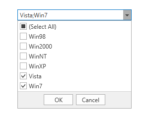
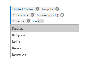
If an editor works in checked, token, or checked token mode, it allows end users to select multiple data items at once. In this case, the editor’s EditValue property returns a list of Objects. You can cast these objects to the following:
- The type of bound data items if an editor is bound to simple objects or is in lookup mode (the ValueMember property is not specified).
- The type of the data field specified in the ValueMember property.
Refer to the following help topic for more information: Multiple Selection in ComboBoxEdit, LookUpEdit, and ListBoxEdit.
ComboBoxEdit Operation Modes
Refer to the ComboBoxEdit Operation Modes topic for more information on how to work with operation modes.
Customize Appearance
Refer to the Appearance Customization topic for more information on how to customize ComboBoxEdit and ListBox item appearance.
Auto Complete
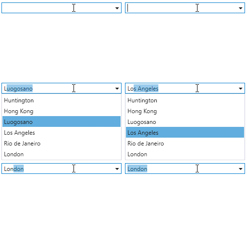
The ComboBoxEdit can automatically complete the text typed by a user to form a valid value. To enable automatic completion, set the AutoComplete property to true.

<dxe:ComboBoxEdit
                 AutoComplete="True"
                 ItemsSource="{Binding Cities}" />
Enable the LookUpEditBase.ImmediatePopup option to display the editor dropdown when a user starts to type:
<dxe:ComboBoxEdit
    AutoComplete="True"
    ImmediatePopup="True"
    ItemsSource="{Binding Cities}" />
Incremental Filtering
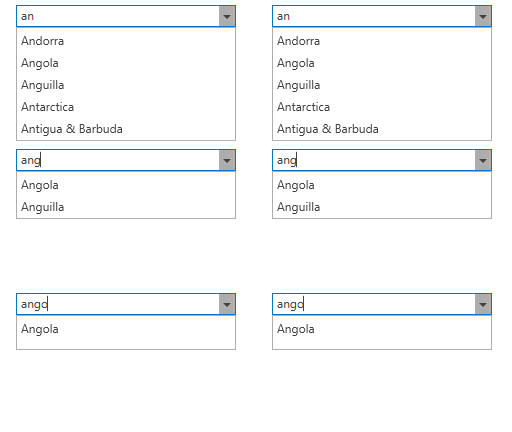
The ComboBoxEdit can filter items on user input.
To enable incremental filtering, set the IncrementalFiltering property to true. To enable case-sensitive filtering, set the LookUpEditBase.IsCaseSensitiveFilter property to true.
<dxe:ComboBoxEdit
                 IncrementalFiltering="True"
                 ItemsSource="{Binding Countries}" />
Incremental search
Refer to the Incremental Search topic for more information on how to enable the incremental search for the ComboBoxEdit control.
Related GitHub Examples
The following code snippets (auto-collected from DevExpress Examples) contain references to the ComboBoxEdit class.
Note
The algorithm used to collect these code examples remains a work in progress. Accordingly, the links and snippets below may produce inaccurate results. If you encounter an issue with code examples below, please use the feedback form on this page to report the issue.
