ProgressBarEdit Class
A progress bar.
Namespace: DevExpress.Xpf.Editors
Assembly: DevExpress.Xpf.Core.v26.1.dll
Declaration
public class ProgressBarEdit :
    RangeBaseEdit,
    IProgressBarExportSettings,
    ITextExportSettings,
IExportSettingsRemarks
The ProgressBarEdit is a visual control that indicates the progress of lengthy operations.

Create a Progress Bar
You can specify the progress bar editor’s value via the RangeBaseEdit.Value or BaseEdit.EditValue property.
<Window ...
    xmlns:dxe="http://schemas.devexpress.com/winfx/2008/xaml/editors">

<!-- Create a progress bar with possible values from 0 to 100.
    Use the RangeBaseEdit.Value property to specify the value.
    Display the progress value in a custom content format. -->
<dxe:ProgressBarEdit
                    Value="75"
                    ContentDisplayMode="Value"
                    DisplayFormatString="{}{0}%"/>
Progress Bar Operation Modes
To change the operation mode of a progress bar, assign the BaseEdit.StyleSettings property of the bar to one of the objects listed in the table below.
Operation Mode | Settings object | Description |
|---|---|---|
Default | A progress bar that indicates the progress of a lengthy operation. This style is the default mode.
| |
Marquee | The editor represents the marquee progress bar, which does not display progress. It displays a block that continuously scrolls from left to right - to indicate a continuous operation.
|

The code snippet below demonstrates how to create a marquee progress bar:
<dxe:ProgressBarEdit>
    <dxe:ProgressBarEdit.StyleSettings>
        <dxe:ProgressBarMarqueeStyleSettings/>
    </dxe:ProgressBarEdit.StyleSettings>
</dxe:ProgressBarEdit>
Content Display Modes
Use the ProgressBarEdit.ContentDisplayMode property to switch between the following display modes.
None - only a progress indicator is displayed.
<dxe:ProgressBarEdit
  Value="75"
  ContentDisplayMode="None"/>
Value - progress bar displays a numeric value.
<dxe:ProgressBarEdit
  Value="75"
  ContentDisplayMode="Value"/>
Content - progress bar displays the contents of its ProgressBarEdit.Content property.
<dxe:ProgressBarEdit
  Value="75"
  ContentDisplayMode="Content">
  <dxe:ProgressBarEdit.Content>
      <Image Source="{dx:DXImage 'SvgImages/Status/Warning.svg'}"/>
  </dxe:ProgressBarEdit.Content>
</dxe:ProgressBarEdit>
Customizable Value Range
You can limit the range of accepted values using the ProgressBarEdit‘s RangeBaseEdit.Minimum and RangeBaseEdit.Maximum properties.
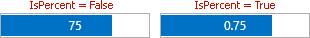
Percent Value Display Mode
To display the ProgressBarEdit‘s value as a decimal number, set the ProgressBarEdit.IsPercent property to true.
Adjustable Orientation
Use the ProgressBarEdit‘s RangeBaseEdit.Orientation property to switch between horizontal and vertical orientations.
Appearance Customization
Use the ProgressBrush to specify the progress color.
Related GitHub Examples
The following code snippets (auto-collected from DevExpress Examples) contain references to the ProgressBarEdit class.
Note
The algorithm used to collect these code examples remains a work in progress. Accordingly, the links and snippets below may produce inaccurate results. If you encounter an issue with code examples below, please use the feedback form on this page to report the issue.