CheckedTokenComboBoxStyleSettings Class
Defines the checked token combo box editor appearance and behavior.
Namespace: DevExpress.Xpf.Editors
Assembly: DevExpress.Xpf.Core.v26.1.dll
Declaration
public class CheckedTokenComboBoxStyleSettings :
    CheckedComboBoxStyleSettings,
ITokenStyleSettingsRemarks
A CheckedTokenComboBoxStyleSettings object defines the Checked Token combo box operation mode.
This mode is inspired by modern mail clients and supports multi-selection. Selected values are represented by tokens.
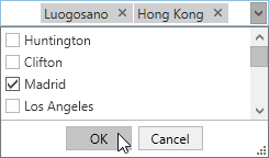
Selected items are automatically hidden from the popup when you utilize the CheckedTokenComboBoxStyleSettings class. To disable this behavior, set the FilterOutSelectedTokens property to false.
The following code switches the combo box operation mode to Checked Token and configures a new token position:
<dxe:ComboBoxEdit>
    <dxe:ComboBoxEdit.StyleSettings>
        <dxe:CheckedTokenComboBoxStyleSettings NewTokenPosition="Far"/>
    </dxe:ComboBoxEdit.StyleSettings>
</dxe:ComboBoxEdit>
Tip
For the complete list of the ComboBoxEdit control operation modes, see ComboBoxEdit operation modes.
Tip
Use the TokenEditorBehavior to control token editing.
Related GitHub Examples
The following code snippets (auto-collected from DevExpress Examples) contain references to the CheckedTokenComboBoxStyleSettings class.
Note
The algorithm used to collect these code examples remains a work in progress. Accordingly, the links and snippets below may produce inaccurate results. If you encounter an issue with code examples below, please use the feedback form on this page to report the issue.