DateRangeControl Class
A control that allows users to select a range of dates.
Namespace: DevExpress.Xpf.Editors
Assembly: DevExpress.Xpf.Core.v26.1.dll
Declaration
Related API Members
The following members return DateRangeControl objects:
Remarks
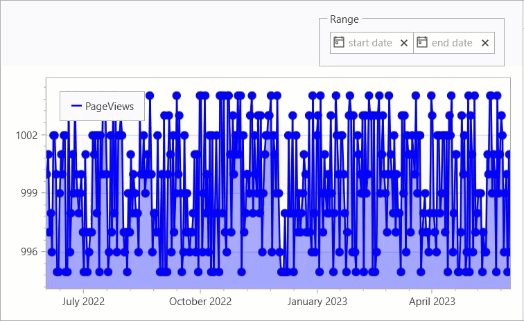
The DateRangeControl‘s pop-up calendar allows users to select a range of dates. The picture below shows the DateRangeControl control in action:
The control supports the following features:
- Predefined date ranges
- You can allow users to select a named date range, such as “this month”. Use the PredefinedRanges property to set up predefined or custom date ranges available in the control’s pop-up calendar. If specified, these range options appear in a list next to calendar controls.
- Selection confirmation buttons
- The pop-up calendar can display footer buttons. Your button choice specifies whether users need to confirm (or if they can cancel) their selection. Use the PopupFooterButtons property to specify which buttons are visible.
- Range constraints
- You can set selection boundaries. Use the MinValue and MaxValue properties to specify the minimum and maximum dates.
- Custom pop-up footer
- You can specify a custom template for the pop-up’s footer. Use the PopupBottomAreaTemplate property.
- Masks
- You can specify a mask for the start and end dates. Use the Mask property.
- Custom style for date editors
- You can specify a custom style for the start and end date editors. Use the StartEditStyle and EndEditStyle properties.
Create a DateRangeControl
Create the DateRangeControl in XAML markup.
<dxe:DateRangeControl/>
You can also drag the DateRangeControl to a window from the Toolbox.
Predefined Date Ranges
The DateRangeControl control allows you to specify custom or use default predefined date ranges that users can select from a pop-up calendar. The following default predefined date ranges are available:
- Previous week
- This week
- Next week
- This month
Set the ShowPredefinedRanges property to true to use these predefined date ranges.
<dxe:DateRangeControl ShowPredefinedRanges="True"/>
To hide the default predefined date ranges, set the ShowPredefinedRanges property to false.
You can specify custom date ranges. To do it in XAML, use the PredefinedRanges property.
<dxe:DateRangeControl>
    <dxe:DateRangeControl.PredefinedRanges>
        <dxe:PredefinedDateRange Name="June" Start="06/01/2023" End="06/30/2023"/>
        <dxe:PredefinedDateRange Name="July" Start="07/01/2023" End="07/31/2023"/>
        <dxe:PredefinedDateRange Name="August" Start="08/01/2023" End="08/31/2023"/>
    </dxe:DateRangeControl.PredefinedRanges>
</dxe:DateRangeControl>
To specify custom date ranges in code, use the RequestPredefinedDateRanges property and an event.
<dxe:DateRangeControl RequestPredefinedDateRanges="RequestPredefinedDateRanges">
void RequestPredefinedDateRanges(object sender, PredefinedRangeEventArgs e) {
    e.Ranges.Clear();
    e.Ranges.Add(new PredefinedDateRange("1 week", DateTime.Today.AddDays(-6), DateTime.Today));
    e.Ranges.Add(new PredefinedDateRange("2 weeks", DateTime.Today.AddDays(-13), DateTime.Today));
    e.Ranges.Add(new PredefinedDateRange("1 month", DateTime.Today.AddMonths(-1), DateTime.Today));
    e.Ranges.Add(new PredefinedDateRange("3 months", DateTime.Today.AddMonths(-3), DateTime.Today));
}
Pop-Up Footer Buttons
The DateRangeControl allows you to specify a display that users can click to confirm or cancel a range selection, or to simply close the pop-up calendar. To specify available buttons, use the PopupFooterButtons property. The following options are available:
- OK and Cancel
- Confirms or cancels the current selection and closes the pop-up calendar.
- Close
- Closes the pop-up calendar.
- None
- No buttons are displayed. In this case, the pop-up calendar closes automatically when a user selects a date range.
The following code sample shows how to specify buttons:
<dxe:DateRangeControl PopupFooterButtons="OkCancel"/>
The following code sample hides all buttons. The pop-up calendar closes automatically after a user selects a range:
<dxe:DateRangeControl PopupFooterButtons="None"/>
Range Constraints
The following code sample uses MinValue and MaxValue properties to specify range constraints:
<dxe:DateRangeControl MinValue="01/01/2023" MaxValue="01/01/2025"/>
Pop-Up Footer Customization
The DateRangeControl allows you to customize the pop-up’s appearance and content. To specify a template for a custom pop-up footer, use the PopupBottomAreaTemplate property. The following code sample shows how to specify a template for a custom pop-up footer:
<dxe:DateRangeControl>
    <dxe:DateRangeControl.PopupBottomAreaTemplate>
        <ControlTemplate>
            <StackPanel Orientation="Horizontal">
                <Button Content="Choose"/>
                <Button Content="Cancel"/>
            </StackPanel>
        </ControlTemplate>
    </dxe:DateRangeControl.PopupBottomAreaTemplate>
</dxe:DateRangeControl>
Mask
The DateRangeControl allows you to specify a mask for the start and end dates. To do it in XAML, use the Mask property. The following code sample shows how to specify a mask:
<dxe:DateRangeControl Mask="d"/>
Custom Style for Date Editors
The DateRangeControl allows you to specify a custom style for the start and end date editors. To do it in XAML, use the StartEditStyle and EndEditStyle properties, respectively. The following code sample shows how to specify a style for the start date editor:
<dxe:DateRangeControl.StartEditStyle>
    <Style TargetType="{x:Type dxe:ButtonEdit}">
        <Setter Property="Background" Value="LightGreen"/>
        <Setter Property="FontWeight" Value="Bold"/>
    </Style>
</dxe:DateRangeControl.StartEditStyle>
Related GitHub Examples
The following code snippet (auto-collected from DevExpress Examples) contains a reference to the DateRangeControl class.
Note
The algorithm used to collect these code examples remains a work in progress. Accordingly, the links and snippets below may produce inaccurate results. If you encounter an issue with code examples below, please use the feedback form on this page to report the issue.