DateTimeAxisX Class
The X-axis that the chart uses to display series of data points with date-time arguments.
Namespace: DevExpress.Maui.Charts
Assembly: DevExpress.Maui.Charts.dll
NuGet Package: DevExpress.Maui.Charts
Declaration
public class DateTimeAxisX :
    AxisX
Remarks
ChartView chooses the X-axis type based on the data in the first series. If arguments are date-time values, the chart uses a DateTimeAxisX.
The chart shows DateTime values in the UTC format. Even if you change the time to a local value, ChartView shows them as if you converted them back to UTC. To resolve the issue, create a new DateTime value with the value returned by the ToLocalTime method and the Kind property set to UTC:
DateTime baseTime = new DateTime(2022, 11, 14, 9, 0, 0, DateTimeKind.Utc);
baseTime = new DateTime(baseTime.ToLocalTime().Ticks, DateTimeKind.Utc);
Use the ChartView.AxisX property to access the automatically created axis. To create and customize axes for individual series, use the Series.AxisX property.
<dxc:ChartView>
    <!--Specify an X-axis at the chart level-->
    <dxc:ChartView.AxisX>
        <dxc:DateTimeAxisX />
    </dxc:ChartView.AxisX>

    <dxc:ChartView.Series>
        <dxc:LineSeries>
            <!--Specify an X-axis at the series level-->
            <dxc:LineSeries.AxisX>
                <dxc:DateTimeAxisX />
            </dxc:LineSeries.AxisX>
        </dxc:LineSeries>
    </dxc:ChartView.Series>
</dxc:ChartView>
The DateTimeAxisX class properties allow you to configure the following axis options: range, scale parameters, labels, title, constant lines, strip, gridlines, tickmarks and interlacing colors. You can also change the axis position.

Value Range
The ChartView automatically calculates the axis range based on data series values. You can specify a custom range for the axis. To do this, set the DateTimeAxisX.Range property to a DateRange object with the following properties specified:
Min and Max - specify the entire range of the axis scale. A chart does not visualize data that is out of this range. A user can scroll the chart through this range when scroll is enabled for the X-axis (AxisXNavigationMode).
VisualMin and VisualMax - configure the axis scale range currently visible on the screen.
SideMargin - sets the value of margins on both sides of the axis.

<dxc:DateTimeAxisX>
    <dxc:DateTimeAxisX.Range>
        <dxc:DateTimeRange Min="1/1/1950" VisualMin="1/1/1970"
                           Max="1/1/2050" VisualMax="1/1/2030"
                           SideMargin="1"/>
    </dxc:DateTimeAxisX.Range>
</dxc:DateTimeAxisX>
You can also set the DateTimeAxisX.EmptyRangesVisible property to False to hide the ranges of the DateTimeAxisX that contain no data.
Axis Scale Parameters
Use the following properties to configure the axis scale:
- GridOffset - The distance between the first tickmark/gridline and the minimum value of the axis value range (in measurement units).
- GridSpacing - The number of GridAlignment units between adjacent major tickmarks/gridlines.

<dxc:DateTimeAxisX MeasureUnit="Month" GridOffset="6"
                   GridAlignment="Year" GridSpacing="10"/>
Axis Labels
Axis labels display values at major tickmarks. They are automatically generated based on series data.

To configure axis labels, set the axis’s Label property to an AxisLabel object with the specified settings. For example, you can use the AxisLabel.TextFormat property to change the text pattern applied to axis labels.
<dxc:DateTimeAxisX>
    <dxc:DateTimeAxisX.Label>
        <dxc:AxisLabel TextFormat="yyyy yr"/>
    </dxc:DateTimeAxisX.Label>
</dxc:DateTimeAxisX>
Label Text Formatter
To generate text strings for axis labels based on a custom condition:
- Create a class that inherits the IAxisLabelTextFormatter interface and implement the Format method.
- Assign an instance of the newly created class to the LabelTextFormatter property (it has a higher priority than AxisLabel.TextFormat).
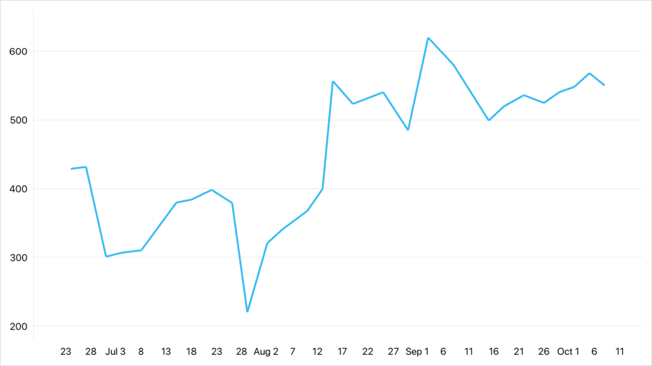
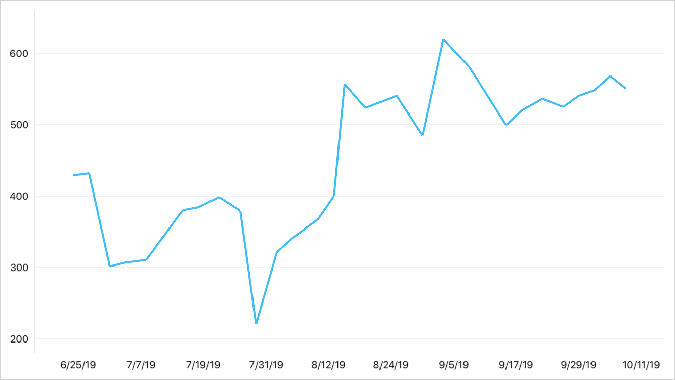
This example shows how to format labels of a date-time axis.

Custom format of axis labels.

Default format of axis labels.
<dxc:DateTimeAxisX GridAlignment="Day" GridSpacing="7">
    <dxc:DateTimeAxisX.LabelTextFormatter>
        <local:AxisLabelTextFormatter/>
    </dxc:DateTimeAxisX.LabelTextFormatter>
</dxc:DateTimeAxisX>
using DevExpress.Maui.Charts;
...

public class AxisLabelFormatter : IAxisLabelTextFormatter {
    public string Format(object axisValue) {
        DateTime value = (DateTime)axisValue;
        return ((value.Day >= 1) && (value.Day <= 7)) ? $"{value.ToString("MMM, d")}" : $"{value.Day}";
    }
}
Label Format Auto Replace
The ChartView can detect if adjacent date-time argument values belong to different measurement units (for example, days of different months) and automatically display a transition label on a date-time axis (for example, the first-day label of the next month) with a different format.
To enable this functionality:
- Set the DateTimeAxisX.LabelFormatAutoReplaceOptions property to an AxisLabelFormatAutoReplaceOptions object.
Add DateTimeLabelFormat objects that specify label formats (Format) for arguments of different measurement units (MeasureUnit) to the AxisLabelFormatAutoReplaceOptions.LabelFormats collection.
Note
LabelFormats is a content property. You can skip property tags in the markup.
If you do not populate the LabelFormats collection explicitly, the following default formats are used depending on the axis’s MeasureUnit and GridAlignment settings:
Measurement Unit*
Label Format
Millisecond
Millisecond - “SSS”
Second - “HH:mm:ss SSS”
Day - “dd MMMM HH:mm:ss SSS”
Year - “dd/MM/yyyy HH:mm:ss SSS”Second
Minute
HourSecond - “HH:mm:ss”
Day - “dd MMMM HH:mm:ss”
Year - “dd/MM/yyyy HH:mm:ss”Day
WeekDay - “dd MMMM”
Year - “dd MMMM yyyy”Month
QuarterMonth - “MMMM”
Year - “MMMM yyyy”Year
Year - “yyyy”
Measurement Unit* - the larger measurement unit assigned to the MeasureUnit and GridAlignment properties.
The following example configures a date-time axis so that it automatically shows when the next month starts:
<dxc:DateTimeAxisX x:Name="xAxis" GridAlignment="Day" GridSpacing="5">
    <dxc:DateTimeAxisX.LabelFormatAutoReplaceOptions>
        <dxc:AxisLabelFormatAutoReplaceOptions>
            <dxc:DateTimeLabelFormat MeasureUnit="Day" Format="d"/>
            <dxc:DateTimeLabelFormat MeasureUnit="Month" Format="MMM, d"/>
        </dxc:AxisLabelFormatAutoReplaceOptions>
    </dxc:DateTimeAxisX.LabelFormatAutoReplaceOptions>
</dxc:DateTimeAxisX>
Avoid Axis Label Overlap
You can hide axis labels to resolve overlapping labels. To enable this option, assign an AxisLabelResolveOverlappingOptions object (its AllowHide property should be set to true) to the AxisLabel.ResolveOverlappingOptions property.
Some labels are automatically hidden to avoid overlapping.
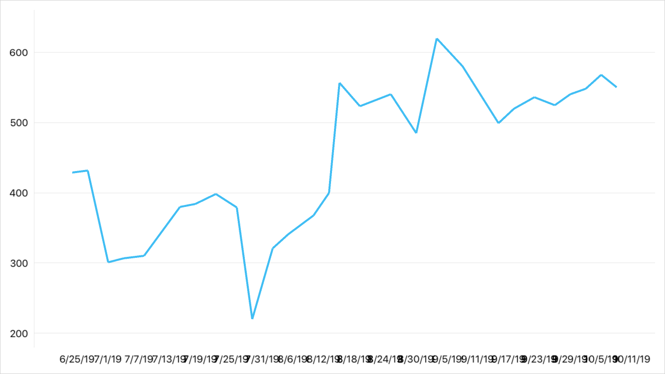
Labels overlap.
<dxc:DateTimeAxisX x:Name="myAxis" GridAlignment="Day" GridSpacing="6">
    <dxc:DateTimeAxisX.Label>
        <dxc:AxisLabel TextFormat="M/d/yy">
            <dxc:AxisLabel.ResolveOverlappingOptions>
                <dxc:AxisLabelResolveOverlappingOptions AllowHide="True"/>
            </dxc:AxisLabel.ResolveOverlappingOptions>
        </dxc:AxisLabel>
    </dxc:DateTimeAxisX.Label>
</dxc:DateTimeAxisX>
Axis Title
Use the Title property to access the X-axis’s title settings.
This example creates, aligns, and customizes the appearance of the X-axis’s title.

<dxc:DateTimeAxisX>
    <dxc:DateTimeAxisX.Title>
        <dxc:AxisTitle Text="Year" Alignment="Center"/>
            <dxc:AxisTitle.Style>
                <dxc:TitleStyle>
                    <dxc:TitleStyle.TextStyle>
                        <dxc:TextStyle Color="DarkRed" Size="24"/>
                    </dxc:TitleStyle.TextStyle>
                </dxc:TitleStyle>
            </dxc:AxisTitle.Style>
    </dxc:DateTimeAxisX.Title>
</dxc:DateTimeAxisX>
You can also use the AxisTitle‘s Visible property to change the title visibility.
Constant Lines
A Constant Line visually highlights an axis value as a line perpendicular to the X-Axis.

This example shows how to add a constant line to the X-axis, customize its appearance and display it in the chart legend. To do this, add a DateTimeConstantLine object with the specified properties to the DateTimeAxisX.ConstantLines collection.
<dxc:DateTimeAxisX>
    <dxc:DateTimeAxisX.ConstantLines>
        <dxc:DateTimeConstantLine AxisValue="2019" ShowBehind="False"
                                  VisibleInLegend="True" LegendText="Nowadays">
            <!-- Customize the constant line title. -->
            <dxc:DateTimeConstantLine.Title>
                <dxc:ConstantLineTitle Text="Nowadays" ShowBelowLine="False" Alignment="Near">
                    <dxc:ConstantLineTitle.Style>
                        <dxc:TitleStyle>
                            <dxc:TitleStyle.TextStyle>
                                <dxc:TextStyle Color="DarkBlue" Size="24"/>
                            </dxc:TitleStyle.TextStyle>
                        </dxc:TitleStyle>
                    </dxc:ConstantLineTitle.Style>
                </dxc:ConstantLineTitle>
            </dxc:DateTimeConstantLine.Title>
            <!-- Customize the constant line appearance. -->
            <dxc:DateTimeConstantLine.Style>
                <dxc:ConstantLineStyle Thickness="5"/>
            </dxc:DateTimeConstantLine.Style>
        </dxc:DateTimeConstantLine>
    </dxc:DateTimeAxisX.ConstantLines>
</dxc:DateTimeAxisX>
Strip
A Strip highlights a specific range of axis values as a rectangular area with an axis label.

<dxc:DateTimeAxisX>
    <dxc:DateTimeAxisX.Strips>
        <dxc:DateTimeStrip MinLimit="2019" MaxLimitEnabled="False">
            <dxc:DateTimeStrip.AxisLabel>
                <dxc:StripAxisLabel Text="Future"/>
            </dxc:DateTimeStrip.AxisLabel>
        </dxc:DateTimeStrip>
    </dxc:DateTimeAxisX.Strips>
</dxc:DateTimeAxisX>
Note
The axis hides its labels when any strip has a label.
Axis Appearance
The axis has the Style property that stores the appearance of the following elements:
Element | Properties |
|---|---|
Axis Line | |
Major Tickmarks | LineColor, MajorTickmarksThickness, MajorTickmarksLength, MajorTickmarksVisible |
Minor Tickmarks | LineColor, MinorTickmarksThickness, MinorTickmarksLength, MinorTickmarksVisible |
Major Gridlines | MajorGridlinesThickness, MajorGridlinesColor, MajorGridlinesVisible |
Minor Gridlines | MinorGridlinesThickness, MinorGridlinesColor, MinorGridLinesVisible |
Interlacing |

Note
Labels, Titles, Constant Lines and Strips have Style properties that manage the appearance of these elements.
Axis Position
Use the DisplayPosition property to specify where an X-axis should be positioned within the chart diagram.
This example anchors an X-axis to the top portion of the chart’s plot area:

<dxc:DateTimeAxisX>
    <dxc:DateTimeAxisX.DisplayPosition>
        <dxc:AxisDisplayPositionFar/>
    </dxc:DateTimeAxisX.DisplayPosition>
</dxc:DateTimeAxisX>