PieHint Class
Stores appearance settings of pie chart hints.
Namespace: DevExpress.Maui.Charts
Assembly: DevExpress.Maui.Charts.dll
NuGet Package: DevExpress.Maui.Charts
Declaration
public class PieHint :
    HintBase
Related API Members
The following members return PieHint objects:
Remarks
A hint is a small pop-up rectangle that shows information about a tapped series or point. The pie chart displays its hints as tooltips.
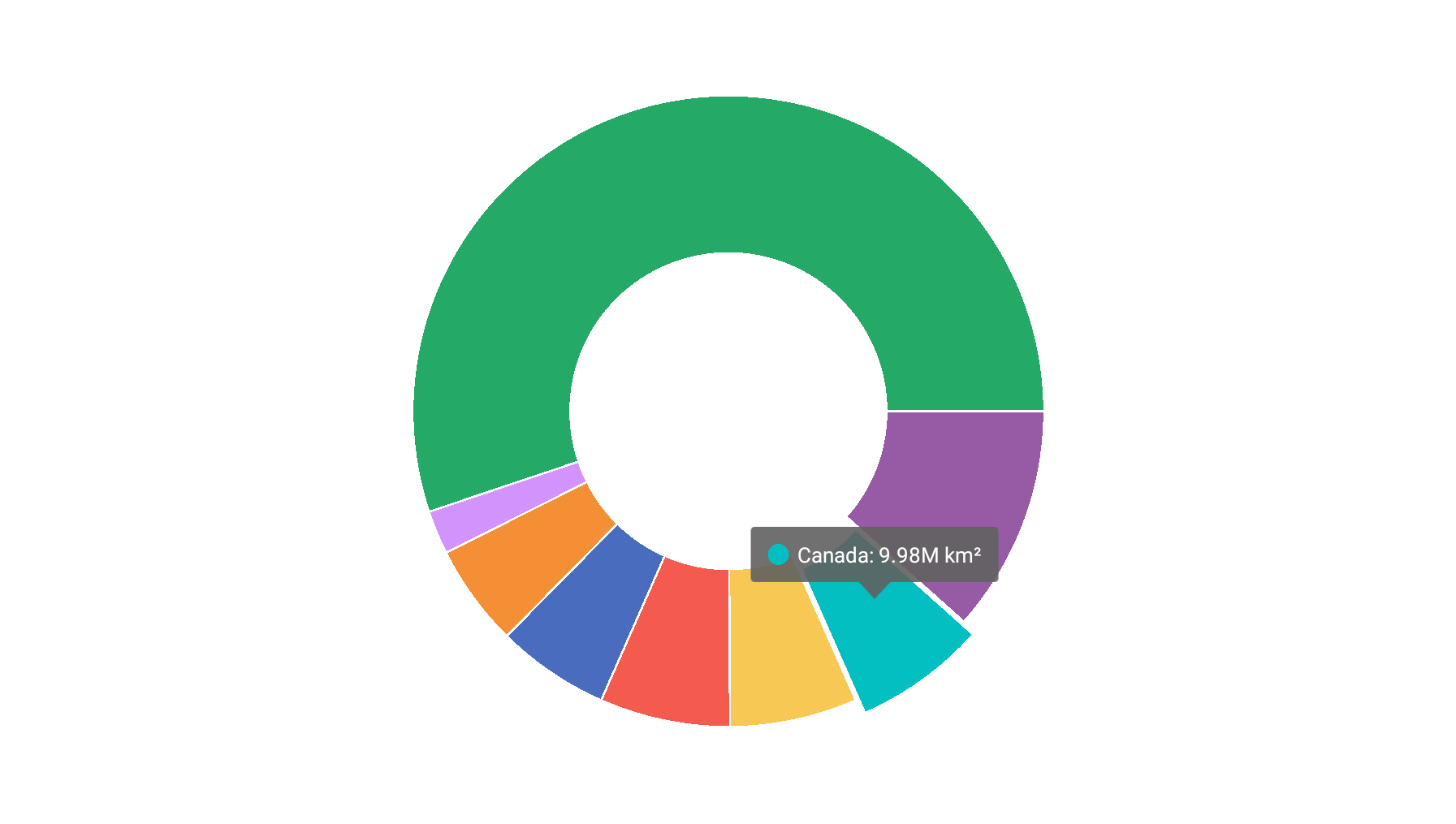
How to: Enable Hints in the Pie Chart
- Create a new
PieHintobject and assign it to the PieChartView.Hint property. - Set the Enabled property to True.
- Use the ShowMode property to specify a gesture on which the pie chart shows the hint.
<dxc:PieChartView>
  <!--...-->
  <dxc:PieChartView.Hint>
    <dxc:PieHint Enabled="True" ShowMode="OnTap" />
  </dxc:PieChartView.Hint>
</dxc:PieChartView>
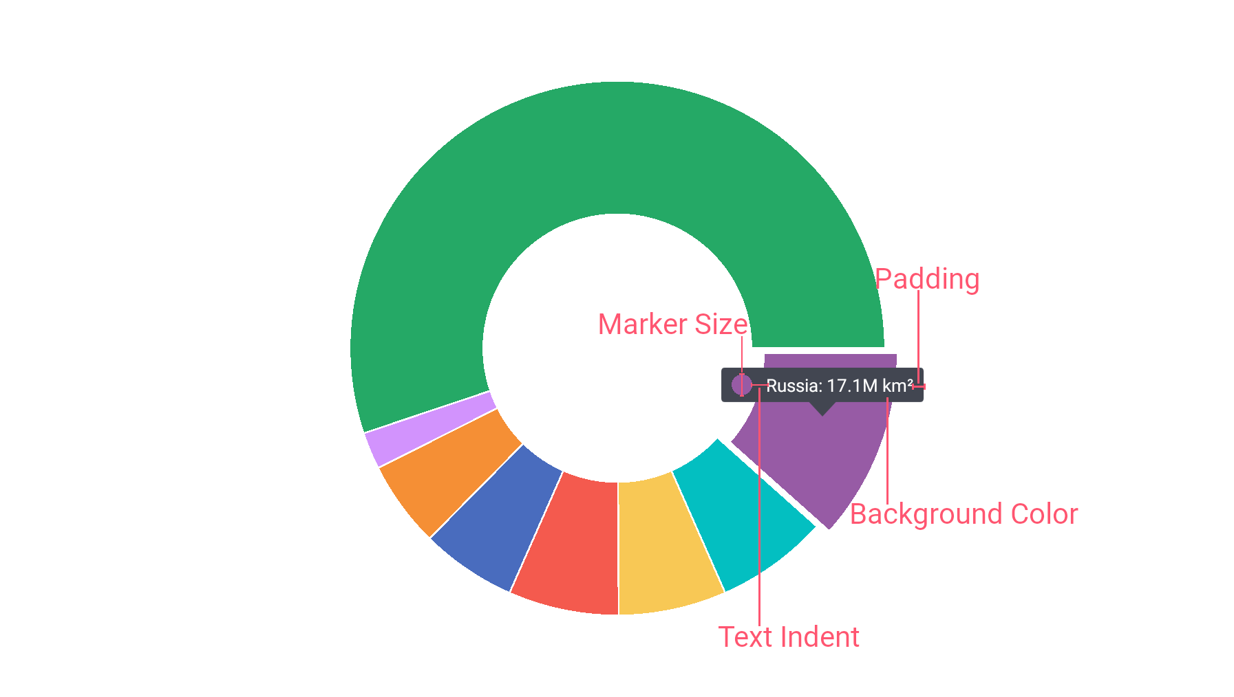
How to: Customize the Hint Appearance
This example shows how to customize the appearance of pie chart hints. To do this, assign a PieHintStyle object with the specified properties to the PieHint.Style property:
<dxc:PieChartView>
    <dxc:PieChartView.Hint>
        <dxc:PieHint Enabled="True" ShowMode="OnTap">
            <dxc:PieHint.Style>
                <dxc:PieHintStyle BackgroundColor="#424651"
                                  MarkerSize="30"
                                  Padding="15,15,10,10"
                                  TextIndent="20"/>
            </dxc:PieHint.Style>
        </dxc:PieHint>
    </dxc:PieChartView.Hint>
</dxc:PieChartView>
Use the following properties of the PieHintStyle object to configure the hint appearance:
Property | Description |
|---|---|
Gets or sets the hint label’s background color. This is a bindable property. | |
Gets or sets the hint’s label padding. This is a bindable property. | |
Gets or sets the hint’s marker size. This is a bindable property. | |
Gets or sets the indent between a hint marker and text. This is a bindable property. |