BubbleSeries Class
Displays three-dimensional data as a collection of bubbles, so that each bubble position visualizes the first two dimensions and the bubble size is the third dimension.
Namespace: DevExpress.Maui.Charts
Assembly: DevExpress.Maui.Charts.dll
NuGet Package: DevExpress.Maui.Charts
Declaration
public class BubbleSeries :
    XYSeries
Remarks
The Bubble series allows you to visually represent data that has a third dimension, expressed as the bubble’s size. You map two dimensions along the usual X and Y axes, and then the third dimension is displayed as a filled circle (bubble) at the data point. The BubbleSeries.MinSize and BubbleSeries.MaxSize properties specify the size of the smallest and largest marker on the chart.
Series Data
To provide data for the bubble series, set the BubbleSeries.Data property to the SeriesDataAdapter class instance. Use the adapter’s properties to specify the data source for the series, and to define the data source members used to generate series points and labels. This series type requires 1 argument and 2 values (value and weight) for a data point.
You can also create a custom data adapter to populate the series with data. For example, it can be useful when data is generated on the fly and you don’t need to store it.
<ContentPage.BindingContext>
    <local:MainViewModel/>
</ContentPage.BindingContext>
<dxc:ChartView>
    <dxc:ChartView.Series>
        <dxc:BubbleSeries ColorEach="true">
            <dxc:BubbleSeries.Data>
                <dxc:SeriesDataAdapter DataSource="{Binding HighestGrossingFilmsByYearData}" ArgumentDataMember="Date">
                    <dxc:ValueDataMember Type="Value" Member="Value" />
                    <dxc:ValueDataMember Type="Weight" Member="WorldwideGrosses" />
                </dxc:SeriesDataAdapter>
            </dxc:BubbleSeries.Data>
        </dxc:BubbleSeries>
    </dxc:ChartView.Series>
</dxc:ChartView>
public class MainViewModel {
public List<FilmData> HighestGrossingFilmsByYearData { get; }
public MainViewModel() {
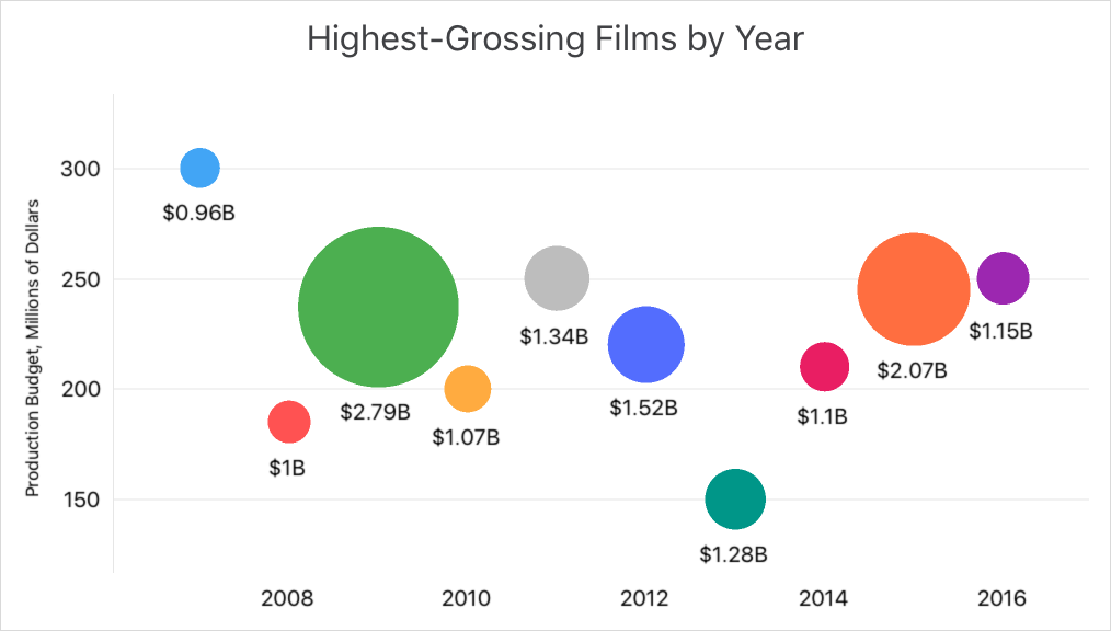
HighestGrossingFilmsByYearData = new List<FilmData> {
new FilmData(new DateTime(2007, 1, 1), "Pirates of the Caribbean: At World's End", 300D, 0.963),
new FilmData(new DateTime(2008, 1, 1), "The Dark Knight", 185D, 1.004),
new FilmData(new DateTime(2009, 1, 1), "Avatar", 237D, 2.788),
new FilmData(new DateTime(2010, 1, 1), "Toy Story 3", 200D, 1.067),
new FilmData(new DateTime(2011, 1, 1), "Harry Potter and the Deathly Hallows Part 2", 250D, 1.341),
new FilmData(new DateTime(2012, 1, 1), "Marvel's The Avengers", 220D, 1.519),
new FilmData(new DateTime(2013, 1, 1), "Frozen", 150D, 1.276),
new FilmData(new DateTime(2014, 1, 1), "Transformers: Age of Extinction", 210D, 1.104),
new FilmData(new DateTime(2015, 1, 1), "Star Wars: The Force Awakens", 245D, 2.068),
new FilmData(new DateTime(2016, 1, 1), "Captain America: Civil War", 250D, 1.153),
};
}
}
public class FilmData {
public DateTime Date { get; private set; }
public string Name { get; private set; }
public double Value { get; private set; }
public double WorldwideGrosses { get; private set; }
public FilmData(DateTime date, string name, double value, double worldwideGrosses) {
Date = date;
Name = name;
Value = value;
WorldwideGrosses = worldwideGrosses;
}
}

Important
ChartView chooses the X-axis type depending on data in the first series. If you specify the axis X for the chart or an individual series, set the ChartView.AxisX or Series.AxisX property to an object that is compatible with the series’ data type (otherwise, the chart does not display the series).
Series Labels
You can accompany series’ data points with labels to show point values as text on a chart:
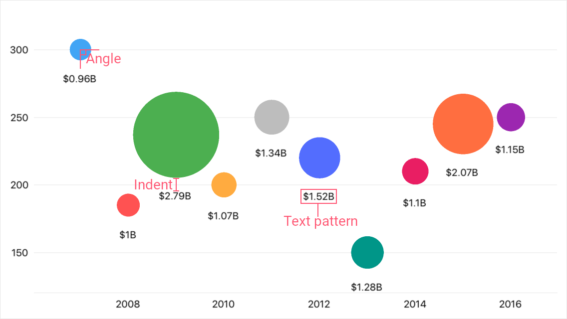
To enable series labels, set the BubbleSeries.Label property to the BubbleSeriesLabel object, and use this object’s properties to adjust the label settings:
TextPattern - Formats series label text.
A pattern includes regular text (which is displayed as is) and placeholder strings enclosed in braces. Placeholders define which values are shown in labels. You can use the following placeholders to specify the text pattern for bubble series’ labels:Placeholder
Description
{S}
Displays a series name.
{A}
Displays a series point argument.
{V}
Displays a series point value.
{W}
Displays a series point weight.
Note
To format these values, you can use default format strings after the
$sign.
For example, in the{W$#.##}string,Wis a placeholder,$is a format string separator, and#.##is a format string.- Position, Angle, Indent - Specify how a label is positioned relative to a series point.
- Style - Provides access to the SeriesLabelStyle object that stores label appearance settings (TextStyle).
- Visible - Allows you to show or hide labels for the series.
<dxc:BubbleSeries>
    <dxc:BubbleSeries.Label>
        <dxc:BubbleSeriesLabel TextPattern="{}${W$#.##}B"
                               Position="Outside"
                               Angle="90"
                               Indent="12"/>
    </dxc:BubbleSeries.Label>
</dxc:BubbleSeries>
Hints
ChartView can display hints (ChartView.Hint) as tooltips or as a crosshair cursor to show information about a tapped series point. A hint requests data to display from a series. Use the Series.HintOptions property to specify which data the series should return for a hint.
Tooltips
This example sets up the chart so that it shows a tooltip with the specified information when a user taps a bubble.

Subscribe to the SelectionChanged event and enable hints for the chart.
<dxc:ChartView x:Name="bubbleChart"
               SelectionKind="Point"
               SelectionMode="Single"
               SelectionChanged="OnBubbleSelectionChanged" >
    <dxc:ChartView.Series>
        <dxc:BubbleSeries x:Name="bubbleSeries">
            <!--...-->
        </dxc:BubbleSeries>
    </dxc:ChartView.Series>
    <dxc:ChartView.Hint>
        <dxc:Hint/>
    </dxc:ChartView.Hint>
</dxc:ChartView>
In the event handler, call the chart’s ShowHint method to show a hint for the selected bubble.
To specify the tooltip text pattern, set the series’ HintOptions property to the SeriesHintOptions object and use this object’s PointTextPattern property. You can use the following placeholders to specify text patterns for tooltips:
Placeholder
Description
{S}
Displays a series name.
{A}
Displays a series point argument.
{V}
Displays a series point value.
{W}
Displays a series point weight.
Note
To format these values, you can use default format strings after the
$sign.
For example, in the{V$#.##}string,Vis a placeholder,$is a format string separator, and#.##is a format string.The DataSourceKey.DataObject property allows you to access an object that corresponds to the selected bubble and cast it to the type of the data source’s item (FilmData).
using BubbleChartExample.Data;
using DevExpress.Maui.Charts;
using Microsoft.Maui.Controls;

// …

void OnBubbleSelectionChanged(object sender, DevExpress.Maui.Charts.SelectionChangedEventArgs e) {
    if (e.SelectedObjects.Count > 0 && e.SelectedObjects[0] is DataSourceKey dataSourceKey) {
        if (dataSourceKey.DataObject is FilmData bubbleDataObject) {
            bubbleSeries.HintOptions = new SeriesHintOptions();
            bubbleSeries.HintOptions.PointTextPattern =
                bubbleDataObject.Name + "\nProduction budget: {V$$#M}\nWorldwide grosses: {W$$#.##B}";
            bubbleChart.ShowHint(0, dataSourceKey.Index);
        }
    }
}
Crosshair Cursor
This example sets up the chart so that it shows a series point hint as a crosshair cursor when a user taps a bubble.

Subscribe to the SelectionChanged event and enable hints for the chart. Set the chart hint’s Behavior property to the CrosshairHintBehavior class instance.
<dxc:ChartView x:Name="bubbleChart"
               SelectionKind="Point"
               SelectionMode="Single"
               SelectionChanged="OnBubbleSelectionChanged" >
    <dxc:ChartView.Series>
        <dxc:BubbleSeries x:Name="bubbleSeries">
            <!--...-->
        </dxc:BubbleSeries>
    </dxc:ChartView.Series>
    <dxc:ChartView.Hint>
        <dxc:Hint>
          <dxc:Hint.Behavior>
              <dxc:CrosshairHintBehavior GroupHeaderVisible="False"/>
          </dxc:Hint.Behavior>
    </dxc:Hint>
    </dxc:ChartView.Hint>
</dxc:ChartView>
In the event handler, call the chart’s ShowHint method to show a hint for the selected bubble.
To specify the text pattern for the crosshair label, set the series’ HintOptions property to the SeriesCrosshairOptions object and use this object’s PointTextPattern property. You can use the following placeholders to specify a crosshair label pattern:
Placeholder
Description
{S}
Displays a series name.
{A}
Displays a series point argument.
{V}
Displays a series point value.
{W}
Displays a series point weight.
Note
To format these values, you can use default format strings after the
$sign.
For example, in the{V$#.##}string,Vis a placeholder,$is a format string separator, and#.##is a format string.The DataSourceKey.DataObject property allows you to access an object that corresponds to the selected bubble and cast it to the type of the data source’s item (FilmData).
using BubbleChartExample.Data;
using DevExpress.Maui.Charts;
using Microsoft.Maui.Controls;

// …

void OnBubbleSelectionChanged(object sender, DevExpress.Maui.Charts.SelectionChangedEventArgs e) {
    if (e.SelectedObjects.Count > 0 && e.SelectedObjects[0] is DataSourceKey dataSourceKey) {
        if (dataSourceKey.DataObject is FilmData bubbleDataObject) {
            bubbleSeries.HintOptions = new SeriesCrosshairOptions();
            bubbleSeries.HintOptions.PointTextPattern =
                bubbleDataObject.Name + "\nWorldwide grosses: {W$$#.##B}";
            bubbleChart.ShowHint(0, dataSourceKey.Index);
        }
    }
}
Series Appearance
Bubble Size
A characteristic feature of the bubble series is that it displays a third dimension of data for series points, expressed as bubble size. To specify the minimum and maximum allowed size of bubbles, use the BubbleSeries.MinSize and BubbleSeries.MaxSize properties.Bubble Color
To specify the palette of used colors, assign a ChartStyle object with the specified Palette to the chart view’s ChartStyle property.To draw all bubbles of a series in the same color, set the BubbleSeries.Style property to the BubbleSeriesStyle object and set the BubbleSeriesStyle.MarkerStyle property to the MarkerStyle object with the specified Fill color.
This example shows how to adjust a bubble chart view so that it draws bubbles in different colors taken from the specified palette, and how to configure the size of bubbles.
<ContentPage>
    <ContentPage.BindingContext>
        <local:MainViewModel/>
    </ContentPage.BindingContext>
    <dxc:ChartView>
        <dxc:ChartView.ChartStyle>
            <dxc:ChartStyle Palette="{Binding Palette}"/>
        </dxc:ChartView.ChartStyle>
        <dxc:ChartView.Series>
            <dxc:BubbleSeries ColorEach="True" MinSize="1" MaxSize="2">
                <!--...-->
            </dxc:BubbleSeries>
        </dxc:ChartView.Series>
    </dxc:ChartView>
</ContentPage>
using Microsoft.Maui.Graphics;
// ...
class MainViewModel {
    // ...
    public Color[] Palette { get; }

    public ViewModel() {
        // ...
        Palette = new Color[] {
            Color.FromHex("#7faedb"),
            Color.FromHex("#abaca8"),
            Color.FromHex("#809ad0"),
            Color.FromHex("#c8e0f2"),
            Color.FromHex("#dddfdc"),
            Color.FromHex("#f29f64"),
            Color.FromHex("#ebcb5a"),
            Color.FromHex("#98bf81"),
            Color.FromHex("#fbdabf"),
            Color.FromHex("#ffeaab")
        };
    }
}
