HintStyleBase Class
The base class for styles that configure the appearance of ChartView and PieChartView hints.
Namespace: DevExpress.Maui.Charts
Assembly: DevExpress.Maui.Charts.dll
NuGet Package: DevExpress.Maui.Charts
Declaration
public class HintStyleBase :
    TextElementStyleBase
Remarks
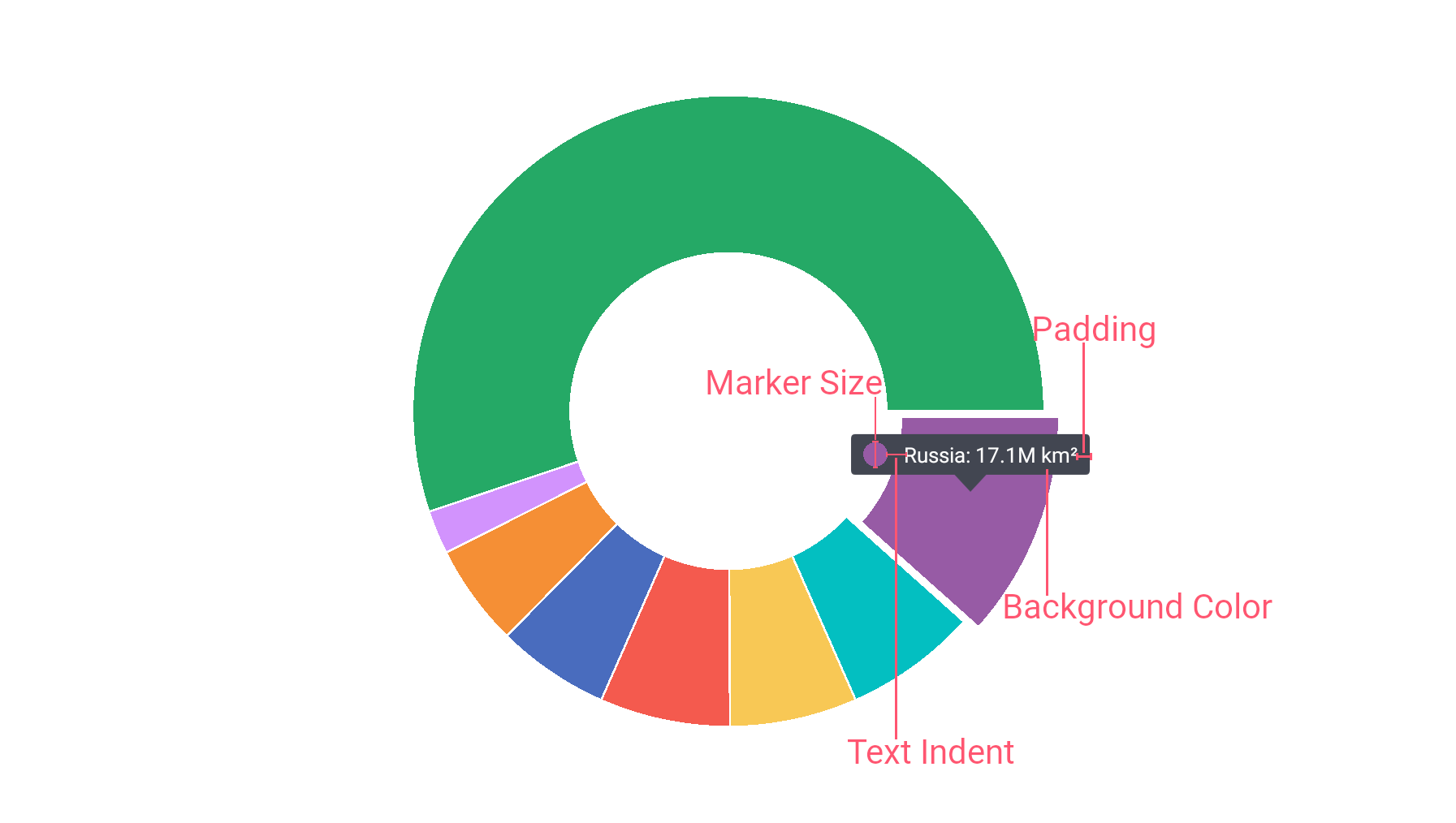
The HintStyleBase class serves as a base class for the HintStyle and PieHintStyle classes and provides properties to customize the hint appearance. For example, you can change background color, paddings, or marker sizes for hint labels.
Example
This example shows how to customize the appearance of pie chart hints. To do this, assign a PieHintStyle object with the specified properties to the PieHint.Style property:
<dxc:PieChartView>
    <dxc:PieChartView.Hint>
        <dxc:PieHint Enabled="True" ShowMode="OnTap">
            <dxc:PieHint.Style>
                <dxc:PieHintStyle BackgroundColor="#424651"
                                  MarkerSize="30"
                                  Padding="15,15,10,10"
                                  TextIndent="20"/>
            </dxc:PieHint.Style>
        </dxc:PieHint>
    </dxc:PieChartView.Hint>
</dxc:PieChartView>
Use the following properties of the PieHintStyle object to configure the hint appearance:
Property | Description |
|---|---|
Gets or sets the hint label’s background color. This is a bindable property. | |
Gets or sets the hint’s label padding. This is a bindable property. | |
Gets or sets the hint’s marker size. This is a bindable property. | |
Gets or sets the indent between a hint marker and text. This is a bindable property. |