DevExpress Image & Image Editor for .NET MAUI
- 3 minutes to read
The DevExpress Mobile UI for .NET MAUI Suite ships with controls that allow users to display and edit images.
Image
DevExpress DXImage for .NET MAUI allows users to display an image. DXImage extends the standard Image component functionality with the TintColor property. Use the TintColor property to specify a fill color for a vector image.
Download and install the DevExpress.Maui.Core package to obtain the DXImage component.
Refer to the following help topics for more information:
- Install Packages from NuGet.org: Visual Studio, VS Code, and JetBrains Rider
- Get Started with DevExpress Controls for .NET Multi-platform App UI (.NET MAUI)
This example demonstrates how you can use the DXImage control to display an icon within a pop-up view.

<dx:DXImage Source="mail_light" VerticalOptions="Center" TintColor="{AppThemeBinding Light={StaticResource Gray500}, Dark={StaticResource Gray200}}"/>
Image Editor
The DevExpress Mobile UI for .NET MAUI Suite contains the ImageEdit component that allows users to crop, rotate, flip images, and save the result in a supported format.
Download and install the DevExpress.Maui.Editors package to obtain the ImageEdit component. See the following help topic for more information: Get Started with DevExpress Mobile UI for .NET MAUI.
Crop Area
The image editor allows you to crop the source image.
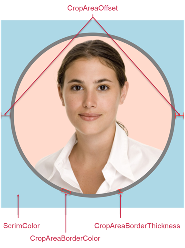
Use the following properties to configure the crop area:
- CropAreaOffset
- Gets or sets the crop area offset. This is a bindable property.
- CropAreaBorderColor
- Gets or sets the crop area border color. This is a bindable property.
- CropAreaBorderThickness
- Gets or sets the crop area border thickness. This is a bindable property.
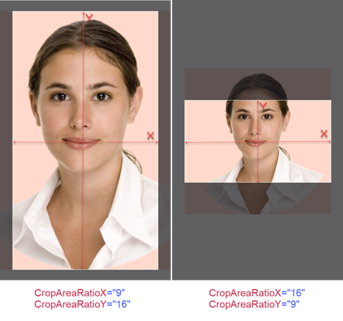
- CropAreaRatioX | CropAreaRatioY
Allow you to specify the aspect ratio for the crop area.
- CropAreaShape
Allows you to specify the crop area shape. You can also use the SwitchCropAreaShape() method to switch the crop area between elliptical and rectangular shapes.

Flip and Rotate Actions
The image editor allows you to flip the image horizontally and vertically. You can also rotate the image to the left or right by 90 degrees.
Use the following API to perform flip and rotate actions:
- FlipHorizontal()
- Flips the edit image horizontally (swap left and right).
- FlipVertical()
- Flips the edit image vertically (swap top and bottom).
- RotateLeft()
- Rotates the edit image to the left by 90º.
- RotateRight()
- Rotates the edit image to the right by 90º.
Save Image
Use the following methods to save an image:
- SaveAsBase64(ImageFormat, Boolean)
- Saves the edit image as a Base64 string.
- SaveAsImageSource(ImageFormat, Boolean)
- Saves the edit image as an ImageSource.
- SaveAsStream(Stream, ImageFormat, Boolean)
- Saves the edit image to a stream.
Note that the Boolean parameter allows you to disable the crop area.
Toolbar with Controls
You can use the ImageEdit control together with DXToolbar.

The following example creates a toolbar with custom controls that allow you to rotate the edit image to the left or right by 90 degrees, flip the edit image horizontally or vertically, and switch the crop area between elliptical and rectangular shapes:
    <ContentPage.Resources>
        <Style TargetType="dxc:ToolbarButton">
            <Setter Property="IconColor" Value="White"/>
            <Setter Property="IconWidth" Value="40"/>
            <Setter Property="IconHeight" Value="40"/>
        </Style>
    </ContentPage.Resources>

    <Grid>
        <dxe:ImageEdit x:Name="editor"
            MaxScaleFactor="3"
            CropAreaBorderThickness="1"
            CropAreaRatioX="1"
            CropAreaRatioY="1"/>

        <dxc:DXToolbar VerticalOptions="End" ItemAlignment="Fill" BackgroundColor="Black">
            <dxc:ToolbarButton
                Icon="rotate_left"
                Command="{Binding Source={x:Reference editor}, Path=Commands.RotateLeft}"/>
            <dxc:ToolbarButton
                Icon="rotate_right"
                Command="{Binding Source={x:Reference editor}, Path=Commands.RotateRight}"/>
            <dxc:ToolbarButton
                Icon="{Binding Source={x:Reference editor}, Path=CropAreaShape}"
                Command="{Binding Source={x:Reference editor}, Path=Commands.SwitchCropAreaShape}"/>
            <dxc:ToolbarButton
                Icon="flip_h"
                Command="{Binding Source={x:Reference editor}, Path=Commands.FlipHorizontal}"/>
            <dxc:ToolbarButton
                Icon="flip_v"
                Command="{Binding Source={x:Reference editor}, Path=Commands.FlipVertical}"/>
        </dxc:DXToolbar>
    </Grid>
Related Scenario

This example uses the DataFormView control to implement a contact edit form. DXImage and ImageEdit controls allow users to display and edit avatars.