CrosshairHintBehavior Class
Defines the crosshair hint behavior.
Namespace: DevExpress.Maui.Charts
Assembly: DevExpress.Maui.Charts.dll
NuGet Package: DevExpress.Maui.Charts
Declaration
public class CrosshairHintBehavior :
    HintBehavior
Remarks
Tooltips are the default display of the ChartView hints. To customize tooltips, refer to the TooltipHintBehavior class.
To set the chart hints to crosshair cursor behavior, set the Hint.Behavior property to the CrosshairHintBehavior object.
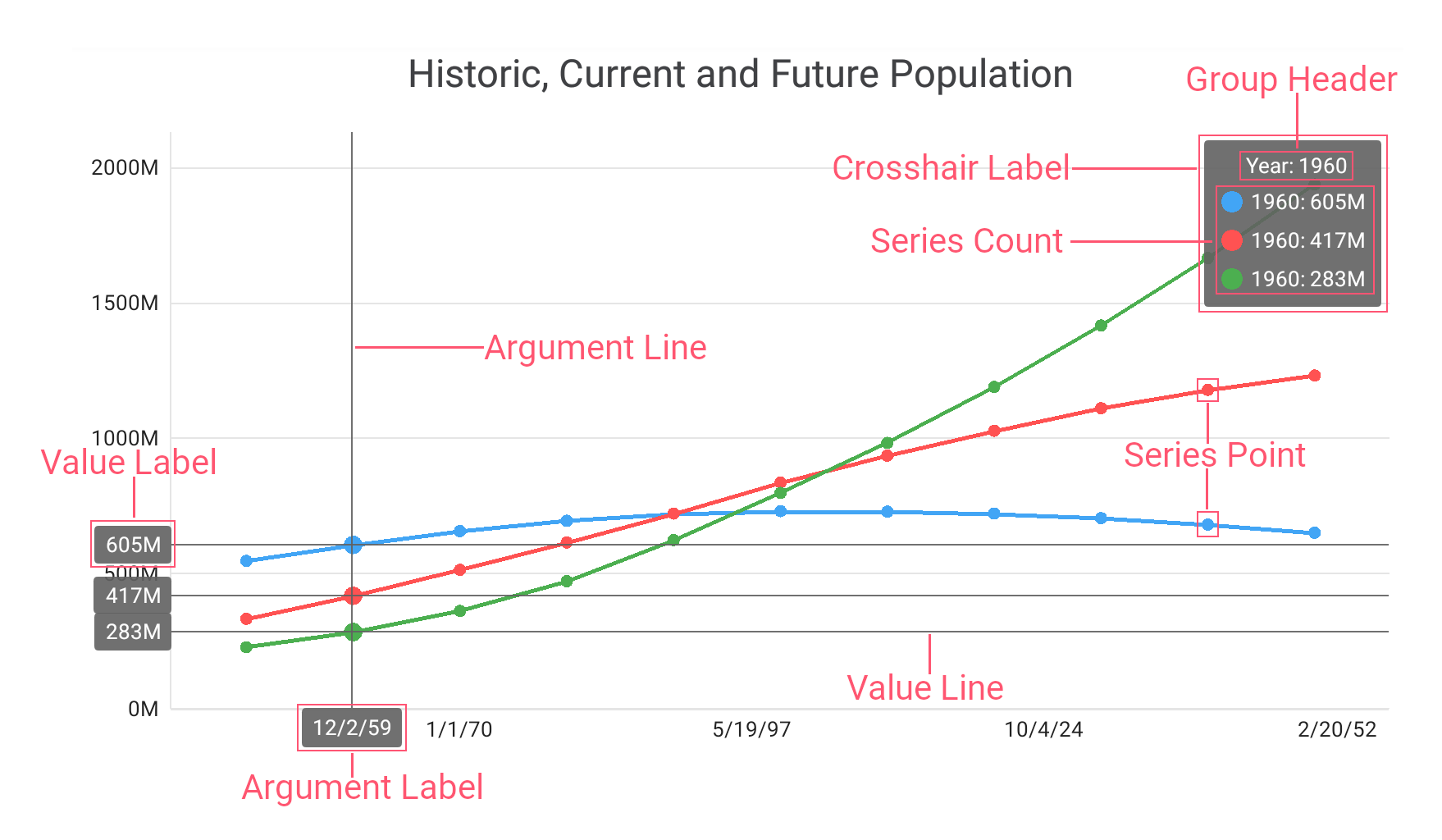
A crosshair cursor is a pair of intersecting horizontal and vertical lines (value line and argument line) with the corresponding axis labels at the end of these lines. You can use the corresponding properties of the CrosshairHintBehavior object to show or hide these lines and their labels, and the hint style ArgumentLineStyle and ValueLineStyle properties to customize their appearance.
A crosshair cursor displays its label (crosshair label) at the intersection of the value and argument lines. This tooltip shows the values for the current series point argument and value by default.
The chart may contain multiple series. In this case:
- The crosshair cursor displays the value line for each series;
- The crosshair label provides information for each series point and contains a group header that helps to operate with numerous data.
The CrosshairHintBehavior object provides properties that manage the crosshair label content and position.
Example
This example configures the crosshair cursor behavior and appearance.
<dxc:ChartView.Hint>
    <dxc:Hint Enabled="True" ShowMode="OnTap">
        <!--...-->
        <dxc:Hint.Behavior>
            <dxc:CrosshairHintBehavior GroupHeaderVisible="True"
                                       GroupHeaderTextPattern="{} Year: {A$YYYY}"
                                       ArgumentLabelVisible="True" ArgumentLineVisible="True"
                                       ValueLabelVisible="True" ValueLineVisible="True"
                                       HighlightPoint="True"
                                       MaxSeriesCount="3">
                <dxc:CrosshairHintBehavior.LabelPosition>
                    <dxc:StaticCrosshairLabelPosition />
                </dxc:CrosshairHintBehavior.LabelPosition>
            </dxc:CrosshairHintBehavior>
        </dxc:Hint.Behavior>
    </dxc:Hint>
<dxc:ChartView.Hint>
The CrosshairHintBehavior class provides the following properties to configure the crosshair cursor elements:
Property | Description |
|---|---|
Gets or sets whether the argument label is visible on the chart. This is a bindable property. | |
Gets or sets whether the argument line is visible on the chart. This is a bindable property. | |
Gets or sets the text pattern for the group header of the crosshair label. This is a bindable property. | |
Gets or sets whether the group header is visible inside the crosshair label. This is a bindable property. | |
Gets or sets whether the chart highlights the series point when the crosshair cursor hovers over it. This is a bindable property. | |
Gets or sets the position of the crosshair label on the chart. This is a bindable property. | |
Gets or sets the highest number of series listed in the crosshair label. This is a bindable property. | |
Gets or sets whether the value label is visible on the chart. This is a bindable property. | |
Gets or sets whether the value line is visible on the chart. This is a bindable property. |