DevExpress Utility Controls for .NET MAUI
- 2 minutes to read
DevExpress Mobile UI for .NET MAUI ships with a number of utility controls. These compact controls mirror the features found in standard controls while maintaining a visual style consistent with other DevExpress .NET MAUI controls. Additionally, many of these controls offer functionality that exceeds that of standard counterparts.
Download and install the DevExpress.Maui.Core package to obtain our utility controls.
Refer to the following help topics for additional information:
- Install Packages from NuGet.org: Visual Studio, VS Code, and JetBrains Rider
- Get Started with DevExpress Controls for .NET Multi-platform App UI (.NET MAUI)
Buttons
Our .NET MAUI library includes DXButton and DXToggleButton controls. Control settings allow you to change the caption, icon, background color, and button shape.

Switch
The DXSwitch control performs the assigned action when a user toggles it.

Scroll View
The DXScrollView control is a scrollable container. You can use it to scroll content in both horizontal and vertical directions.
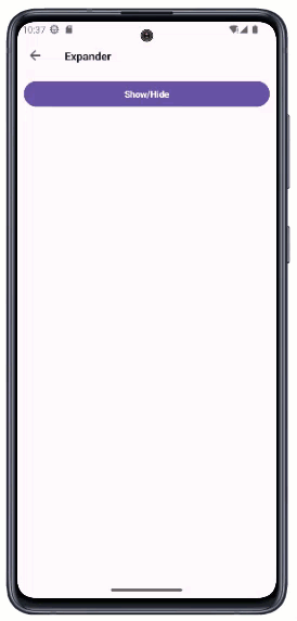
Expander
The DXExpander control is a container that can expand and collapse any content in both horizontal and vertical directions.
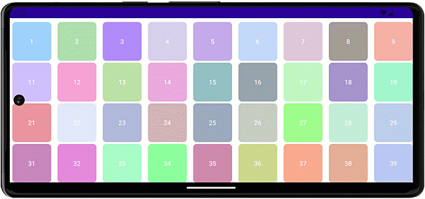
Color Selector
The DXColorSelector control allows users to choose a color from a predefined array of options. With this control, you can display items in a single line or wrap them based on the parent container’s dimensions.

Border
The DXBorder control allows you to display a panel with a custom background color. You can specify different border thickness values for each side.
<dx:DXBorder BackgroundColor="LightGreen" BorderThickness="0,0,5,0" BorderColor="#505050"/>

Content Presenter
The DXContentPresenter control allows you to reuse your DataTemplate in multiple locations:
<ContentPage.Resources>
    <DataTemplate x:Key="employeeTemplate">
        <!-- ... -->
        <Label Text="{Binding FirstName}"/>
    </DataTemplate>
</ContentPage.Resources>

<dx:DXContentPresenter Content="{Binding Employee}" ContentTemplate="{StaticResource employeeTemplate}" />
Additionally, this control can display an icon, text and includes APIs to customize them. DXContentPresenter is a DXBorder descendant, and it inherits all the functionality available in DXBorder.
Separator
The DXSeparator control is a line that visually separates items. You can specify the separator’s length, thickness, and margins. DXSeparator supports our color themes to apply a consistent application appearance.