HintStyle Class
Stores the appearance settings of chart hints.
Namespace: DevExpress.Maui.Charts
Assembly: DevExpress.Maui.Charts.dll
NuGet Package: DevExpress.Maui.Charts
Declaration
public class HintStyle :
    HintStyleBase
Related API Members
The following members return HintStyle objects:
Remarks
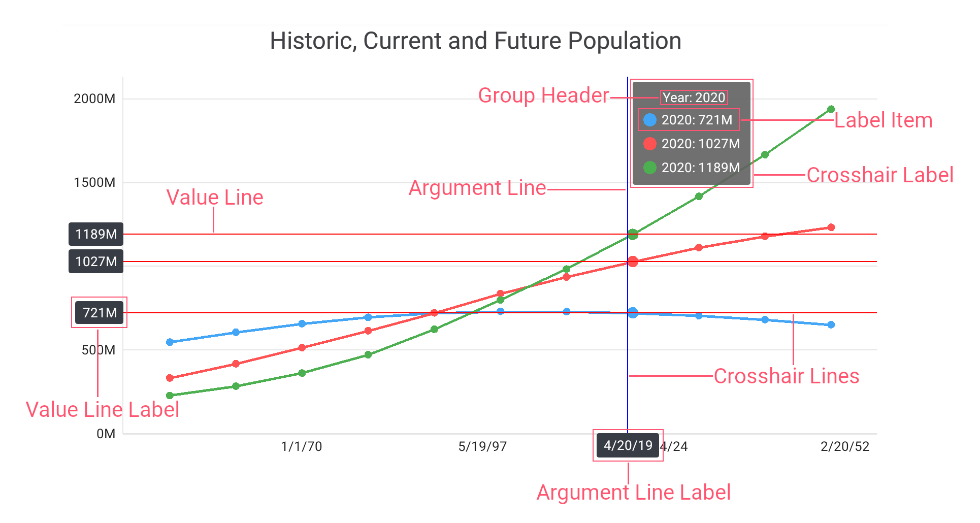
The HintStyle class provides a set of properties that you can use to customize the appearance of hints that the chart shows:
Hint Element | Property | Description |
|---|---|---|
1. Hint Label | Gets or sets the hint label’s background color. This is a bindable property. | |
Gets or sets the indent between crosshair hint label items. This is a bindable property. | ||
Gets or sets the hint’s marker size. This is a bindable property. | ||
Gets or sets the hint’s label padding. This is a bindable property. | ||
Gets or sets the indent between a hint marker and text. This is a bindable property. | ||
2. Argument Line | Gets or sets the options that configure the argument line appearance for the crosshair hint. This is a bindable property. | |
3. Value Line | Gets or sets the options that configure the value line appearance for the crosshair hint. This is a bindable property. |

Example
This example sets the ChartView hint behavior to crosshair, and how to specify the crosshair hint properties.
- Set the ChartView.Hint property to the Hint object, with the Enabled property set to True.
- Assign the CrosshairHintBehavior object to the Hint.Behavior property. Specify the GroupHeaderTextPattern and MaxSeriesCount properties to manage the crosshair cursor label content.
- Create a new
HintStyleobject and assign it to the Hint.Style property to customize the hint appearance. Assign the CrosshairLineStyle class instance with specified LabelBackgroundColor, Stroke, and TextStyle properties to the HintStyle.ArgumentLineStyle and HintStyle.ValueLineStyle properties to modify appearance of the hint lines and hint labels.
<dxc:ChartView.Hint>
    <dxc:Hint Enabled="True">
        <!--...-->
        <dxc:Hint.Behavior>
            <dxc:CrosshairHintBehavior
                    GroupHeaderTextPattern="{} Year: {A$YYYY}"
                    MaxSeriesCount="3" />
        </dxc:Hint.Behavior>
        <dxc:Hint.Style>
            <dxc:HintStyle>
                <dxc:HintStyle.ArgumentLineStyle>
                    <dxc:CrosshairLineStyle LabelBackgroundColor="#383c44"
                                            Stroke="Blue">
                        <dxc:CrosshairLineStyle.TextStyle>
                            <dxc:TextStyle Color="White"
                                           Size="30"/>
                        </dxc:CrosshairLineStyle.TextStyle>
                    </dxc:CrosshairLineStyle>
                </dxc:HintStyle.ArgumentLineStyle>
                <dxc:HintStyle.ValueLineStyle>
                    <dxc:CrosshairLineStyle LabelBackgroundColor="#383c44"
                                            Stroke="Red">
                        <dxc:CrosshairLineStyle.TextStyle>
                            <dxc:TextStyle Color="White"
                                           Size="30"/>
                        </dxc:CrosshairLineStyle.TextStyle>
                    </dxc:CrosshairLineStyle>
                </dxc:HintStyle.ValueLineStyle>
            </dxc:HintStyle>
        </dxc:Hint.Style>
    </dxc:Hint>
</dxc:ChartView.Hint>