BarButtonItem.ActAsDropDown Property
Gets or sets whether this BarButtonItem should be displayed as a single element. This property is in effect when the BarButtonItem.ButtonStyle property is set to BarButtonStyle.DropDown.
Namespace: DevExpress.XtraBars
Assembly: DevExpress.XtraBars.v25.2.dll
NuGet Package: DevExpress.Win.Navigation
Declaration
Property Value
| Type | Description |
|---|---|
| Boolean | true if this BarButtonItem should be displayed as a single element; otherwise, false. |
Remarks
You can assign a drop-down menu to a BarButtonItem via the BarButtonItem.DropDownControl property (the button’s BarButtonItem.ButtonStyle property must be set to DropDown). When this is done, you can additionally set the ActAsDropDown property to specify whether the item should be displayed as a single UI element (in this case, clicking the button invokes the menu), or as two separate elements: item caption/glyph and drop-down arrow (clicking the caption/glyph will raise the BarItem.ItemClick event, the drop-down menu is only invoked by clicking the drop-down arrow). The figure below illustrates an item whose ActAsDropDown property equals false.

Note
A BarButtonItem‘s item region can include this item’s caption, glyph or both of them depending on the current BarItem.PaintStyle setting and the host control (BarManager or RibbonControl).
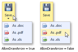
For BarButtonItems that act as drop-down menus, it is possible to hide or display a drop-down arrow by using the BarButtonItem.AllowDrawArrow property (see the figure below).

BarButtonItems whose ActAsDropDown property equals false ignore the BarButtonItem.AllowDrawArrow property and always draw their drop-down arrows.