PropertyGridControl Class
The control that allows you to display and edit properties of any object or set of objects.
Namespace: DevExpress.XtraVerticalGrid
Assembly: DevExpress.XtraVerticalGrid.v25.2.dll
NuGet Packages: DevExpress.Win.Navigation, DevExpress.Win.VerticalGrid
Declaration
public class PropertyGridControl :
    VGridControlBase,
    IButtonsPanelOwner,
    IButtonPanelControlAppearanceOwner,
    IAppearanceOwner,
    IEditorBackgroundProvider,
    IServiceProvider,
    IDXManagerPopupMenu,
    IPropertyDescriptorService,
IPropertiesEditorRelated API Members
The following members return PropertyGridControl objects:
Remarks
A Property Grid can be bound to an object or collection of objects (use the PropertyGridControl.SelectedObject or PropertyGridControl.SelectedObjects property respectively). After the object(s) has been bound, the PropertyGrid retrieves information on the object’s fields and creates the corresponding EditorRow objects for each field. By default, row objects are created for the fields that are marked with the BrowsableAttribute.Yes attribute. It’s possible to modify the collection of browsable attributes via the PropertyGridControl.BrowsableAttributes collection.
Binding the PropertyGridControl at design time to a complex object which contains more than approximately 200 properties (including nested properties), may take a long time as a new row object needs to be created for each of these properties.
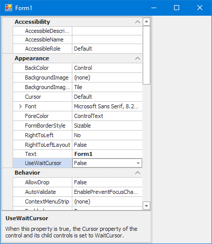
The following image shows a PropertyGridControl which lists the properties of a sample object:

The created rows can be accessed via the VGridControlBase.Rows property. Note that rows form a tree-like structure that reflects the hierarchy of properties in the bound object. Row objects are components, and if they are created at design time, you can use their names to refer to them in code.
An object’s property can be related to a specific category via the CategoryAttribute attribute. To represent categories, the PropertyGridControl creates CategoryRow objects. If an object’s property is not related to any category, the corresponding row in the PropertyGridControl will be displayed under a Misc category row. To prevent root category rows from being displayed, set the BaseOptionsView.ShowRootCategories property to false.
To allow the nested properties of a specific property to be listed in the PropertyGridControl, the property’s type must be declared with the [TypeConverter(typeof(ExpandableObjectConverter))] attribute.
The PropertyGridControl allows you to specify default editors that will be used to represent and edit values of a specific type. To do this, a specific editor must be associated with a specific type via the PropertyGridControl.DefaultEditors collection, or at design time using the Designer’s Default Editors Page. For instance, values of the Boolean type are edited, by default, using the ComboBoxEdit control with two options (True and False). If you associate the Boolean type with a CheckEdit control, all Boolean properties of the bound object will be represented as check boxes.
To display descriptions for properties being browsed in PropertyGridControl, use PropertyDescriptionControl. You can create a bar with buttons, allowing you to change the order of properties in PropertyGridControl (arrange properties alphabetically or group them by categories). For instance, you can use the StandaloneBarDockControl object from the XtraBars library.
Example
The following example combines a PropertyGridControl and PropertyDescriptionControl in a panel. The PropertyDescriptionControl displays property descriptions when you browse through items in the PropertyGridControl.

using DevExpress.XtraEditors;
using DevExpress.XtraVerticalGrid;

private void Form1_Load(object sender, EventArgs e) {
    PanelControl panelControl1 = new PanelControl();
    panelControl1.Parent = this;
    panelControl1.Dock = DockStyle.Left;
    panelControl1.Width = 300;

    PropertyGridControl propertyGridControl1 = new PropertyGridControl(); ;
    PropertyDescriptionControl propertyDescriptionControl1 = new PropertyDescriptionControl();

    propertyGridControl1.Parent = panelControl1;
    propertyGridControl1.Dock = System.Windows.Forms.DockStyle.Fill;
    propertyGridControl1.SelectedObject = this;

    propertyDescriptionControl1.Parent = panelControl1;
    propertyDescriptionControl1.AutoHeight = true;
    propertyDescriptionControl1.Dock = DockStyle.Bottom;
    propertyDescriptionControl1.PropertyGrid = propertyGridControl1;
}
Example: Property Display Name Localization
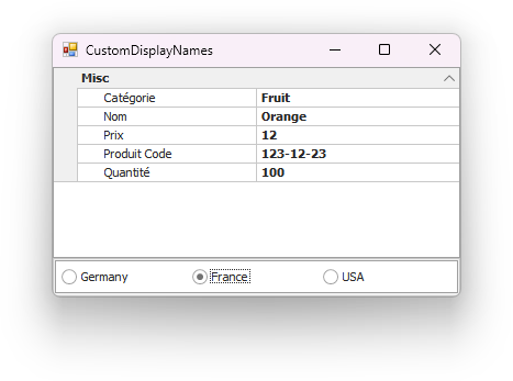
This example applies the System.ComponentModel.DisplayName attribute to properties to enable localization.

Example: Implement Unbound Rows
PropertyGridControl does not support unbound rows out of the box. The example implements this functionality using custom property descriptors.
Example
The following code creates a PropertyGridControl and makes it display its own properties.
By default, Boolean values are edited in the Property Grid Control using a ComboBox control with the True and False options. This example shows how to associate a CheckEdit control with the Boolean data type. As a result, the CheckEdit control will be used by default for editing Boolean values.
Firstly, a repository item (RepositoryItemCheckEdit) which corresponds to the CheckEdit control is created. Then it is associated with the Boolean type via the PropertyGridControl.DefaultEditors collection.
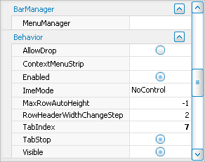
The following image shows the result. Notice that the created repository item is customized to represent traditional check boxes as radio buttons.

using DevExpress.XtraVerticalGrid;
using DevExpress.XtraEditors.Repository;
// ...
PropertyGridControl pGrid = new PropertyGridControl();
this.Controls.Add(pGrid);
pGrid.SelectedObject = pGrid;
pGrid.Dock = DockStyle.Fill;
// Create a repository item which represents an in-place CheckEdit control.
RepositoryItemCheckEdit riCheckEdit = new RepositoryItemCheckEdit();
// Represent check boxes as radio buttons.
riCheckEdit.CheckStyle = DevExpress.XtraEditors.Controls.CheckStyles.Radio;
// Associate the Boolean data type with the created repository item.
pGrid.DefaultEditors.Add(typeof(Boolean), riCheckEdit);