ContextButton Class
A regular context button that can be clicked.
Namespace: DevExpress.Utils
Assembly: DevExpress.Utils.v26.1.dll
Declaration
Remarks
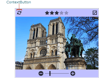
The ContextButton is a button that displays a caption and/or glyph and can be clicked by an end-user. See the ContextItem base class for the list of controls that support displaying context buttons. In the figure below, you can see the ContextButton displayed in the PictureEdit control.
The ContextButtonBase.Caption property specifies the button caption. If the ContextButtonBase.AllowHtmlText setting is enabled, you can display a hyperlink in the caption using the href tag and handle the ContextButtonBase.HyperlinkClick event. To customize the hyperlink color, use the ContextButtonBase.HyperLinkColor property.
You can also specify the button’s maximum width and height using the ContextButtonBase.MaxWidth and ContextButtonBase.MaxHeight properties, and the amount of space around the button using the ContextButtonBase.Padding property.