DataViewBase.ColumnHeaderStyle Property
Gets or sets a style applied to the all column headers within the View. This is a dependency property.
Namespace: DevExpress.Xpf.Grid
Assembly: DevExpress.Xpf.Grid.v26.1.Core.dll
NuGet Package: DevExpress.Wpf.Grid.Core
Declaration
Property Value
| Type | Description |
|---|---|
| Style | A style applied to the all column headers within the View. |
Remarks
Use the BaseColumn.HeaderStyle / DataViewBase.ColumnHeaderStyle properties to customize column headers’ appearance.
Note
The BaseColumn.HeaderStyle property takes precedence over the DataViewBase.ColumnHeaderStyle property.
Note
Target Type: BaseGridHeader
Example 1
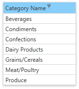
The code sample below shows how to make the CategoryName column’s header blue and always show the filter button:
<dxg:GridColumn FieldName="CategoryName">
   <dxg:GridColumn.HeaderStyle>
      <Style TargetType="dxg:BaseGridHeader">
         <Setter Property="dxg:BaseGridColumnHeader.ShowFilterButtonOnHover" Value="False" />
         <Setter Property="Background" Value="LightSkyBlue" />
      </Style>
   </dxg:GridColumn.HeaderStyle>
</dxg:GridColumn>
Example 2
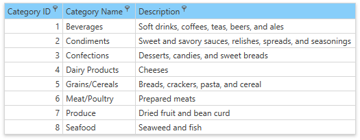
The code sample below shows how to apply a style to all column headers within the View:
<dxg:TableView>
    <dxg:TableView.ColumnHeaderStyle>
        <Style TargetType="dxg:BaseGridHeader">
            <Setter Property="dxg:BaseGridColumnHeader.ShowFilterButtonOnHover" Value="False" />
            <Setter Property="Background" Value="LightSkyBlue" />
        </Style>
    </dxg:TableView.ColumnHeaderStyle>
</dxg:TableView>
Header Elements
The image below shows elements that a column header can contain:
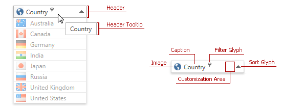
The following table lists column header elements and contains the corresponding references to customization approaches:
| Header Element | Description | Topic |
|---|---|---|
| Header Caption | Identifies column content. | Header Content Customization |
| Header Image | Provides graphical information about column content. | Header Image Customization |
| Customization Area | Allows you to display custom content within a column header. | Using Customization Area |
| Header Tooltip | Displayed when a user hovers the mouse pointer over the column header. | Header Tooltip Customization |
| Filter and Sort Glyphs | Allows users to filter and sort column values. | Inner Column Header Template Customization |
Tip
Topic: Column Header Customization