Header Content Customization
- 5 minutes to read
The main part of header content is a caption. You can change a caption and add different elements to the header content.
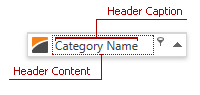
Header Caption
Specify the BaseColumn.Header property to change the column header’s caption. The ColumnBase.FieldName property specifies the caption if the BaseColumn.Header property is not specified. Camel-case field names are separated by spaces, for example, the header for the CategoryName field name is “Category Name”.
Tip
- Use the BaseColumn.HorizontalHeaderContentAlignment property to specify content’s alignment.
- Use the BaseColumn.HeaderCaption property to obtain a column header caption.
Example: Specify Alignment in Columns
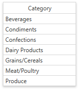
The following code snippet specifies the CategoryName column’s header caption and displays it in the center:
<dxg:GridColumn
   FieldName="CategoryName"
   Header="Category"
   HorizontalHeaderContentAlignment="Center"/>
To align content in column cells, follow the steps below:
- Create an
EditSettingsobject and assign it to the ColumnBase.EditSettings property. - Use the BaseEditSettings.HorizontalContentAlignment property to specify the cell content alignment.

<dxg:GridColumn FieldName="CategoryName" Header="Category" HorizontalHeaderContentAlignment="Center">
   <dxg:GridColumn.EditSettings>
         <dxe:TextEditSettings HorizontalContentAlignment="Center"/>
   </dxg:GridColumn.EditSettings>
</dxg:GridColumn>
Example: Format the Header Caption
You can bind a column’s header to a property and specify the StringFormat:
<dxg:GridColumn
   FieldName="CategoryName"
   Header="{Binding Path=InterestRate, StringFormat='Interest Rate: ##.0 %'}" />

Header Content
Specify the BaseColumn.HeaderTemplate property to customize individual column header content. You can specify a common template for all columns in the current GridControl view with the DataViewBase.ColumnHeaderTemplate. The data context (binding source) for these templates is the BaseColumn.HeaderCaption property.
The following example adds a button to header’s content:

<dxg:GridColumn FieldName="CategoryName">
   <dxg:GridColumn.HeaderTemplate>
      <DataTemplate>
         <StackPanel>
            <TextBlock Text="{Binding}"></TextBlock>
            <Button Content="Button" Margin="0,5,0,0"></Button>
         </StackPanel>
      </DataTemplate>
   </dxg:GridColumn.HeaderTemplate>
</dxg:GridColumn>
If you have more than one template that defines header content, specify the BaseColumn.HeaderTemplateSelector property to choose a template based on custom logic. Use the BaseColumn.ActualHeaderTemplateSelector property to obtain the actual template selector.
Customize Header Content Based on Location
The GridControl displays column headers in the following containers:
- Column Header Panel
- Group Panel (if you group data by this column)
- Column Chooser
- Filter Editor
- Filter Panel
The GridControl applies the BaseColumn.HeaderTemplate to column headers in all containers.
For the Column Header Panel, Group Panel, and Column Chooser, you can use the ColumnBase.HeaderPresenterType attached property to determine the header location. The following example demonstrates this approach:
The ColumnBase.FilterEditorHeaderTemplate property allows you to specify a template for headers displayed in the Filter Editor and Filter Panel:

<dxg:GridColumn FieldName="ProductName">
   <dxg:GridColumn.HeaderTemplate>
      <DataTemplate>
         <TextBlock Text="{Binding}"
                    FontWeight="Bold"
                    Foreground="Red"/>
      </DataTemplate>
   </dxg:GridColumn.HeaderTemplate>
   <dxg:GridColumn.FilterEditorHeaderTemplate>
      <DataTemplate>
         <TextBlock Text="{Binding}"
                    FontWeight="Bold"
                    Foreground="Blue"
                    FontStyle="Italic"/>
      </DataTemplate>
   </dxg:GridColumn.FilterEditorHeaderTemplate>
</dxg:GridColumn>
Header Content Style
Specify the ColumnBase.ColumnHeaderContentStyle property to change header content appearance. Use the DataViewBase.ColumnHeaderContentStyle property to specify the common style applied to all columns in the current GridControl’s view. The target element for these styles is the ContentControl class.
The following example changes header caption color and increases the font size:
<dxg:GridColumn FieldName="CategoryName">
   <dxg:GridColumn.ColumnHeaderContentStyle>
      <Style TargetType="{x:Type ContentControl}">
         <Setter Property="FontSize" Value="15" />
         <Setter Property="Foreground" Value="Red" />
      </Style>
   </dxg:GridColumn.ColumnHeaderContentStyle>
</dxg:GridColumn>

Tip
Use the ColumnBase.ActualColumnHeaderContentStyle property to obtain the style applied to column header content.
Header Layout
Use the HeaderLayoutTemplate property to change appearance and display custom content within all column headers. To override the default template for a specific column, specify the ColumnBase.HeaderLayoutTemplate property. The column-level template has higher priority.
Tip
The template’s DataContext includes the GridColumn object, so you can bind template elements to column properties (for example, Header or FieldName) to display column-specific information within a custom layout.
You can also use the DataViewBase.ColumnHeaderTemplate property to change captions for all column headers.
Example: Set a Custom Header Layout for All Columns
The following example changes appearance for all column headers in the TableView and preserves default filter and sort indicators:
<dx:ThemedWindow xmlns="http://schemas.microsoft.com/winfx/2006/xaml/presentation"
                 xmlns:x="http://schemas.microsoft.com/winfx/2006/xaml"
                 xmlns:dx="http://schemas.devexpress.com/winfx/2008/xaml/core"
                 xmlns:dxg="http://schemas.devexpress.com/winfx/2008/xaml/grid">
    <dx:ThemedWindow.Resources>
        <ControlTemplate x:Key="ColumnHeaderLayoutTemplate">
            <Border Background="#FFE0E8F5" BorderBrush="BlueViolet"
                    BorderThickness="0,0,1,2"
                    HorizontalAlignment="Stretch" VerticalAlignment="Stretch">
                <Grid>
                    <Grid.ColumnDefinitions>
                        <ColumnDefinition Width="auto" />
                        <ColumnDefinition Width="*" />
                        <ColumnDefinition Width="*" />
                        <ColumnDefinition Width="4" />
                    </Grid.ColumnDefinitions>
                    <ContentControl Name="PART_Content"
                                    Margin="6,4,6,5"
                                    HorizontalAlignment="Center"
                                    Padding="{TemplateBinding Padding}"
                                    VerticalAlignment="Center" />
                    <ContentControl Grid.Column="1"
                                    Name="PART_Filter"
                                    Margin="2,4"
                                    HorizontalAlignment="Left"
                                    Visibility="Visible" />
                    <dxg:SortIndicatorControl Grid.Column="2"
                                            Name="PART_SortIndicator"
                                            Margin="2,4"
                                            HorizontalAlignment="Right"
                                            Visibility="Collapsed" />
                    <dxg:GridThumb Grid.Column="3"
                                    Name="PART_Thumb"
                                    Cursor="SizeWE" />
                </Grid>
            </Border>
        </ControlTemplate>
    </dx:ThemedWindow.Resources>
    <dxg:GridControl ItemsSource="{Binding Orders}">
        <dxg:GridControl.View>
            <dxg:TableView HeaderLayoutTemplate="{StaticResource ColumnHeaderLayoutTemplate}"/>
        </dxg:GridControl.View>
    </dxg:GridControl>
</dx:ThemedWindow>
Example: Set a Custom Header Layout for a Specific Column
To change the layout for individual columns only, assign the template to the ColumnBase.HeaderLayoutTemplate property. The column-level template overrides the view-level DataViewBase.HeaderLayoutTemplate.
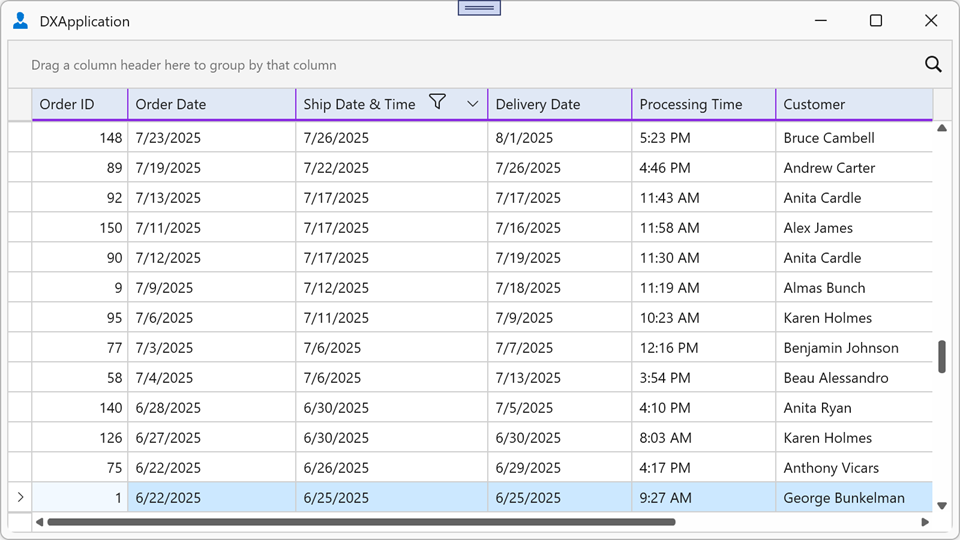
The following example assigns ColumnHeaderLayoutTemplate (defined in the previous example) to the view, so it applies to every column header. Order Date and Ship Date & Time columns specify their own HighlightedColumnHeaderLayoutTemplate (a copy of ColumnHeaderLayoutTemplate with a different accent color), that overrides the view-level template for these two columns:
<dx:ThemedWindow.Resources>
<ControlTemplate x:Key="HighlightedColumnHeaderLayoutTemplate">
<Border Background="#FFFFE7CE" BorderBrush="DarkOrange"
BorderThickness="0,0,1,2"
HorizontalAlignment="Stretch" VerticalAlignment="Stretch">
<Grid>
<Grid.ColumnDefinitions>
<ColumnDefinition Width="auto" />
<ColumnDefinition Width="*" />
<ColumnDefinition Width="*" />
<ColumnDefinition Width="4" />
</Grid.ColumnDefinitions>
<ContentControl Name="PART_Content"
Margin="6,4,6,5"
HorizontalAlignment="Center"
Padding="{TemplateBinding Padding}"
VerticalAlignment="Center" />
<ContentControl Grid.Column="1"
Name="PART_Filter"
Margin="2,4"
HorizontalAlignment="Left"
Visibility="Visible" />
<dxg:SortIndicatorControl Grid.Column="2"
Name="PART_SortIndicator"
Margin="2,4"
HorizontalAlignment="Right"
Visibility="Collapsed" />
<dxg:GridThumb Grid.Column="3"
Name="PART_Thumb"
Cursor="SizeWE" />
</Grid>
</Border>
</ControlTemplate>
</dx:ThemedWindow.Resources>
<dxg:GridControl ItemsSource="{Binding Orders}">
<dxg:GridControl.View>
<dxg:TableView HeaderLayoutTemplate="{StaticResource ColumnHeaderLayoutTemplate}"/>
</dxg:GridControl.View>
<dxg:GridControl.Columns>
<dxg:GridColumn FieldName="OrderDate" Header="Order Date"
HeaderLayoutTemplate="{StaticResource HighlightedColumnHeaderLayoutTemplate}"/>
<dxg:GridColumn FieldName="ShipDateTime" Header="Ship Date & Time"
HeaderLayoutTemplate="{StaticResource HighlightedColumnHeaderLayoutTemplate}"/>
</dxg:GridControl.Columns>
</dxg:GridControl>