Inner Column Header Template Customization
- 3 minutes to read
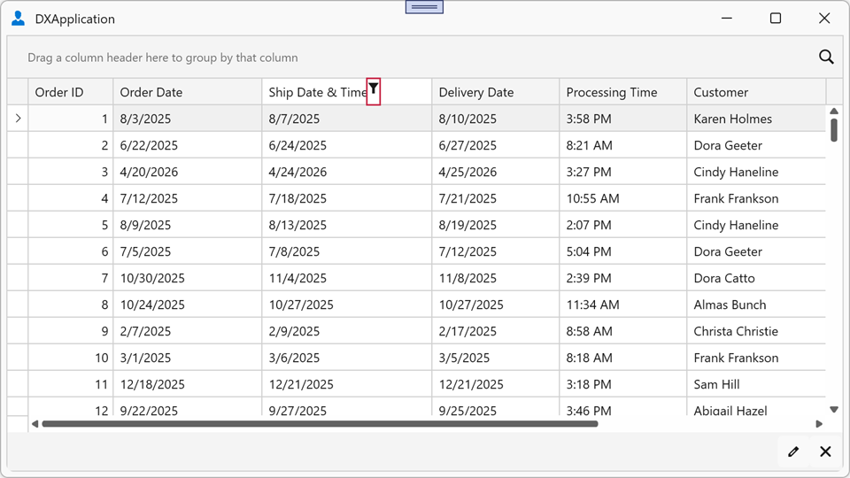
You can modify column header appearance using built-in templates. Locate the required element’s template, embed it in your application’s resources, and modify it without compromising the template’s internal structure. The image below demonstrates an example of a grid column with a modified column header filter button:

The following example changes column header filter button appearance:
<dx:ThemedWindow.Resources>
   <ControlTemplate x:Key="{dxgt:GridColumnHeaderThemeKey ResourceKey=ColumnFilterTemplate, IsThemeIndependent=True}"
                    TargetType="{x:Type ToggleButton}">
      <Image Source="Filter.png" Width="16" Height="16" />
   </ControlTemplate>
</dx:ThemedWindow.Resources>
Refer to the following help topic for more information: Modify Theme Resources.
Replace the Filter Popup Glyph
To replace only the filter popup glyph (the predefined icon displayed in a column header when the filter popup is hidden) without redefining the entire filter button template, assign a ControlTemplate to the DataViewBase.FilterPopupGlyphTemplate property. To replace the glyph in an individual column header, use the ColumnBase.FilterPopupGlyphTemplate property. The column-level template has higher priority than the view-level template.
The following example assigns a custom icon as the filter popup glyph for all column headers in the TableView:
<dx:ThemedWindow xmlns="http://schemas.microsoft.com/winfx/2006/xaml/presentation"
                 xmlns:x="http://schemas.microsoft.com/winfx/2006/xaml"
                 xmlns:dx="http://schemas.devexpress.com/winfx/2008/xaml/core"
                 xmlns:dxg="http://schemas.devexpress.com/winfx/2008/xaml/grid">
    <dx:ThemedWindow.Resources>
        <ControlTemplate x:Key="CustomFilterGlyph">
            <Path Data="M 0,0 L 8,0 L 5,4 L 5,8 L 3,8 L 3,4 Z"
                  Fill="{Binding Path=(TextBlock.Foreground),
                                 RelativeSource={RelativeSource AncestorType=ContentPresenter}}"
                  HorizontalAlignment="Center"
                  VerticalAlignment="Center"
                  Stretch="Uniform"
                  Width="10" Height="10"/>
        </ControlTemplate>
    </dx:ThemedWindow.Resources>
    <dxg:GridControl ItemsSource="{Binding Orders}">
        <dxg:GridControl.View>
            <dxg:TableView FilterPopupGlyphTemplate="{StaticResource CustomFilterGlyph}"/>
        </dxg:GridControl.View>
    </dxg:GridControl>
</dx:ThemedWindow>
To replace the glyph for a selected column only, assign the template to that column’s FilterPopupGlyphTemplate property instead:
<dxg:GridControl.Columns>
<dxg:GridColumn FieldName="ShipDateTime" Header="Ship Date & Time"
FilterPopupGlyphTemplate="{StaticResource CustomFilterGlyph}"/>
<dxg:GridColumn FieldName="CustomerName" Header="Customer"/>
</dxg:GridControl.Columns>
Modify the Sort Indicator Glyph
The sort indicator is a small arrow that displays a column’s sort order within the column header. The column header displays the sort indicator only if the ColumnBase.ShowSortIndicator or DataViewBase.ShowSortIndicator property is enabled, and the column is currently sorted.
Assign a Style to the ColumnBase.SortIndicatorStyle property to display a custom sort glyph within an individual column header. The target element for this style is the SortIndicatorControl class.
Note
A custom style overrides the theme style and resets the indicator’s default settings. Specify the Template property to define the icon for the ascending sort order. Add a trigger on the SortOrder property (a ListSortDirection value) to define the icon for the descending sort order.
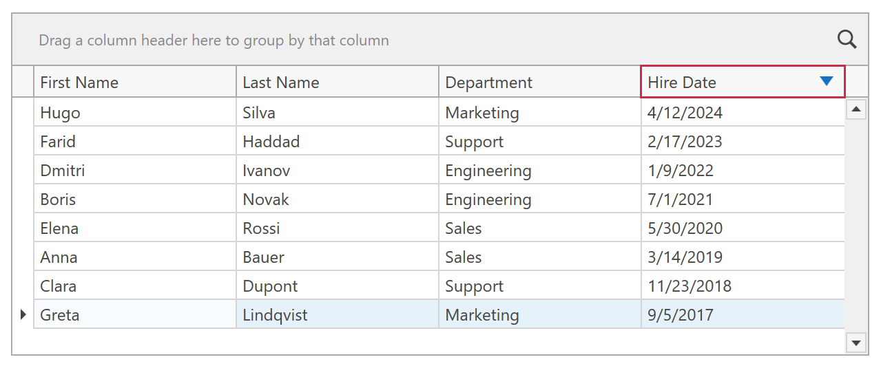
The following example displays custom sort icons within the Hire Date column header:
<dx:ThemedWindow xmlns="http://schemas.microsoft.com/winfx/2006/xaml/presentation"
                 xmlns:x="http://schemas.microsoft.com/winfx/2006/xaml"
                 xmlns:dx="http://schemas.devexpress.com/winfx/2008/xaml/core"
                 xmlns:dxg="http://schemas.devexpress.com/winfx/2008/xaml/grid">
    <dx:ThemedWindow.Resources>
        <Style x:Key="CustomSortIndicatorStyle" TargetType="{x:Type dxg:SortIndicatorControl}">
            <Setter Property="Width" Value="14" />
            <Setter Property="Height" Value="14" />
            <Setter Property="Template">
                <Setter.Value>
                    <ControlTemplate TargetType="{x:Type dxg:SortIndicatorControl}">
                        <Grid Background="Transparent">
                            <Path x:Name="Arrow"
                                  Fill="#D9480F"
                                  HorizontalAlignment="Center"
                                  VerticalAlignment="Center"
                                  Data="M 0,7 L 10,7 L 5,0 Z" />
                        </Grid>
                        <ControlTemplate.Triggers>
                            <Trigger Property="SortOrder" Value="Descending">
                                <Setter TargetName="Arrow" Property="Data" Value="M 0,0 L 10,0 L 5,7 Z" />
                                <Setter TargetName="Arrow" Property="Fill" Value="#1971C2" />
                            </Trigger>
                        </ControlTemplate.Triggers>
                    </ControlTemplate>
                </Setter.Value>
            </Setter>
        </Style>
    </dx:ThemedWindow.Resources>
    <dxg:GridControl ItemsSource="{Binding}">
        <dxg:GridControl.View>
            <dxg:TableView ShowSortIndicator="True" />
        </dxg:GridControl.View>
        <dxg:GridControl.Columns>
            <dxg:GridColumn FieldName="FirstName" />
            <dxg:GridColumn FieldName="LastName" />
            <dxg:GridColumn FieldName="Department" />
            <dxg:GridColumn FieldName="HireDate"
                            SortIndicatorStyle="{StaticResource CustomSortIndicatorStyle}" />
        </dxg:GridControl.Columns>
    </dxg:GridControl>
</dx:ThemedWindow>