GridControlRuntimeStringId Enum
Lists resource strings that can be localized at runtime.
Namespace: DevExpress.Xpf.Grid
Assembly: DevExpress.Xpf.Grid.v26.1.Core.dll
Declaration
Members
| Name | Description |
|---|---|
CellPeerName
|
Return Value: Item: {0}, Column Display Index: {1} |
CellPeerNameIndexes
|
|
CellPeerNameWithoutRowCount
|
|
CellPeerNameWithPagesIndexes
|
|
CellPeerNameWithPagesIndexesWithoutPageCount
|
|
UnknownCount
|
|
AutoFilterCellPeerName
|
|
NewItemRowCellPeerName
|
|
PeerNodeLevel
|
|
GridGroupPanelText
|
The text displayed within the Group Panel. Return Value: Drag a column header here to group by that column |
GridGroupRowDisplayTextFormat
|
A pattern used to format the group row caption. Return Value: {0}: {1} |
ErrorWindowTitle
|
The error window’s caption. Return Value: Error |
InvalidRowExceptionMessage
|
The text displayed within the error message box invoked if the focused row contains invalid values. Return Value: Do you want to correct the value? |
GridOutlookIntervals
|
Contains all possible group intervals. To learn more, see Group Modes and Custom Grouping. Return Value: Older;Last Month;Earlier this Month;Three Weeks Ago;Two Weeks Ago;Last Week;;;;;;;;Yesterday;Today;Tomorrow;;;;;;;;Next Week;Two Weeks Away;Three Weeks Away;Later this Month;Next Month;Beyond Next Month; |
DefaultGroupSummaryFormatString_Count
|
A pattern used to format the Count group summary value. Return Value: Count={0} |
DefaultGroupSummaryFormatString_Min
|
A pattern used to format the Min group summary value. Return Value: Min of {1} is {0} |
DefaultGroupSummaryFormatString_Max
|
A pattern used to format the Max group summary value. Return Value: Max of {1} is {0} |
DefaultGroupSummaryFormatString_Avg
|
A pattern used to format the Avg group summary value. Return Value: Avg of {1} is {0:#.##} |
DefaultGroupSummaryFormatString_Sum
|
A pattern used to format the Sum group summary value. Return Value: Sum of {1} is {0:#.##} |
DefaultTotalSummaryFormatStringInSameColumn_Count
|
A pattern used to format the Count total summary value. Return Value: Count={0} |
DefaultTotalSummaryFormatStringInSameColumn_Min
|
A pattern used to format the Min total summary value. Return Value: Min of {1} is {0} |
DefaultTotalSummaryFormatStringInSameColumn_Max
|
A pattern used to format the Max total summary value. Return Value: Max of {1} is {0} |
DefaultTotalSummaryFormatStringInSameColumn_Avg
|
A pattern used to format the Avg total summary value. Return Value: Avg of {1} is {0:#.##} |
DefaultTotalSummaryFormatStringInSameColumn_Sum
|
A pattern used to format the total summary value. Return Value: Sum of {1} is {0:#.##} |
DefaultTotalSummaryFormatString_Count
|
A pattern used to format the Count total summary value, calculated for one column and displayed within another column. Return Value: Count={0} |
DefaultTotalSummaryFormatString_Min
|
A pattern used to format the Min total summary value, calculated for one column and displayed within another column. Return Value: Min of {1} is {0} |
DefaultTotalSummaryFormatString_Max
|
A pattern used to format the Max total summary value, calculated for one column and displayed within another column. Return Value: Max of {1} is {0} |
DefaultTotalSummaryFormatString_Avg
|
A pattern used to format the Avg total summary value, calculated for one column and displayed within another column. Return Value: Avg of {1} is {0:#.##} |
DefaultTotalSummaryFormatString_Sum
|
A pattern used to format the total summary value, calculated for one column and displayed within another column. Return Value: Sum of {1} is {0:#.##} |
DefaultGroupColumnSummaryFormatStringInSameColumn_Count
|
A pattern used to format the Count group summary value when the TableView.GroupSummaryDisplayMode property is set to AlignByColumns. The DefaultGroupColumnSummaryFormatStringInSameColumn_Count pattern is used when a column contains multiple summaries. Return Value: Count={0} |
DefaultGroupColumnSummaryFormatStringInSameColumn_Min
|
A pattern used to format the Min group summary value when the TableView.GroupSummaryDisplayMode property is set to AlignByColumns. The DefaultGroupColumnSummaryFormatStringInSameColumn_Min pattern is used when a column contains multiple summaries. Return Value: Min={0} |
DefaultGroupColumnSummaryFormatStringInSameColumn_Max
|
A pattern used to format the Max group summary value when the TableView.GroupSummaryDisplayMode property is set to AlignByColumns. The DefaultGroupColumnSummaryFormatStringInSameColumn_Max pattern is used when a column contains multiple summaries. Return Value: Max={0} |
DefaultGroupColumnSummaryFormatStringInSameColumn_Avg
|
A pattern used to format the Avg group summary value when the TableView.GroupSummaryDisplayMode property is set to AlignByColumns. The DefaultGroupColumnSummaryFormatStringInSameColumn_Avg pattern is used when a column contains multiple summaries. Return Value: Avg={0:0.##} |
DefaultGroupColumnSummaryFormatStringInSameColumn_Sum
|
A pattern used to format the Sum group summary value when the TableView.GroupSummaryDisplayMode property is set to AlignByColumns. The DefaultGroupColumnSummaryFormatStringInSameColumn_Sum pattern is used when a column contains multiple summaries. Return Value: Sum={0:0.##} |
DefaultGroupColumnSummaryFormatString_Count
|
A pattern used to format the Count group summary value when the TableView.GroupSummaryDisplayMode property is set to AlignByColumns. Return Value: Count={0} |
DefaultGroupColumnSummaryFormatString_Min
|
A pattern used to format the Min group summary value when the TableView.GroupSummaryDisplayMode property is set to AlignByColumns. Return Value: Min of {1} is {0} |
DefaultGroupColumnSummaryFormatString_Max
|
A pattern used to format the Max group summary value when the TableView.GroupSummaryDisplayMode property is set to AlignByColumns. Return Value: Max of {1} is {0} |
DefaultGroupColumnSummaryFormatString_Avg
|
A pattern used to format the Avg group summary value when the TableView.GroupSummaryDisplayMode property is set to AlignByColumns. Return Value: Avg of {1} is {0:0.##} |
DefaultGroupColumnSummaryFormatString_Sum
|
A pattern used to format the Sum group summary value when the TableView.GroupSummaryDisplayMode property is set to AlignByColumns. Return Value: Sum of {1} is {0:0.##} |
PopupFilterAll
|
The caption of the filter item displayed within the Drop-down Filter that cancels any filtering by a column. Return Value: (All) |
PopupFilterBlanks
|
The caption of the filter item displayed within the Drop-down Filter that displays the records which contain DBNull values in a column. Return Value: (Blanks) |
PopupFilterNonBlanks
|
The caption of the filter item displayed within the Drop-down Filter that displays records which do not contain DBNull values in a column. Return Value: (Non blanks) |
ColumnChooserCaption
|
The Column Chooser‘s caption. Return Value: Customization |
ColumnBandChooserCaption
|
Represents the Column Chooser‘s caption. Return Value: Customization |
ColumnChooserCaptionForMasterDetail
|
A pattern used to format the Column Chooser‘s caption in Master-Detail Mode. Return Value: {0}: Column Chooser |
ColumnChooserDragText
|
The text displayed within the Column Chooser when it is empty. Return Value: Drag a column here to customize the layout |
BandChooserDragText
|
The text displayed within the Bands tab of the Column Chooser in Banded View when it is empty. Return Value: Drag a band here to customize layout |
ColumnBandChooserColumnsTabCaption
|
The caption of the Columns tab inside the Column Chooser in Banded View. Return Value: Columns |
ColumnBandChooserBandsTabCaption
|
Represents the caption of the Bands tab inside the Column Chooser in Banded View. Return Value: Bands |
GridNewRowText
|
The text displayed within the New Item Row when it is not focused. Return Value: Click here to add a new row |
ExcelColumnFilterPopupSearchScopeDay
|
The caption of the menu item in the search box’s dropdown menu in the Excel-style Drop-down Filter displayed for date-time columns. Clicking this item enables searching within day values of dates. Return Value: Date |
ExcelColumnFilterPopupSearchScopeMonth
|
The caption of the menu item in the search box’s dropdown menu in the Excel-style Drop-down Filter displayed for date-time columns. Clicking this item enables searching within month values of dates. Return Value: Month |
ExcelColumnFilterPopupSearchScopeYear
|
The caption of the menu item in the search box’s dropdown menu in the Excel-style Drop-down Filter displayed for date-time columns. Clicking this item enables searching within year values of dates. Return Value: Year |
ExcelColumnFilterPopupSearchScopeAll
|
The caption of the menu item in the search box’s dropdown menu in the Excel-style Drop-down Filter displayed for date-time columns. Clicking this item enables searching within all dates. Return Value: All |
ExcelColumnFilterPopupValuesTabCaption
|
Represents the Filter values tab caption within the Excel style filter dropdown. Return Value: “FILTER VALUES”. |
ExcelColumnFilterPopupFilterRulesTabCaption
|
Represents the Filter rules tab caption within the Excel style filter dropdown. Return Value: “FILTER RULES”. |
ExcelColumnFilterPopupClearFilter
|
Represents the caption of the Clear Filter button in the Excel-style filter dropdown. Return Value: Clear Filter |
ExcelColumnFilterPopupFilterBetweenFrom
|
Represents the text of label displayed for the From editor that allows to edit Between and NotBetween filter conditions in the Excel-style filter dropdown. Return value: From: |
ExcelColumnFilterPopupFilterBetweenTo
|
Represents the text of label displayed for the To editor that allows to edit Between and NotBetween filter conditions in the Excel-style filter dropdown. Return value: To: |
ExcelColumnFilterPopupSearchNullText
|
Represents the null text of the search box in Filter Values tab in the Excel-style filter dropdown. Return Value: Search |
ExcelColumnFilterPopupSearchNullTextAll
|
Represents the null text of the search box in Filter Values tab in the Excel-style filter dropdown for date values when the search is performed against year, month and date values. Return Value: Search (All) |
ExcelColumnFilterPopupSearchNullTextYear
|
Represents the null text of the search box in Filter Values tab in the Excel-style filter dropdown for date values when the search is performed against year values. Return Value: Search Year |
ExcelColumnFilterPopupSearchNullTextMonth
|
Represents the null text of the search box in Filter Values tab in the Excel-style filter dropdown for date values when the search is performed against month values. Return Value: Search Month |
ExcelColumnFilterPopupSearchNullTextDate
|
Represents the null text of the search box in Filter Values tab in the Excel-style filter dropdown for date values when the search is performed against date values. Return Value: Search Date |
ExcelColumnFilterPopupEnterValue
|
Represents the null text of the text edit that allows editing filter conditions in Filter Rules tab in the Excel-style filter dropdown. Return Value: Enter a value… |
ExcelColumnFilterPopupSelectValue
|
Represents the null text of the combobox edit that allows to edit filter conditions in Filter Rules tab in the Excel-style filter dropdown. Return Value: Select a value… |
ExcelColumnFilterPopupSelectDate
|
Represents the null text of the date edit that allows to edit filter conditions in Filter Rules tab in the Excel-style filter dropdown. Return Value: Select a date… |
ExcelColumnFilterPopupConditionPeer
|
|
ExcelColumnFilterPopupValuePeer
|
|
AddCurrentSelectionToFilter
|
Represents the caption of the Add current selection to filter item in the Excel-style filter dropdown. Return Value: Add current selection to filter |
ExtendedColumnChooserSearchColumns
|
Return Value: Search Columns… |
ExtendedColumnChooserSearchColumnsAndBands
|
Return Value: Search Columns and Bands… |
MenuGroupPanelFullExpand
|
The text displayed within the item in the Group Panel Context Menu that expands all group rows displayed within a View. |
MenuGroupPanelFullCollapse
|
The text displayed within the item in the Group Panel Context Menu that collapses all group rows displayed within a View. |
MenuGroupPanelClearGrouping
|
The text displayed within the item in the Group Panel Context Menu that clears grouping. |
MenuColumnSortAscending
|
The caption of the item in the Column Context Menu that sorts data by the column’s values in ascending order. Return Value: Sort Ascending |
MenuColumnSortDescending
|
The caption of the item in the Column Context Menu that sorts data by the column’s values in descending order. Return Value: Sort Descending |
MenuColumnSortBySummaryAscending
|
Return Value: Sort Ascending |
MenuColumnSortBySummaryDescending
|
Return Value: Sort Descending |
MenuColumnSortBySummaryMax
|
Return Value: Max |
MenuColumnSortBySummaryMin
|
Return Value: Min |
MenuColumnSortBySummaryCount
|
Return Value: Count |
MenuColumnSortBySummaryAverage
|
Return Value: Average |
MenuColumnSortBySummarySum
|
Return Value: Sum |
MenuColumnClearSorting
|
The caption of the item in the Column Context Menu that unsorts data by the column’s values. Return Value: Clear Sorting |
MenuColumnUnGroup
|
The caption of the item in the Column Context Menu that ungroups data by the column’s values. Return Value: Ungroup |
MenuColumnGroup
|
The caption of the item in the Column Context Menu that groups data by the column’s values. Return Value: Group By This Column |
MenuColumnShowGroupPanel
|
The caption of the item in the Column Context Menu that shows the Group Panel. Return Value: Show Group Panel |
MenuColumnHideGroupPanel
|
The caption of the item in the Column Context Menu, that hides the Group Panel. Return Value: Hide Group Panel |
MenuColumnGroupInterval
|
The caption of the sub item in a column’s context menu, allowing an end-user to specify a DateTime column’s interval grouping. |
MenuColumnGroupIntervalNone
|
Returns “None”. Corresponds to the menu item that groups rows by values (ColumnGroupInterval.Default). To learn more, see interval grouping. |
MenuColumnGroupIntervalDay
|
The caption of the item in a column’s context menu, that groups rows by the date part of their values. To learn more, see interval grouping. |
MenuColumnGroupIntervalMonth
|
The caption of the item in a column’s context menu, that groups rows by the month of their values. To learn more, see interval grouping. |
MenuColumnGroupIntervalYear
|
The caption of the item in a column’s context menu, that groups rows by the year of their values. To learn more, see interval grouping. |
MenuColumnGroupIntervalSmart
|
The caption of the item in a column’s context menu, that groups rows according to their date value as compared with the current system date (ColumnGroupInterval.DateRange). To learn more, see interval grouping. |
MenuColumnShowColumnChooser
|
The caption of the item in the Column Context Menu that invokes the Column Chooser. Return Value: Show Column Chooser |
MenuColumnHideColumnChooser
|
The caption of the item in the Column Context Menu, that hides the Column Chooser. Return Value: Hide Column Chooser |
MenuColumnShowColumnBandChooser
|
The caption of the item in the Column Context Menu that invokes the Column Chooser in Banded View. Return Value: Show Column/Band Chooser |
MenuColumnHideColumnBandChooser
|
The caption of the item in the Column Context Menu that hides the Column Chooser in Banded View. Return Value: Show Column Chooser |
MenuColumnResetGroupSummarySort
|
The caption of the item in the Column Context Menu that cancels sorting rows by group summary values. As a result, rows are sorted by the column’s values. Return Value: Clear Summary Sorting |
MenuColumnSortGroupBySummaryMenu
|
The caption of the subitem in the Column Context Menu whose child items are used to sort rows by group summary values. This item is hidden, if a View isn’t grouped by the values of this column. Return Value: Sort By Summary |
MenuColumnGroupSummarySortFormat
|
A pattern used to format the captions of submenu items used to sort rows by group summary values. Return Value: {1} by - ‘{0}’ - {2} Where:
|
MenuColumnGroupSummaryEditor
|
The caption of the item in the Column Context Menu that invokes the Runtime Group Summary Editor. Return Value: Group Summary Editor… |
MenuColumnBestFit
|
The caption of the item in the Column Context Menu that best fits the width of the current grid column. Return Value: Best Fit |
MenuColumnBestFitColumns
|
The caption of the item in the Column Context Menu that best fits the widths of all grid columns. Return Value: Best Fit (all columns) |
MenuColumnUnboundExpressionEditor
|
The caption of the item in the Column Context Menu that invokes the Expression Editor. Return Value: Expression Editor… |
MenuColumnClearFilter
|
The caption of the item in the Column Context Menu, that clears filtering applied to a column. Return Value: Clear Filter |
MenuColumnFilterEditor
|
The caption of the item in the Column Context Menu, that shows the Filter Editor. Return Value: Filter Editor… |
MenuColumnFixedStyle
|
The caption of the sub item in a column’s context menu, allowing an end-user to specify a column’s behavior when a View is scrolled. |
MenuColumnFixedNone
|
The caption of a column’s menu item used to unfix a column (a column takes part in horizontal scrolling). Return Value: None |
MenuColumnFixedLeft
|
The caption of the item in the Column Context Menu, that fixes a column to the left. Return Value: Left |
MenuColumnFixedRight
|
The caption of the item in the Column Context Menu, that fixes a column to the right. Return Value: Right |
MenuColumnShowSearchPanel
|
Return Value: Show Search Panel |
MenuColumnHideSearchPanel
|
Return Value: Hide Search Panel |
MenuFooterSum
|
The caption of the Sum item displayed within the Summary Context Menu. Return Value: Sum |
MenuFooterMin
|
The caption of the Min item displayed within the Summary Context Menu. Return Value: Min |
MenuFooterMax
|
The caption of the Max item displayed within the Summary Context Menu. Return Value: Max |
MenuFooterCount
|
The caption of the Count item displayed within the Summary Context Menu. Return Value: Count |
MenuFooterAverage
|
The caption of the Avg item displayed within the Summary Context Menu. Return Value: Average |
MenuFooterCustom
|
Return Value: Custom |
MenuFooterCustomize
|
The caption of the item displayed within the Summary Context Menu that invokes the Runtime Summary Editor. Return Value: Customize… |
MenuFooterRowCount
|
Return Value: Show row count |
GroupSummaryEditorFormCaption
|
The caption of the Runtime Summary Editor used to manage group summaries. Return Value: Group Summaries |
TotalSummaryEditorFormCaption
|
A pattern used to format the caption of the runtime total summary editor that allows end-users to manage total summaries. Return Value: Totals for ‘{0}’ |
TotalSummaryPanelEditorFormCaption
|
Return Value: Totals for ‘{0}’ |
SummaryEditorFormItemsTabCaption
|
The caption of the Runtime Summary Editor‘s tab page that lists summary items. Return Value: Items |
SummaryEditorFormOrderTabCaption
|
The caption of the Runtime Summary Editor‘s tab page that displays the order of summary items. Return Value: Order |
SummaryEditorFormOrderLeftSide
|
Return Value: Left side |
SummaryEditorFormOrderRightSide
|
Return Value: Right side |
SummaryEditorFormOrderAndAlignmentTabCaption
|
Return Value: Order and Alignment |
SummaryEditorFormMoveItemUpCaption
|
The caption of the button used to move the selected summary item up in the list. This button is displayed within the Runtime Summary Editor‘s Order tab page. Return Value: Up |
SummaryEditorFormMoveItemDownCaption
|
The caption of the button used to move the selected summary item down in the list. This button is displayed within the Runtime Summary Editor‘s Order tab page. Return Value: Down |
FilterEditorTitle
|
The caption of the Filter Editor window. Return Value: Filter Editor |
FilterEditorNotEditableMessage
|
|
FilterPanelCaptionFormatStringForMasterDetail
|
Return Value: {0} filter: |
GroupPanelDisplayFormatStringForMasterDetail
|
Return Value: {0}: |
ErrorPanelTextFormatString
|
Return Value: Error occurred during processing server request ({0}) |
ProgressWindowTitle
|
The title of the progress window. Return Value: Loading data |
ProgressWindowCancel
|
The caption of the Cancel button displayed within the progress window. Return Value: Cancel |
ProgressWindowTitleCancelling
|
Return Value: Cancelling |
SummaryItemsSeparator
|
Represents the summary item separator. Return Value: , |
InvalidValueErrorMessage
|
Return Value: Invalid Value |
CheckboxSelectorColumnCaption
|
Return Value: Selection |
GridCardExpandButtonTooltip
|
Return Value: Expand a card |
GridCardCollapseButtonTooltip
|
Return Value: Collapse a card |
NavigationMoveFirstRow
|
Return Value: First |
NavigationMovePrevPage
|
Return Value: Previous Page |
NavigationMovePrevRow
|
Return Value: Previous |
NavigationMoveNextRow
|
Return Value: Next |
NavigationMoveNextPage
|
Return Value: Next Page |
NavigationMoveLastRow
|
Return Value: Last |
NavigationAddNewRow
|
Return Value: Append |
NavigationDeleteFocusedRow
|
Return Value: Delete |
NavigationEditFocusedRow
|
Return Value: Edit |
NavigationRecord
|
Return Value: Record {0} of {1} |
DateFiltering_ShowAllFilterName
|
Represents the caption of the Show all item in the date-time filter dropdown. Return Value: Show all |
DateFiltering_FilterBySpecificDateFilterName
|
Represents the caption of the Filter by a specific date item in the date-time filter dropdown. Return Value: Filter by a specific date |
DateFiltering_PriorToThisYearFilterName
|
Represents the caption of the Prior to this year item in the date-time filter dropdown. Return Value: Prior to this year |
DateFiltering_EarlierThisYearFilterName
|
Represents the caption of the Earlier this year item in the date-time filter dropdown. Return Value: Earlier this year |
DateFiltering_EarlierThisMonthFilterName
|
Represents the caption of the Earlier this month item in the date-time filter dropdown. Return Value: Earlier this month |
DateFiltering_LastWeekFilterName
|
Represents the caption of the Last week item in the date-time filter dropdown. Return Value: Last week |
DateFiltering_EarlierThisWeekFilterName
|
Represents the caption of the Earlier this week item in the date-time filter dropdown. Return Value: Earlier this week |
DateFiltering_YesterdayFilterName
|
Represents the caption of the Yesterday item in the date-time filter dropdown. Return Value: Yesterday |
DateFiltering_TodayFilterName
|
Represents the caption of the Today item in the date-time filter dropdown. Return Value: Today |
DateFiltering_TomorrowFilterName
|
Represents the caption of the Tomorrow item in the date-time filter dropdown. Return Value: Tomorrow |
DateFiltering_LaterThisWeekFilterName
|
Represents the caption of the Later this week item in the date-time filter dropdown. Return Value: Later this week |
DateFiltering_NextWeekFilterName
|
Represents the caption of the Next week item in the date-time filter dropdown. Return Value: Next week |
DateFiltering_LaterThisMonthFilterName
|
Represents the caption of the Later this month item in the date-time filter dropdown. Return Value: Later this month |
DateFiltering_LaterThisYearFilterName
|
Represents the caption of the Later this year item in the date-time filter dropdown. Return Value: Later this year |
DateFiltering_BeyondThisYearFilterName
|
Represents the caption of the Beyond this year item in the date-time filter dropdown. Return Value: Beyond this year |
DateFiltering_BeyondFilterName
|
Represents the caption of the Beyond item in the Date-Time Filter Dropdown. Return Value: Beyond |
DateFiltering_ThisWeekFilterName
|
Represents the caption of the This week item in the date-time filter dropdown. Return Value: This week |
DateFiltering_ThisMonthFilterName
|
Represents the caption of the This month item in the date-time filter dropdown. Return Value: This month |
DateFiltering_EarlierFilterName
|
Represents the caption of the Earlier item in the date-time filter dropdown. Return Value: Earlier |
DateFiltering_EmptyFilterName
|
Represents the caption of the Empty item in the date-time filter dropdown. Return Value: Empty |
DDExtensionsAddRows
|
Represents the caption that the target hint displays when a row is dragged to another control. Return Value: “Add rows”. |
DDExtensionsCannotDropHere
|
Represents the caption that the target hint displays when a row cannot be dropped at the current pointer position. Return Value: “Cannot drop here”. |
DDExtensionsDraggingMultipleRows
|
A pattern used to format the source hint caption when an end-user drags multiple rows. Return Value: “Dragging {0} rows”. |
DDExtensionsDraggingOneRow
|
A pattern used to format the source hint caption when an end-user drags a single row. Return Value: “Dragging 1 row:”. |
DDExtensionsInsertAfter
|
Represents the caption that the target hint displays when an end-user positions the cursor at the bottom of a grid row. Return Value: “Insert after row:”. |
DDExtensionsInsertBefore
|
Represents the caption that the target hint displays when an end-user positions the cursor at the top of a grid row. Return Value: “Inset before row:”. |
DDExtensionsMoveToChildrenCollection
|
Represents the caption that the target hint displays when an end-user moves a node to a child collection of another node. Return Value: “Move to children collection:”. |
DDExtensionsMoveToGroup
|
Represents the caption that the target hint displays when an end-user drags a row from one group to another. Return Value: “Move to group:”. |
DDExtensionsRow
|
Represents the caption that the hint displays to the left of the dragged row identifier. Return Value: “Row”. |
EditForm_UpdateButton
|
Represents a caption of the edit form Update button. Return Value: “Update”. |
EditForm_CancelButton
|
Represents a caption of the edit form Cancel button. Return Value: “Cancel”. |
EditForm_Modified
|
The text displayed within the message box invoked if an end-user closes the inline edit form without saving the changes. Return Value: “Your data is modified. Do you want to save the changes?” |
EditForm_Cancel
|
The text displayed within the message box invoked if the cancel button was clicked in edit form. Return Value: “Do you want to cancel editing?” |
EditForm_Warning
|
Represents a caption of the warning message box. Return Value: “Warning”. |
MenuRowFixedTop
|
Represents the caption of the fix row popup menu item that fixes the row at the top of the grid. Return Value: “Top”. |
MenuRowFixedNone
|
Represents the caption of the fix row popup menu item that unfixes the row. Return Value: “None”. |
MenuRowFixedBottom
|
Represents the caption of the fix row popup menu item that fixes the row at the bottom of the grid. Return Value: “Bottom”. |
MenuCompactModeShowInGroups
|
The caption of the menu’s item in the compact panel, clicking on which allows end-users to show GridControl records in collapsible groups. Return Value: Show in Groups |
CompactModeNoneColumn
|
The text displayed within the sort element dropdown menu when GridControl is not sorted by any column. Return Value: None |
CompactModeAscendingOrder
|
The caption of the sort button in the compact panel when data is sorted in ascending order. Return Value: Ascending |
CompactModeDescendingOrder
|
The caption of the sort button in the compact panel when data is sorted in descending order. Return Value: Descending |
CompactModeBy
|
The text displayed within the sort element dropdown menu indicating by which column the grid is sorted. Return Value: By |
CompactModeFilter
|
The caption of the filter element button in the compact panel when no filter is selected. Return Value: Filter |
MenuCompactModeArrangeBy
|
The caption of the merged menu’s item in the compact panel, clicking on which allows end-users to select a column by which the data should be sorted. Return Value: Arrange By |
MenuCompactModeReverseSort
|
The caption of the merged menu’s item in the compact panel, clicking on which allows end-users to reverse the sort order in GridControl. Return Value: Reverse Sort |
LoadingRowRetry
|
Return Value: Retry |
LoadingRowRefresh
|
|
LoadingRowLoadMore
|
Return Value: Load More |
NoRecords
|
A caption that is shown within the data area when the GridControl‘s data source is not specified or empty. Return Value: No Records |
NoRecordsFound
|
A caption that is shown within the data area when a filter/search query has no results. Return Value: No Records Found |
LoadingRowRefreshMessage
|
|
DeletionErrorCaption
|
|
UpdateRowButtonsUpdate
|
Represents the caption of the Update button in the Edit Entire Row mode. |
UpdateRowButtonsCancel
|
Represents the caption of the Cancel button in the Edit Entire Row mode. |
UpdateRowButtonsAdd
|
|
FilterCriteriaDefault
|
|
AutoFilterNullText
|
|
MergedGroupsSeparator
|
|
RefreshDataSourceFailed
|
|
DialogEditFormBehavior_Save
|
|
DialogEditFormBehavior_Cancel
|
|
HeaderFiltered
|
|
FilterEditorPropertyPeer
|
|
FilterEditorRemoveConditionPeer
|
|
FilterEditorAddNewConditionPeer
|
|
FilterEditorAddChildConditionPeer
|
|
FilterEditorOperatorPeer
|
|
FilterEditorCustomExpression
|
|
FilterPanelEnablePeer
|
Filter Enable |
FilterPanelExpandPeer
|
Expand Panel |
FilterPanelCollapsePeer
|
Collapse Panel |
FilterPanelMRUPeer
|
Most Recently Used Filters |
FilterPanelEditPeer
|
Edit Filter |
FilterPanelClearPeer
|
Clear Filter |
Remarks
Individual default strings displayed within the grid (e.g. group panel text, the column chooser’s caption, etc.) can be changed at runtime. To translate individual resource strings at runtime, create a DevExpress.Xpf.Grid.RuntimeStringIdInfo object with the specified Id and Value properties, and add it to the View’s RuntimeLocalizationStrings collection. The Id property identifies the required resource string. The Value property specifies a new value for it.
Example
This example shows how to change the default string displayed in the Group Panel at runtime.
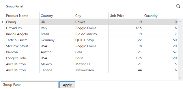
<dxg:GridControl x:Name="grid" AutoGenerateColumns="AddNew">
    <dxg:GridControl.View>
        <dxg:TableView x:Name="view" AutoWidth="True"/>
    </dxg:GridControl.View>
</dxg:GridControl>
<StackPanel Grid.Row="1" Orientation="Horizontal">
    <TextBox x:Name="textBox" Width="200" KeyDown="textBox_KeyDown" Margin="3,3,3,3"/>
    <Button Content="Apply" Click="button_Click" Margin="0,3,0,3"/>
</StackPanel>
void LocalizeGroupPanelText() {
    var NewText = textBox.Text;
    var localization = new GridRuntimeStringCollection();
    localization.Add(new RuntimeStringIdInfo(GridControlRuntimeStringId.GridGroupPanelText, NewText));
    view.RuntimeLocalizationStrings = localization;
}
void button_Click(object sender, RoutedEventArgs e) {
    LocalizeGroupPanelText();
}

void textBox_KeyDown(object sender, System.Windows.Input.KeyEventArgs e) {
    if (e.Key == System.Windows.Input.Key.Enter) {
        LocalizeGroupPanelText();
    }
}