DataViewBase.HeaderLayoutTemplate Property
Gets or sets the layout template used to display custom content (or UI elements) within all column headers. This is a dependency property.
Namespace: DevExpress.Xpf.Grid
Assembly: DevExpress.Xpf.Grid.v26.1.Core.dll
Declaration
Property Value
| Type | Description |
|---|---|
| ControlTemplate | A ControlTemplate used to display custom content within all column headers. |
Remarks
Use the HeaderLayoutTemplate property to change appearance and display custom content within all column headers. To override the default template for a specific column, specify the ColumnBase.HeaderLayoutTemplate property. The column-level template has higher priority.
Tip
The template’s DataContext includes the GridColumn object, so you can bind template elements to column properties (for example, Header or FieldName) to display column-specific information within a custom layout.
You can also use the DataViewBase.ColumnHeaderTemplate property to change captions for all column headers.
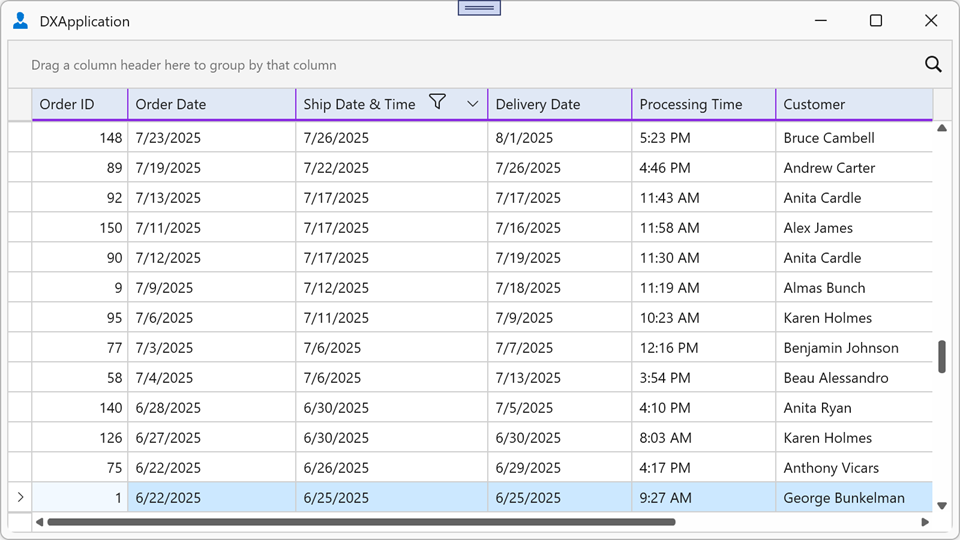
Example: Set a Custom Header Layout for All Columns
The following example changes appearance for all column headers in the TableView and preserves default filter and sort indicators:
<dx:ThemedWindow xmlns="http://schemas.microsoft.com/winfx/2006/xaml/presentation"
                 xmlns:x="http://schemas.microsoft.com/winfx/2006/xaml"
                 xmlns:dx="http://schemas.devexpress.com/winfx/2008/xaml/core"
                 xmlns:dxg="http://schemas.devexpress.com/winfx/2008/xaml/grid">
    <dx:ThemedWindow.Resources>
        <ControlTemplate x:Key="ColumnHeaderLayoutTemplate">
            <Border Background="#FFE0E8F5" BorderBrush="BlueViolet"
                    BorderThickness="0,0,1,2"
                    HorizontalAlignment="Stretch" VerticalAlignment="Stretch">
                <Grid>
                    <Grid.ColumnDefinitions>
                        <ColumnDefinition Width="auto" />
                        <ColumnDefinition Width="*" />
                        <ColumnDefinition Width="*" />
                        <ColumnDefinition Width="4" />
                    </Grid.ColumnDefinitions>
                    <ContentControl Name="PART_Content"
                                    Margin="6,4,6,5"
                                    HorizontalAlignment="Center"
                                    Padding="{TemplateBinding Padding}"
                                    VerticalAlignment="Center" />
                    <ContentControl Grid.Column="1"
                                    Name="PART_Filter"
                                    Margin="2,4"
                                    HorizontalAlignment="Left"
                                    Visibility="Visible" />
                    <dxg:SortIndicatorControl Grid.Column="2"
                                            Name="PART_SortIndicator"
                                            Margin="2,4"
                                            HorizontalAlignment="Right"
                                            Visibility="Collapsed" />
                    <dxg:GridThumb Grid.Column="3"
                                    Name="PART_Thumb"
                                    Cursor="SizeWE" />
                </Grid>
            </Border>
        </ControlTemplate>
    </dx:ThemedWindow.Resources>
    <dxg:GridControl ItemsSource="{Binding Orders}">
        <dxg:GridControl.View>
            <dxg:TableView HeaderLayoutTemplate="{StaticResource ColumnHeaderLayoutTemplate}"/>
        </dxg:GridControl.View>
    </dxg:GridControl>
</dx:ThemedWindow>