DataViewBase.DetailHeaderContent Property
Gets or sets the detail section’s header content.
Namespace: DevExpress.Xpf.Grid
Assembly: DevExpress.Xpf.Grid.v26.1.Core.dll
Declaration
Property Value
| Type | Description |
|---|---|
| Object | An object representing the detail section’s header content. |
Remarks
Details display header sections when the DetailDescriptorBase.ShowHeader option is enabled. When using a DataControlDetailDescriptor, you can specify the header section content via the detail Grid View’s DataViewBase.DetailHeaderContent. If no template has been assigned to the DetailDescriptorBase.HeaderContentTemplate, then the header will display the textual representation of the assigned content object. If you specify a template, then the DataViewBase.DetailHeaderContent will define the DataContext for the template.
The following image shows a detail header section’s default representation (when no template has been assigned).
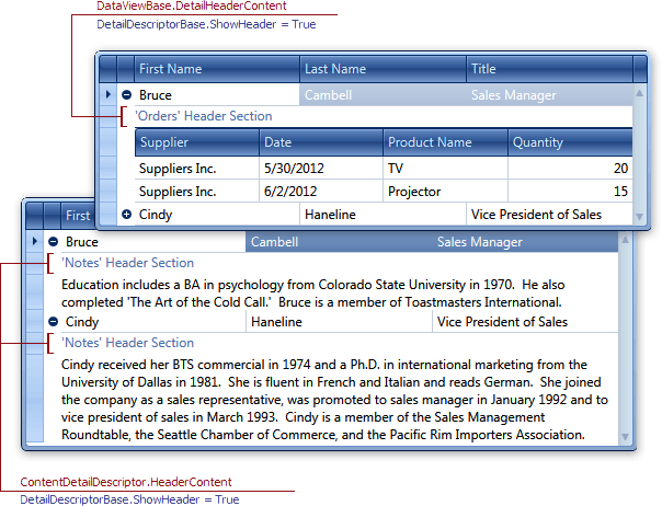
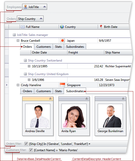
The DetailHeaderContent property also specifies the string representation of the Detail section within the Group Panel, Filter Panel and detail tab headers. For ContentDetailDescriptor objects, use the ContentDetailDescriptor.HeaderContent property. The following image shows these two properties in action.
Example
This example creates tabbed details (TabViewDetailDescriptor) in the GridControl. The Orders tab displays the GridControl (DataControlDetailDescriptor), and the Notes tab displays a memo field (ContentDetailDescriptor).

<Window.Resources>
    <DataTemplate x:Key="EmployeeNotes">
        <TextBlock Text="{Binding Path=Notes}" TextWrapping="Wrap" Padding="4"/>
    </DataTemplate>
</Window.Resources>
<Grid>
    <dxg:GridControl x:Name="grid" AutoGenerateColumns="AddNew">
        <dxg:GridControl.View>
            <dxg:TableView DetailHeaderContent="Employees" AutoWidth="True" ShowGroupPanel="False"/>
        </dxg:GridControl.View>
        <dxg:GridControl.DetailDescriptor>
            <dxg:TabViewDetailDescriptor>
                <dxg:DataControlDetailDescriptor ItemsSourcePath="Orders">
                    <dxg:DataControlDetailDescriptor.DataControl>
                        <dxg:GridControl AutoGenerateColumns="AddNew">
                            <dxg:GridControl.View>
                                <dxg:TableView DetailHeaderContent="Orders" AutoWidth="True" ShowGroupPanel="False"/>
                            </dxg:GridControl.View>
                        </dxg:GridControl>
                    </dxg:DataControlDetailDescriptor.DataControl>
                </dxg:DataControlDetailDescriptor>
                <dxg:ContentDetailDescriptor ContentTemplate="{StaticResource EmployeeNotes}" HeaderContent="Notes"/>
            </dxg:TabViewDetailDescriptor>
        </dxg:GridControl.DetailDescriptor>
    </dxg:GridControl>
</Grid>
Related GitHub Examples
The following code snippets (auto-collected from DevExpress Examples) contain references to the DetailHeaderContent property.
Note
The algorithm used to collect these code examples remains a work in progress. Accordingly, the links and snippets below may produce inaccurate results. If you encounter an issue with code examples below, please use the feedback form on this page to report the issue.