TrackBarEditTickItem.DisplayMode Property
Gets or sets a value that specifies how the current item is displayed. This is a dependency property.
Namespace: DevExpress.Xpf.Editors
Assembly: DevExpress.Xpf.Core.v26.1.dll
Declaration
Property Value
| Type | Description |
|---|---|
| TrackBarEditTickItemDisplayMode | One of the TrackBarEditTickItemDisplayMode enumeration values. |
Available values:
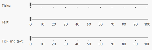
| Name | Description |
|---|---|
| Tick | Track bar displays tick marks. |
| Text | Track bar displays text labels. |
| TickAndText | Track bar displays text labels with tick marks. |
Remarks
Use the DisplayMode property to customize the display mode for particular track-bar items.
Example
The code sample below demonstrates how to display large ticks with labels each 10 steps and display medium-sized ticks for steps like 5, 15, 25, 35, etc.
xmlns:dxe="http://schemas.devexpress.com/winfx/2008/xaml/editors"

<dxe:TrackBarEdit
                 Margin="20"
                 TickAlternationCount="10"
                 TickFrequency="1"
                 TickPlacement="BottomRight">
    <dxe:TrackBarEdit.TickItemContainerStyle>
        <Style TargetType="dxe:TrackBarEditTickItem">
            <Style.Triggers>
                <Trigger Property="AlternationIndex" Value="0">
                    <Setter Property="TickLength" Value="10" />
                    <Setter Property="DisplayMode" Value="TickAndText" />
                </Trigger>
                <Trigger Property="AlternationIndex" Value="5">
                    <Setter Property="TickLength" Value="6" />
                </Trigger>
            </Style.Triggers>
        </Style>
    </dxe:TrackBarEdit.TickItemContainerStyle>
</dxe:TrackBarEdit>
The image below illustrates the result.

See Also