TcxDBCheckComboBox Class
A data-aware combo box editor that can display items with check boxes.
Declaration
TcxDBCheckComboBox = class(
    TcxCustomCheckComboBox
)
Remarks
The TcxDBCheckComboBox class implements a data-aware check combo box editor that consists of an edit box and a check list displayed in a drop-down window. Users can click check boxes in the list to select any number of items. All checked items are displayed in the edit box.
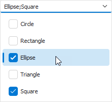
To manage check combo box items, use the Properties.Items property.
Main API Members
The list below outlines key members of the TcxCheckComboBox class that allow you to configure check combo box editors.
Appearance and Behavior Settings
- BeepOnEnter
- Specifies if the check combo box plays the default system sound when a user confirms input.
- Style | StyleDisabled | StyleFocused | StyleHot | StyleReadOnly
Allow you to define individual appearance settings for different editor states.
Tip
To apply the same style settings to multiple editors, use a TcxEditStyleController component. If you need to apply the same style settings to all editors in your application, you can use a TcxDefaultEditStyleController component.
- Styles
- Provides access to individual styles applied to the check combo box in different states.
Content-Related APIs
- Clear
- Unchecks all items.
- CopyToClipboard | CutToClipboard | PasteFromClipboard
- Allow you to perform clipboard operations.
- CanDropDown | DroppedDown | CloseUp
- Manage the drop-down menu.
- EditValue
- Specifies all item check states as one value.
- ItemIndex
- Specifies the active check combo box item.
- OnEditing
- Allows you to prevent users from activating the check combo box.
- PopupWindow
- Allows you to access and customize the drop-down menu.
- ResetEditValue
- Restores the previous edit value before the pending change is applied.
- States
- Specifies check states for individual items.
- TextHint
- Specifies a text hint for the check combo box when it has no assigned edit value.
Data-Related APIs
- CanPostEditValue
- Identifies if the data-aware combo box can post its edit value to the bound data storage.
- DataBinding
Allows you to bind the combo box to data. DataBinding.DataSource and DataBinding.DataField properties specify the target data source and the target field in the underlying dataset.
The bound database field must contain integer values. The check combo box interprets integer values as bitwise flag combinations where each flag corresponds to a checkable item in the drop-down window.
- OnPostEditValue
- Executes custom code when the editor posts its value to the bound data storage.
- PostEditValue
- Posts the edit value to the bound data storage.
Check Combo Box Settings and Repository Items
- ActiveProperties
- Provides access to the current check combo box settings regardless of their source. This property set does not allow you to customize check combo box settings.
- GetPropertiesClass
- Returns the actual editor settings type.
- Properties
- Allows you to customize check combo box settings directly if the check combo box does not have an assigned repository item.
- RepositoryItem
- Specifies a repository item as an external source of check combo box settings. A repository item has priority over other check combo box settings.
General-Purpose API Members
- Enabled
- Specifies if the check combo box is enabled.
- CanModify
- Identifies if the check combo box is in read-only mode.
- IsEditValidating | IsHiding | IsPosting
- Allow you to identify the current operation in the check combo box.
- Width | Height
- Allow you to explicitly define check combo box dimensions.
Check States and Edit Values
Call CalculateCheckStatesValue and CalculateCheckStates global functions to convert a check combo box editor’s edit value into an array of item check states and vice versa.
Repository Item Class
You can create a TcxEditRepositoryCheckComboBox component in an edit repository to store check combo box settings and share them between multiple check combo boxes.
Limitations
The data-aware check combo box is designed as a standalone editor. You cannot use a TcxDBCheckComboBox class instance as an in-place editor in container controls.