TcxBarEditItem Class
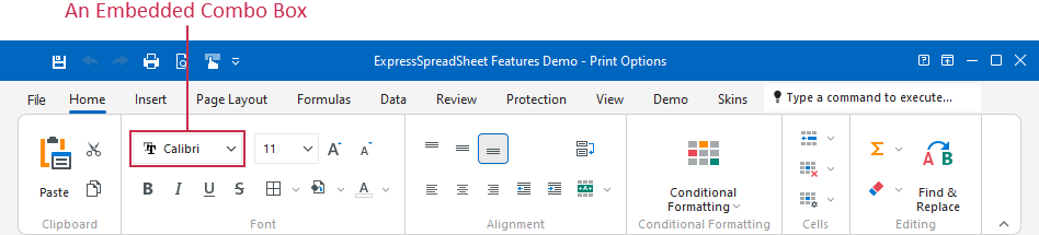
A toolbar item container for an in-place editor from the ExpressEditors Library.
Declaration
TcxBarEditItem = class(
    TcxCustomBarEditItem
)
Remarks
A toolbar item container allows you to use an editor from the ExpressEditors Library in the same manner as in other container controls, such as VCL Data Grid, Tree List, and Vertical Grid.
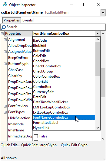
Editor Selection at Design Time
At design time, you can use the Object Inspector to select any available in-place editor. Click a toolbar edit item’s Properties node and select the required editor from the invoked drop-down list.
Main API Members
The list below outlines key members of the TcxBarEditItem class that allow you to configure the toolbar item container and its embedded editor.
- PropertiesClass
- Associates the toolbar item container with a supported editor.
- Properties
- Provides access to the embedded editor’s settings.
- ItemIndex
- Specifies the selected item in a supported combo box editor when it is embedded into the toolbar editor item.
- RepositoryItem
Specifies an edit repository item that defines the embedded editor and its settings in the toolbar editor item.
Tip
Repository items are particularly useful if you need to share in-place editor settings between multiple toolbar editor items.
- EditValue | CurEditValue
- Manage the edit value.
- Width | Height
- Explicitly define the embedded editor’s dimensions.
- BarStyleDropDownButton
- Allows you to switch between drop-down button display modes in the embedded editor.
Additional Information
Refer to the following topic for additional information: In-place Editors.