TcxDBImageComboBox Class
A data-aware image combo box.
Declaration
TcxDBImageComboBox = class(
    TcxCustomImageComboBox
)
Remarks
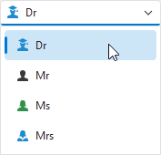
A data-aware image combo box can display images in addition to text description in every item available for selection.
End-User Input Options
Up and Down arrow keys allow users to switch between combo box items, even when the drop-down menu is closed. Ctrl + Page Up and Ctrl + Page Down keystrokes select first and last items, respectively.
Drop-Down Menu Interaction
Users can do the following to open or close the drop-down combo box menu:
- Click the drop-down button.
- Focus the image combo box and press the Alt +↑ or Alt +↓ key combination.
- Focus the image combo box and press the F4 key.
Note
You can invoke the drop-down menu only if it contains at least one value.
Main API Members
The list below outlines key members of the TcxDBImageComboBox class that allow you to configure image combo boxes and manage combo box items.
Appearance and Behavior Settings
- BeepOnEnter
- Specifies if the combo box plays the default system sound when a user confirms input.
- Style | StyleDisabled | StyleFocused | StyleHot | StyleReadOnly
Allow you to define individual appearance settings for different editor states.
Tip
To apply the same style settings to multiple editors, use a TcxEditStyleController component. If you need to apply the same style settings to all editors in your application, you can use a TcxDefaultEditStyleController component.
- Styles
- Provides access to individual styles applied to the combo box in different states.
Content-Related APIs
- Clear | EditingValue | EditValue | EditingText | EditText | ResetEditValue
- Manage the edit value.
- CopyToClipboard | CutToClipboard | PasteFromClipboard
- Allow you to perform clipboard operations.
- CanDropDown | DroppedDown | CloseUp
- Manage the drop-down menu.
- ItemIndex
- Specifies the active image combo box item.
- OnEditing
- Allows you to prevent users from activating the image combo box.
- PopupWindow
- Allows you to access and customize the drop-down menu.
- ResetEditValue
- Restores the previous edit value before the pending change is applied.
- SelectAll
- Selects editor content.
- SelStart | SelLength | SelText | SetSelection | SelectAll | ClearSelection
- Manage content selection.
- TextHint
- Specifies a text hint for the image combo box when it has no assigned edit value.
- Undo
- Discards the last content change when the image combo box has focus.
- ValidateEdit
- Validates the display value.
Data-Related API Members
- CanPostEditValue
- Identifies if the data-aware image combo box can post its edit value to the bound data storage.
- DataBinding
- Allows you to bind the image combo box to data.
- OnPostEditValue
- Executes custom code when the editor posts its value to the bound data storage.
- PostEditValue
- Posts the edit value to the bound data storage.
Image Combo Box Settings and Repository Items
- ActiveProperties
- Provides access to the current image combo box settings regardless of their source. This property set does not allow you to customize image combo box settings.
- GetPropertiesClass
- Returns the actual editor settings type.
- Properties
- Allows you to customize image combo box settings directly if the image combo box does not have an assigned repository item.
- RepositoryItem
- Specifies a repository item as an external source of image combo box settings. A repository item has priority over other image combo box settings.
General-Purpose API Members
- Enabled
- Specifies if the image combo box is enabled.
- CanModify
- Identifies if the image combo box is in read-only mode.
- IsEditValidating | IsHiding | IsPosting
- Allow you to identify the current operation in the image combo box.
- Width | Height
- Allow you to explicitly define image combo box dimensions.
Repository Item Class
You can create a TcxEditRepositoryImageComboBoxItem component in an edit repository to define an unbound image combo box, store combo box settings, and share them between multiple image combo boxes.
Limitations
The data-aware image combo box is designed as a standalone editor. You cannot use a TcxDBImageComboBox class instance as an in-place editor in container controls.