Range Controls
- 2 minutes to read
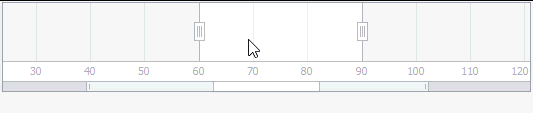
A range control (an instance of the TdxCustomRangeControl class descendant) is an advanced data range selection control that can be integrated with a client control providing and visualizing data in the range control’s content area.
Unlike range track bars that allow you to display and select only ranges of integer values, a range control is capable of working with multiple data types depending on the currently selected data range selection and visualization model. Irrespective of the currently selected model and/or associated client control, the range control provides the following functionality:
Multiple ways to select a data range (such as using the selection thumbs, performing drag-and-drop operations within the content area, and moving the selected range via the Zoom&Scroll bar);
The capability to zoom the data range in or out for more convenient data representation and/or higher range selection precision;
Animated range selection and zooming.
Additionally, certain data range selection and visualization models offer the capability to display multiple scales on the same ruler.
Currently, the TdxRangeControl component supports four data range selection and visualization models:
Numeric (displays a simple numeric scale on the ruler and allows you to select a range of integer, float, or currency values);
Date/Time (displays a single predefined date/time scale on the ruler and allows you to select ranges of date/time values);
Date/Time Header (displays one or more predefined date/time scales on the ruler and allows you to select various ranges of date/time values);
Scheduler (displays one or more predefined date/time scales on the ruler and allows you to select various date/time ranges, displaying them in the active View of the associated TcxScheduler control).