v26.1 Release Notes
- 20 minutes to read
Tip
Visit our website to explore new features/capabilities available across the entire DevExpress product line: What’s New in our Latest Update.
AI Agent Skills
Our Blazor component/UI library ships with AI Skills designed to help coding agents leverage DevExpress Blazor UI components more effectively. Each skill focuses on a specific component and includes all details needed to generate accurate code: required NuGet packages, relevant APIs, entry points, configuration settings, and common usage scenarios.
DevExpress Blazor skills are available in the DevExpress AI Skills repository.
The DevExpress skill set supports the following Blazor components:
Refer to the following help topic for additional information: DevExpress AI Skills for Coding Agents.
End of Bootstrap v4 Support
With the release of v26.1, we completed our transition away from Bootstrap v4 and officially discontinued Bootstrap v4 support:
- The
DevExpress.Blazor.Themespackage no longer includes Bootstrap v4-based stylesheets for classic themes (Blazing Berry, Blazing Dark, Office White, Purple). - All remaining Bootstrap v4 theme dependencies/default CSS were removed.
DevExpress Blazor components now support Bootstrap v5.
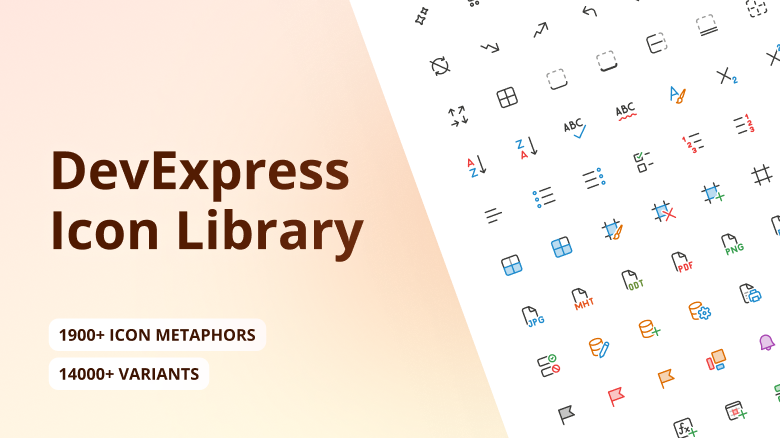
Icon Library (CTP)
The DevExpress Icon Library is now available to Blazor developers via the DevExpress.Images.Blazor NuGet package. The package includes an extensive icon set, uses a sprite-based delivery model, and exposes consistent APIs for Blazor components.
The DevExpress Icon Library is available as a Community Technology Preview in our v26.1 release cycle. We encourage you to explore its possibilities and share your feedback as we continue to refine our APIs and feature set.
Extensive Icon Collection
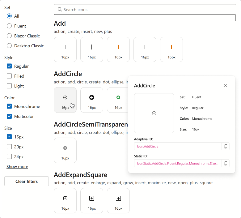
The library includes over 13,000 icons designed to cover a variety of UI requirements. To simplify navigation, icons are grouped by the following attributes:
- Set: Fluent, Desktop Classic, Blazor Classic
- Style: Regular, Light, Filled
- Color: Monochrome, Multicolor
- Size: 12, 16, 20, 24, 28, 32, 48
This structure allows you to select consistent icons that match your application’s visual language and layout requirements.
Optimized Delivery
To minimize performance impact, icons are grouped into ~50 sprites based on associated attributes (set, style, size, and color). Instead of loading sprite files upfront, the application requests them on demand (when a sprite icon is used).
Sprite-based delivery ensures fast startup and low memory usage.
Icon API
Register the DevExpress.Images.Blazor namespace to use the DevExpress Icon Library in your DevExpress-powered Blazor app.
You can assign icons to our Blazor components using IconUrl properties (such as DxAccordionItem.IconUrl or DxRibbonItem.IconUrl).
We recommend using semantic icon references (metaphors) – specify an icon identifier, and the framework automatically selects the appropriate icon (based on current theme and UI settings).
@using DevExpress.Images.Blazor

<DxRibbon>
    <DxRibbonApplicationTab Text="File">
        <DxRibbonApplicationTabItem Text="New"
                                    IconUrl="@Icon.DocumentBlank" />
        <DxRibbonApplicationTabItem Text="Open"
                                    IconUrl="@Icon.FolderOpen" />
        <DxRibbonApplicationTabItem Text="Save as"
                                    IconUrl="@Icon.Save">
            <DxRibbonApplicationTabItem Text="Plain Text" />
            <DxRibbonApplicationTabItem Text="Word Document" />
            <DxRibbonApplicationTabItem Text="PDF" />
        </DxRibbonApplicationTabItem>
        <DxRibbonApplicationTabItem Text="Share"
                                    IconUrl="@Icon.Share" />
        <DxRibbonApplicationTabItem Text="Print"
                                    IconUrl="@Icon.Printer" />
    </DxRibbonApplicationTab>
    @* ... *@
</DxRibbon>
This implementation simplifies icon management and helps deliver a consistent user experiences across themes, size modes, and other appearance configurations.
As an alternative, you can reference an icon resource explicitly:
@using DevExpress.Images.Blazor

<DxButton RenderStyle="@ButtonRenderStyle.Primary"
          Text="Undo"
          IconUrl="@IconStatic.ArrowUndo.Fluent.Filled.Monochrome.Size16"/>
Use exact icon attributes when you need full control over icons.
Icon Explorer Demo
Blazor demos now include an interactive page to browse and explore icons available in the DevExpress Icon Library.
These new demo includes the following capabilities:
- Icon Search and Filtering You can easily find icons (by name or tag) using the built-in search panel with real-time filtering as you type.
- Predefined Filters Based on Classification Includes a right-side panel to filter the icon list by structured classification criteria.
- Icon Details Displays detailed information for selected icons (including API references that you can copy directly into code).
To explore the potential of the DevExpress Icon Library, navigate to locally installed DevExpress Blazor demos and proceed to Icon Library → Icon Explorer.
Performance Enhancements
The following performance-related enhancements were introduced in our v26.1 release cycle:
For all Blazor components: Eliminated virtual tree nodes generated for empty lines and line breaks. This optimization reduces the size and depth of the virtual tree, resulting in performance gains across multiple layers:
- Server-side — faster tree-diff calculations
- Client-side — faster tree updates
- Network — smaller render size due to fewer nodes
For Blazor Ribbon, Buttons, CheckBoxes, and other Editors: Optimized rendering and memory usage.
Together, these changes reduce DOM complexity and deliver improved performance, especially in data-intensive usage scenarios. The graphs below document performance gains across different components and usage scenarios.
Reduced WebSocket Traffic
The following graph documents the reduction in WebSocket traffic and virtual node count for different component libraries: DxGrid, DxListBox<TData, TValue>, DxScheduler, DxTextBox, DxButton, and DxCheckBox<T>.
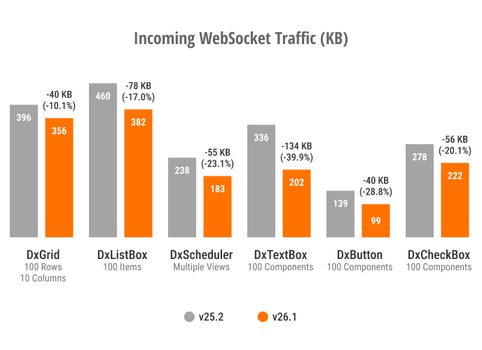
Incoming WebSocket Traffic
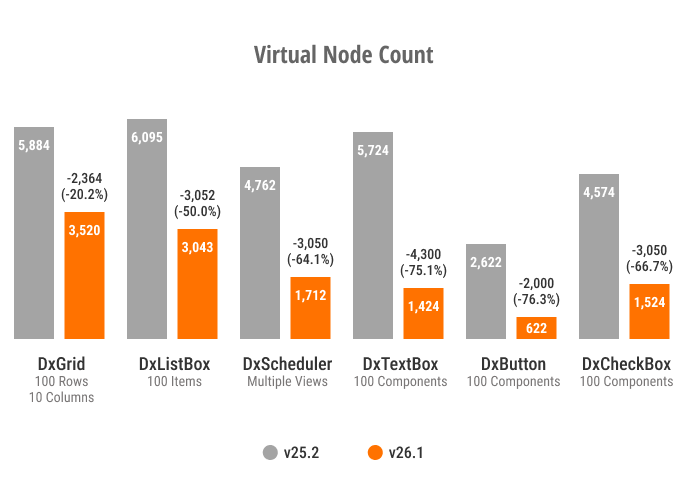
Virtual Node Count
Optimized Memory Usage
We measured memory usage on a combined page featuring several components: an Accordion (5 parent items, 8 child items), a Toolbar (10 items), 3 List Boxes (30 items), and 30 Buttons. The page was rendered in Blazor Server mode and tested under a load of 50 concurrent users (SignalR circuits). As a result of our optimizations, memory consumption decreased by approximately 20 percent, with a notable reduction in Gen2, LOH, and POH objects.
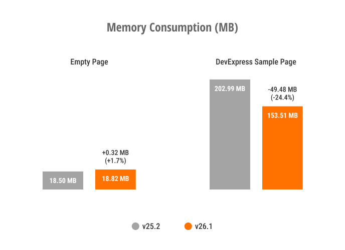
Memory Consumption
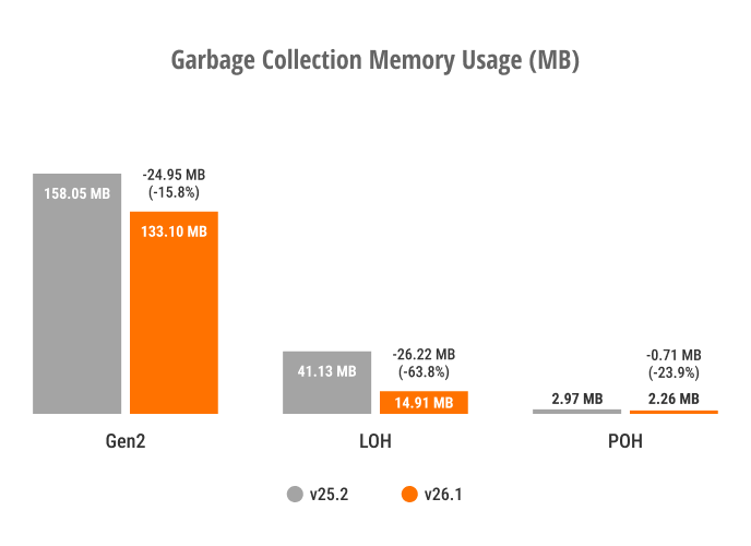
GC Generation Distribution
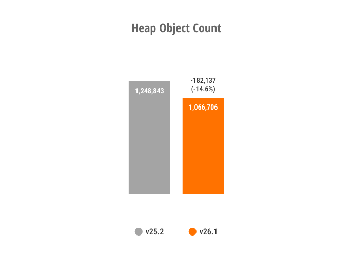
Heap Object Count
Blazor Ribbon - Memory Consumption
We measured memory consumption and Blazor render tree overhead for a Blazor Ribbon component with 1000 items. The page was rendered in Blazor Server mode and tested under a load of 15 concurrent users with 2 active SignalR circuits per user. The new rendering architecture reduced memory consumption by up to 26% and decreased render tree overhead by up to 38%.
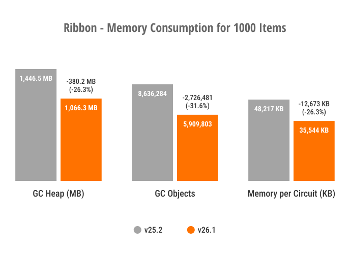
Blazor Ribbon - Memory Consumption
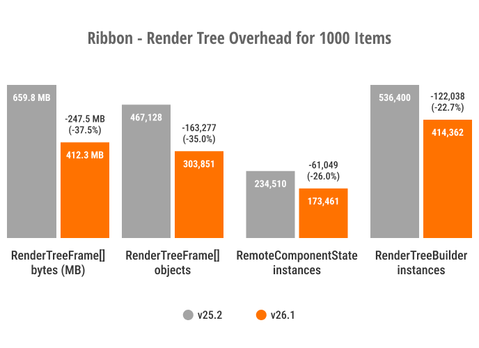
Blazor Ribbon - Render Tree Overhead
Blazor Grid - Performance Enhancements
Try the DevExpress Blazor Grid performance demo (1M rows × 1K columns) to experience the performance enhancements we’ve introduced in this release cycle:
Accessibility Enhancements
General Enhancements
- Improved screen reader support for our AI Chat, ComboBox, Filter Builder, Grid, Popup, TagBox, and TreeList UI components.
- Introduced support for relevant ARIA attributes in our Filter Builder, Grid, HTML Editor, ListBox, Ribbon, Rich Edit, Time Edit, and TreeList UI components.
- Introduced support for the
aria-requiredattribute in the following Blazor Data Editors: CheckBox, ComboBox, Date Edit, Date Range Picker, List Box, Memo, Radio Group, Spin Edit, TagBox, Text Box, Time Edit. - Improved keyboard navigation in our Pivot Table and Ribbon UI components.
- Added the ability to focus editor command buttons.
- Added id attributes to Form Layout item captions.
- Introduced the resize text requirement in our Ribbon UI component.
- Added colored validation states to our CheckBox, Radio, and Radio Group UI components.
Windows High Contrast Mode Support
DevExpress Blazor Fluent themes include built-in support for Windows high contrast mode. When activated, Fluent themes automatically adjust colors to enhance readability and comply with modern accessibility standards. This mode guarantees proper contrast ratios across all UI elements and improves usability for users with visual impairments (without additional setup).
Rich Edit — Screen Reader Support
Screen readers now announce document content as users navigate with the keyboard.
- Read aloud paragraphs, lines, words, and characters.
- Announce and read changes to text selection.
- Notify users about hyperlinks and inline images.
- Read text in table cells.
Template Kit Enhancements
New Sample Views
To help address key business usage scenarios more quickly, we added the following sample Blazor component pages to the DevExpress Template Kit:
- Editable Grid
- Uses a DevExpress Blazor Grid and allows users to edit and modify records.
- Master-Detail Grid
- Uses a DevExpress Blazor Grid and visualizes master-detail relationships between two data tables.
- Basic Form Layout
- Uses a DevExpress Blazor Form Layout and arranges DevExpress Blazor Data Editors in a form, with built-in data validation.
Blazor AI Chat
Vendor-Agnostic AI Chat
To improve the overall user experience and align AI Chat with common DevExpress Blazor patterns, we introduced a set of breaking changes in our v26.1. These changes standardize our AI Chat API surface, add integration with agent-based and vendor-agnostic models, and minimize configuration conflicts across components, models, and usage scenarios.
- DevExpress AI Chat now uses IChatResponseProvider instead of IChatClient
- OpenAI Assistant-related APIs have been deprecated/replaced
- Inference parameters are now obsolete
- MessageSent event is now obsolete
- SendMessage method is now obsolete
- BlazorChatMessage.Content is now obsolete
Use the DevExpress Project Converter to update common code patterns automatically. Pay close attention to the following app areas:
- AI service registration
- Component configurations that reference keyed chat services or inference parameters
- Programmatic message handling
Message Flow Enhancements
DevExpress Blazor AI Chat now includes a more flexible MessageSending event model. New APIs give you precise control over long-running operations and custom message workflows. Use them to preprocess user input, call external services, or append an additional response to the chat:
- Call AppendMessageAsync to add messages to the chat history without sending them to the AI service (for instance, append system prompts, assistant messages, or supplemental context).
- Use the SendMessageAsync method to submit user messages to the chat service.
- Call ShowLoadingIndicatorAsync and HideLoadingIndicatorAsync methods to display the built-in loading indicator during time-consuming operations.
<DxAIChat MessageSending="OnMessageSending" />

@code {
    async Task OnMessageSending(MessageSendingEventArgs args) {
        await args.Chat.AppendMessageAsync($"Translate message to Spanish", ChatRole.System);
        await args.Chat.ShowLoadingIndicatorAsync("Fetching additional context...");
        /* ... */
        await args.Chat.HideLoadingIndicatorAsync();
    }
}
You can handle the MessageSending event to log user messages for diagnostics, telemetry, or audit purposes. The event does not intercept message delivery. Unless you explicitly cancel it, the component continues to send and display the message.
<DxAIChat MessageSending="LogUserMessages"
          FileUploadEnabled="true" />

@code {
    private async Task LogUserMessages(MessageSendingEventArgs args) {
        StringBuilder logMessage = new StringBuilder();
        logMessage.AppendLine($@"User message: ""{args.Text}""");
        if(args.Files != null && args.Files.Count > 0) {
            logMessage.AppendLine($"Attachments: {string.Join(", ", args.Files.Select(f => f.Name))}");
        }
        LogConversationHistory(logMessage.ToString());
    }
}
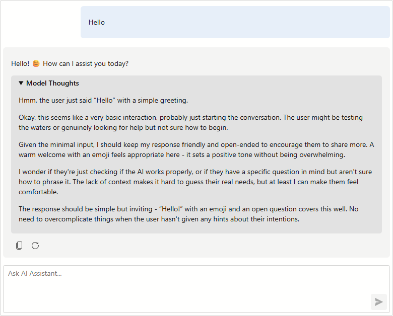
AIContent API
DevExpress Blazor AI Chat exposes individual AIContent items streamed between your application and AI services. You can render rich content using custom templates, submit structured AI requests programmatically, and hide specific messages.
The following new APIs are available:
- BlazorChatMessage.Contents: Returns a collection of AIContent items contained in a message.
- ResponseReceivedEventArgs.Messages: Returns all
BlazorChatMessageobjects from the last AI response. - DxAIChat.SendMessageAsync: Sends a multimodal message that combines text, images, documents, and other content types to the AI service.
- BlazorChatMessage.Visible: Specifies message visibility in chat history.
When used with reasoning models, the Contents collection may include the model’s chain-of-thought alongside the final response. In MessageContentTemplate, inspect message Contents to detect and render these thoughts in the chat.
<DxAIChat ResponseContentFormat="ResponseContentFormat.Markdown">
    <MessageContentTemplate>
        @foreach(var item in context.Contents) {
            if(item is TextReasoningContent reasoning) {
                <details>
                    <summary>Model Thoughts</summary>
                    <p>@ToHtml(reasoning.Text)</p>
                </details>
            }
            else if(item is TextContent text) {
                <p>@ToHtml(text.Text)</p>
            }
        }
    </MessageContentTemplate>
</DxAIChat>

@code {
    private readonly HtmlSanitizer sanitizer = new HtmlSanitizer();

    MarkupString ToHtml(string markdown) {
        string html = Markdown.ToHtml(markdown);
        html = sanitizer.Sanitize(html);
        return new MarkupString(html);
    }
}
Improved AI Chat Typing Experience
DevExpress Blazor AI Chat allows you to control when input text is synchronized with the chat message buffer.
You can update the buffer on every keystroke, when the input box loses focus, or after the user stops typing for a specified interval. Choose the option that best balances responsiveness and processing load for your specific usage scenario. In Interactive WebAssembly and Auto render modes, delayed updates reduce unnecessary state changes when typing and improve chat responsiveness on slower devices or resource-intensive pages.
<DxAIChat BindValueMode="BindValueMode.OnDelayedInput"
          InputDelay="1000" />
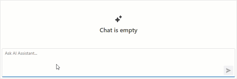
Empty Chat Customization
DevExpress Blazor AI Chat allows you to customize text displayed before a conversation starts:
- EmptyMessageAreaText specifies text displayed in the empty message area.
- InputBoxNullText specifies prompt text in the chat input box when it is empty.
<DxAIChat EmptyMessageAreaText="How can I help you today?"
          InputBoxNullText="Ask a question or describe a task..." />
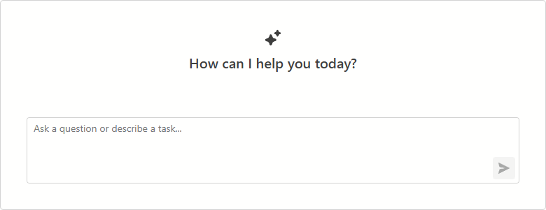
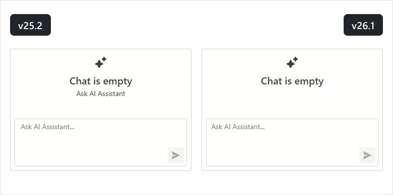
UI/UX Enhancements
We simplified the empty message area to improve the initial DevExpress Blazor AI Chat experience.
New Blazor Smart Paste
The DevExpress Blazor Form Layout component now supports Smart Paste - a new AI-powered extension that simplifies copying content from external sources. The extension parses unstructured text (such as email content or free-form notes) and automatically populates form fields with relevant data.

Our new FormLayoutSmartPaste class allows you to customize Smart Paste behavior (map fields, configure AI processing options, and supply additional prompt instructions).
Our Form Layout also includes a SmartPasteAsync method to trigger Smart Paste workflow from any event handler or custom logic.
<DxMemo @bind-Text="SampleText"/>

<DxButton Text="Smart Paste"
          Click="@OnSmartPasteClick" />

<DxFormLayout Data="@model" @ref="FormLayout">
    <Extensions>
        <FormLayoutSmartPaste/>
    </Extensions>
    <ChildContent>
        <DxFormLayoutItem Caption="Full Name" .../>
        <DxFormLayoutItem Caption="Amount Due" .../>
    </ChildContent>
</DxFormLayout>

@code {
    DxFormLayout FormLayout { get; set; }
    BillingFormModel model = new();
    string SampleText { get; set; } =
        "Hi there ... ";
    async Task OnSmartPasteClick() {
        await FormLayout.SmartPasteAsync(SampleText);
    }
}
Blazor Pivot Table
Server Mode Data Sources
The DevExpress Blazor Pivot Table v26.1 now supports Server Mode data sources for Blazor Server-based applications. These data sources were designed to simplify integration with large data collections (500,000+ records) and maximize performance for these usage scenarios.
Server Mode data sources handle data calculations at the database level. This reduces the amount of transferred data, decreases memory consumption, and improves component responsiveness.
Blazor Grid & TreeList
UI/UX Enhancements
Border and Gridline Visibility
You can now hide column lines (separators between adjacent columns/rows) and component borders when using the DevExpress Blazor Grid and/or TreeList UI components (using the GridlinesVisible property). You can combine available enumeration values as design needs dictate.
<DxGrid Data="Products"
        GridlinesVisible="Gridlines.Horizontal | Gridlines.Outside">
    @* ... *@
</DxGrid>
Filter Menu Button — New On‑Hover Display Mode
DevExpress Blazor Grid and TreeList support on‑hover display mode for Filter Menu buttons. When enabled, buttons appear after users hover over column headers. This mode helps produce a more effective user experience and avoid column caption truncation.
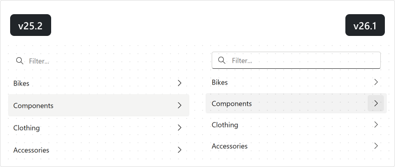
Empty Column Appearance
We refined empty column appearance (may appear during resize operations) to better align with standard Blazor Grid/TreeList columns.
Empty Column Appearance (v25.2)
Empty Column Appearance (v26.1)
Pager Summary
DevExpress Blazor Grid and TreeList UI components include a new PagerSummaryVisible option. Use it to display the current page number, page count, and data row count within our built-in pager.
Edit Cell Mode — Keyboard Support Enhancements
Available in v26.1.4+
Our new Grid/TreeList EditNextCellOnEnter property activates editing of the next cell on Enter (one fewer keystroke to enter edit mode). This option is available when the EnterKeyDirection property is set to Column or Row.
<DxGrid @ref="Grid"
        Data="DataSource"
        KeyFieldName="EmployeeId"
        EditMode="GridEditMode.EditCell"
        EnterKeyDirection="GridEnterKeyDirection.Row"
        EditNextCellOnEnter="true">
    @* ... *@
</DxGrid>
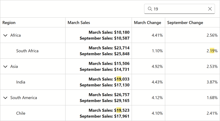
Search Box - Highlight Text/Search Results API Enhancements
Available in v26.1.4+
Our Blazor Grid/TreeList CellDisplayTemplate context now includes a new GetHighlightedText method. Use it to highlight search results in cells that combine multiple data field values.
Blazor TreeList
Unbound Columns
The DevExpress Blazor TreeList component now supports unbound columns. These columns display values that are not stored in the underlying data source. Use unbound columns to display supplementary/computed data without modifying the original data model.
The following APIs allow you to populate unbound columns with data:
- DxTreeList.UnboundColumnData — Allows you to implement custom logic or obtain column values from a custom/external data source.
- DxTreeListDataColumn.UnboundExpression — Specifies an expression used to calculate column values. When exporting to Excel, you can export unbound expressions as formulas.
<DxTreeList Data="TreeListData"
            UnboundColumnData="TreeList_UnboundColumnData" ... >
    <Columns>
        <DxTreeListDataColumn FieldName="AprilSales" />
        <DxTreeListDataColumn FieldName="MaySales" />
        <DxTreeListDataColumn FieldName="JuneSales" />
        <DxTreeListDataColumn FieldName="Q2Sales" Caption="Q2 Sales"
                              UnboundType="TreeListUnboundColumnType.Decimal"
                              UnboundExpression="[AprilSales] + [MaySales] + [JuneSales]" />
        <DxTreeListDataColumn FieldName="Q2YoYChange" Caption="Q2 YoY Change (%)"
                              UnboundType="TreeListUnboundColumnType.Decimal" />
    </Columns>
</DxTreeList>

@code {
    // ...
    void TreeList_UnboundColumnData(TreeListUnboundColumnDataEventArgs e) {
        if(e.FieldName == "Q2YoYChange") {
            var sales = ((SalesByRegion) e.DataItem);
            var currentValue = (decimal)e.GetRowValue("Q2Sales");
            var prevValue = sales.AprilSalesPrev + sales.MaySalesPrev + sales.JuneSalesPrev;
            e.Value = (currentValue - prevValue) / currentValue;
        }
    }
}
Blazor Data Editors
Focusable Buttons
Our Blazor Data Editors include a new Focusable option for command buttons. Once activated, buttons are included in a page’s tab sequence, and users can interact with them using the keyboard.
<DxDateEdit @bind-Date="@DateTimeValue"
            ShowDropDownButton="false">
    <Buttons>
        <DxEditorButton IconCssClass="editor-icon editor-icon-chevron-left-small"
                        Tooltip="Previous Date"
                        Position="@EditorButtonPosition.Left"
                        Focusable="true"
                        Click="@(_ => OnChangeDayButtonClick(false))" />
        <DxEditorButton IconCssClass="editor-icon editor-icon-chevron-right-small"
                        Tooltip="Next Date"
                        Position="@EditorButtonPosition.Right"
                        Focusable="@true"
                        Click="@(_ => OnChangeDayButtonClick(true))" />
        <DxDateEditDropDownButton Focusable="true" />
    </Buttons>
</DxDateEdit>

Keyboard and Mouse Wheel Interaction Options
We added new options to control whether users can change editor values using arrow keys and the mouse wheel: AllowUpDownArrowKeys and AllowMouseWheel. The following editor classes support these new properties:
- DxMaskedInput, DxMaskedInputSettings
- DxSpinEdit, DxSpinEditSettings
- DxDateEdit, DxDateEditSettings (new properties are applied if a date editor uses a mask)
- DxTimeEdit, DxTimeEditSettings (new properties are applied if a time editor uses a mask)
Set AllowUpDownArrowKeys and AllowMouseWheel properties to false to prevent accidental changes and ensure a more controlled user experience.
<DxSpinEdit @bind-Value="@NumericValue"
AllowUpDownArrowKeys="false"
AllowMouseWheel="false" />
<DxDateEdit @bind-Date="@DateTimeValue"
Mask="@DateTimeMask.ShortDate"
AllowUpDownArrowKeys="false"
AllowMouseWheel="false" />
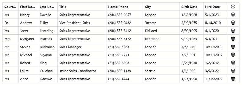
<DxGrid Data="@employees" EditMode="GridEditMode.EditRow">
<Columns>
@*...*@
<DxGridDataColumn FieldName="HireDate">
<EditSettings>
<DxDateEditSettings Mask="@DateTimeMask.ShortDate" AllowUpDownArrowKeys="false" AllowMouseWheel="false" />
</EditSettings>
</DxGridDataColumn>
</Columns>
</DxGrid>
API Enhancements
We added new properties to the DxComboBoxSettings class (contains settings for auto-generated Combo Box editors):
- KeyFieldName/KeyFieldNames — Specify one or more fields to use as identifiers when comparing items.
DataLoadMode — Specifies how the Combo Box loads data:
Auto- The component caches data when the browser loads the web page.OnDemand- The component loads its data whenever a user opens the drop-down window.
UI/UX Enhancements
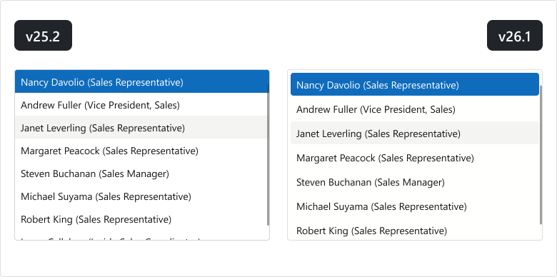
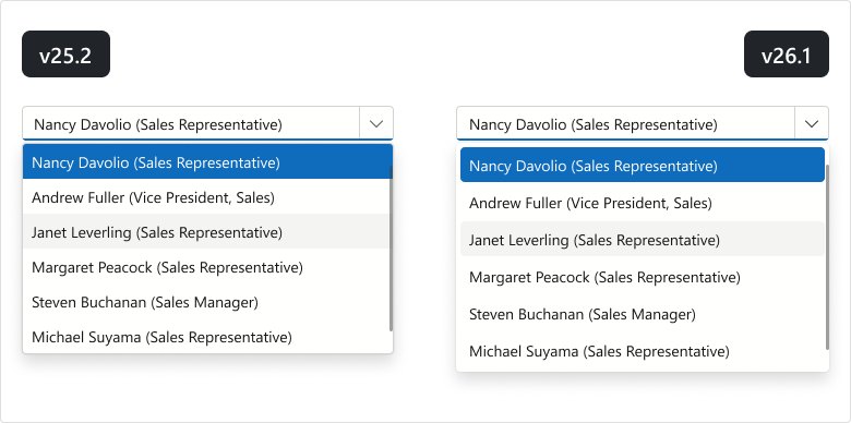
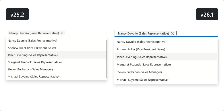
List Editors - Design Updates
We updated the design of our Blazor List Editors (List Box, ComboBox, TagBox) for DevExpress Fluent themes:
- item font size and paddings
- item group style
- disabled/selected item colors
- added spacing between list items
- rounded item corners
- removed extra borders
List Box
ComboBox
TagBox
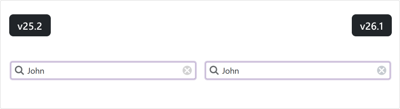
Clear Button
We updated the background color for Clear buttons used in Blazor Editors (Bootstrap and DevExpress Classic themes).
Blazor Navigation
Ribbon Tab Attributes
The DevExpress Blazor Ribbon Tab now supports standard HTML attributes. Use the Attributes property for the tab header and ContentAttributes for the tab content area.
These properties improve accessibility and ensure stable metadata for UI automation.
<DxRibbon>
    <DxRibbonTab Text="Home"
                 Attributes="tabHeaderAttributes"
                 ContentAttributes="tabContentAttributes">
        <DxRibbonGroup>
            <DxRibbonItem Text="New" />
        </DxRibbonGroup>
    </DxRibbonTab>
</DxRibbon>

@code {
    Dictionary<string, object> tabHeaderAttributes = new() {
        { "data-testid", "ribbon-tab-home" }
    };
    Dictionary<string, object> tabContentAttributes = new() {
        { "aria-label", "Home tab items" }
    };
}
Data Mapping API Enhancements
DevExpress Blazor TreeView, Accordion, and Toolbar data mapping APIs now expose additional properties for node and item settings:
TreeView (DxTreeViewDataMapping):
- Expanded — maps a Boolean field that specifies a node’s initial expanded state.
- Selected — maps a Boolean field that specifies a node’s initial selected state.
- BadgeText — maps a string field to node badge text.
- Attributes — maps a field that supplies custom HTML attributes for a node.
Accordion (DxAccordionDataMapping):
- Expanded — maps a Boolean field that specifies an item’s initial expanded state.
- Selected — maps a Boolean field that specifies an item’s initial selected state.
- Attributes — maps a field that supplies custom HTML attributes for an item.
Toolbar (DxToolbarDataMapping):
- Alignment — maps a ToolbarItemAlignment field that specifies item position.
- RenderStyle — maps a ButtonRenderStyle field that defines item appearance.
<DxTreeView Data="@Departments">
    <DataMappings>
        <DxTreeViewDataMapping Children="Children"
                               Text="Name"
                               Expanded="IsExpanded" />
    </DataMappings>
</DxTreeView>

@code {
    List<Department> Departments = new List<Department> {
        new Department {
            Name = "Engineering",
            IsExpanded = true,
            Children = new List<Department> {
                new Department { Name = "Frontend" },
                new Department { Name = "Backend" }
            }
        },
        new Department {
            Name = "Marketing",
            Children = new List<Department> {
                new Department { Name = "Digital" },
                new Department { Name = "Content" }
            }
        }
    };
}
Accordion — Lazy Loading and Pre-Rendering
The RenderMode property defines when DevExpress Blazor Accordion renders content:
- Use Expanded to render Accordion item content only when the item is expanded and remove it from the DOM when the item is collapsed. This mode increases page load speed and reduces DOM size at the cost of a small rendering delay.
- Use All to render all Accordion items on page load. This mode improves UI responsiveness, but increases page load time and DOM size.
- Use OnDemand to render Accordion item content when the item is expanded for the first time and keep it in the DOM after the item is collapsed. This mode balances page load performance, responsiveness, and resource consumption.
<DxAccordion RenderMode="ExpandableContentRenderMode.All">
    <Items>
        <DxAccordionItem Text="Shapes" Expanded="true">
            <Items>
                <DxAccordionItem Text="Circle" />
                <DxAccordionItem Text="Square" />
            </Items>
        </DxAccordionItem>
        <DxAccordionItem Text="Templates" />
    </Items>
</DxAccordion>
UI/UX Enhancements
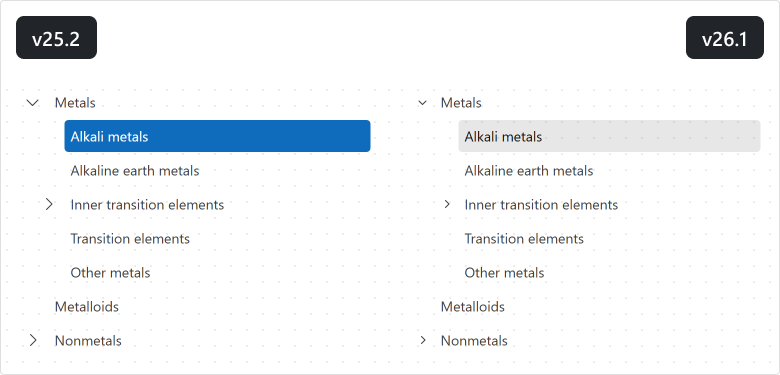
Accordion
To improve readability and contrast on colored and image backgrounds, we enhanced the appearance of the DevExpress Blazor Accordion as follows:
- The filter panel now includes a visible border to distinguish it from list items.
- Hover and pressed state backgrounds are now semi-transparent.
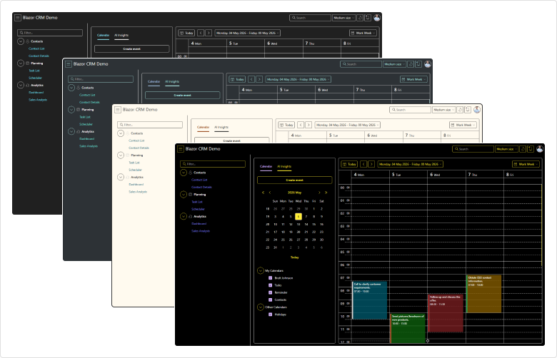
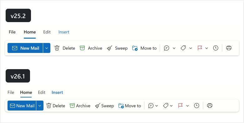
Ribbon
Our Blazor Ribbon more closely aligns with the Microsoft Office Ribbon design. As you can see in the following image, our Blazor Ribbon’s updated UI is more compact and consistent:
TreeView
We updated the design of our Blazor TreeView component:
- Expand/collapse buttons are now more compact and closely align with Microsoft Office design principles.
- New hover and selected state colors better adapt to different background colors.
Blazor Filter Builder
Customize Count Functions
The DevExpress Filter Builder component allows you to customize Count functions for collection fields. Specify EditSettings or define the ValueEditTemplate to customize the editor used to select the Count value. Use the ValueDisplayTemplate to customize how the selected value is displayed.
The following code snippet adds prompt text to the Count editor displayed for the Orders field:
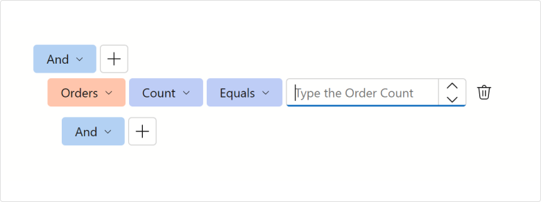
<DxFilterBuilder @bind-FilterCriteria="FilterCriteria">
    <Fields>
        <DxFilterBuilderField FieldName="Orders" Caption="Orders" IsCollection="true">
            <EditSettings>
                <DxSpinEditSettings NullText="Type the Order Count" />
            </EditSettings>
            <Fields>
                <DxFilterBuilderField FieldName="OrderDate" Caption="Order Date" Type="@typeof(DateTime?)" />
                <DxFilterBuilderField FieldName="CustomerName" Caption="Customer" Type="@typeof(string)" />
                <DxFilterBuilderField FieldName="Quantity" Caption="Quantity" Type="@typeof(int)" />
            </Fields>
        </DxFilterBuilderField>
    </Fields>
</DxFilterBuilder>
Toggle User Interaction
You can temporarily deactivate the DevExpress Blazor Filter Builder component using the Enabled property.
Blazor PDF Viewer
Zoom Enhancements
Our new ZoomLevelChanged event allows you to execute custom actions whenever a document is zoomed in/out within the DevExpress Blazor PDF Viewer.
Blazor Themes
Automatic Style Registration
With v26.1, you no longer need to register PDF Viewer, Report Viewer, and Rich Text Editor stylesheets in the Components/App.razor file – the DxResourceManager.RegisterTheme method adds associated styles automatically.
The following is a v25.2 code snippet…
<head>
    @DxResourceManager.RegisterTheme(Themes.Fluent)
    <link href="_content/DevExpress.Blazor.Reporting.Viewer/css/dx-blazor-reporting-components.fluent.css" rel="stylesheet" />
    <link href="_content/DevExpress.Blazor.Viewer/css/dx-blazor-viewer-components.fluent.css" rel="stylesheet" />
    <link href="_content/DevExpress.Blazor.RichEdit/dx-blazor-richedit.css" rel="stylesheet" />
    @* ... *@
</head>
… with v26.1, it can be replaced with a method call:
<head>
    @DxResourceManager.RegisterTheme(Themes.Fluent)
    @* ... *@
</head>
Blazor Buttons
API Enhancements
We added a new property to the DxButtonBase class (contains base settings for buttons):
- IconUrl — Specifies button icon URL.
Blazor Windows
Smoother Focus Behavior Across Devices
The following DevExpress Blazor components now adapt focus behavior for the current device:
On desktop devices, focus moves to the first interactive element in the window to support faster keyboard interaction. On mobile phones and tablets, focus moves to the popup/window container to avoid unexpected keyboard activation and viewport shifts.
DropDown Focus Mode
The FocusOnOpen property specifies whether focus moves to a newly opened DevExpress Blazor DropDown or remains on the current element.
<DxDropDown @bind-IsOpen="isOpen"
            FocusOnOpen="false">
    <BodyContentTemplate>
        <!-- ... -->
        <DxButton Text="Accept the terms of the EULA" />
    </BodyContentTemplate>
</DxDropDown>
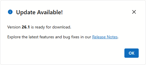
MessageBox — Custom Content Template
DevExpress Blazor Message Box includes a ChildContent template. Use it to display custom Razor markup in the message box body (instead of plain text).
To customize a message box created by the dialog service, pass a RenderFragment to the AlertAsync or ConfirmAsync method.
<DxMessageBox Title="Update Available!">
    <ChildContent>
        <p>Version <b>26.1</b> is ready for download.</p>
        <p>
            Explore the latest features and bug fixes in our
            <a href="https://www.devexpress.com/subscriptions/whats-new/" target="_blank">Release Notes</a>.
        </p>
    </ChildContent>
</DxMessageBox>
Blazor UI Kit Updates
We updated our Blazor UI Kit for the DevExpress Fluent theme as follows:
- Created the first figma component version for the DevExpress Blazor Grid.
- Added a figma component for the DevExpress Blazor Ribbon.
- Implemented separate frames with focus state for the following components:
DxListBox,DxMenu,DxPager,DxTabs, andDxTagBox. - Presented
DxButtonas a separate component and fixed related design issues. - Added information section for each component.
- Refined component section appearance.
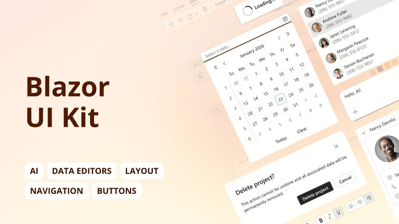
Review and download design files on Figma: Blazor UI Kit — Fluent Theme.