ASPxDateEdit Class
A date editor control.
Namespace: DevExpress.Web
Assembly: DevExpress.Web.v25.2.dll
NuGet Package: DevExpress.Web
Declaration
public class ASPxDateEdit :
    ASPxDropDownEditBase,
    ITimeSectionOwner,
    ICalendarSharedPropertiesOwner,
IAllowNullOwnerRemarks
The ASPxDateEdit is a drop-down editor that provides the drop-down calendar and time editor.
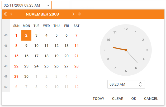
The calendar allows end users to select dates and navigate through months and years. The ASPxDateEdit.Date property specifies the currently selected date. Change this property to raise the ASPxDateEdit.DateChanged event.
The editor’s dropdown window contains two sections:
Calendar section - This section is always visible. Use the ASPxDateEdit.CalendarProperties class to access the calendar section’s settings.
Time section - The time section displays a customizable clock image and time edit that allows end users to set the time. Use the DateEditTimeSectionProperties.Visible property to control the time section’s visibility. The ASPxDateEdit.TimeSectionProperties object provides access to the time section’s settings.
Create a Date Edit
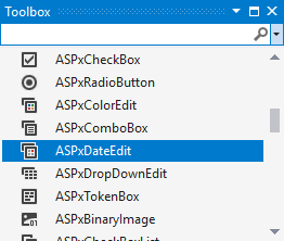
Design Time
The ASPxDateEdit control is available on the DX.25.2: Common Controls toolbox tab in the Microsoft Visual Studio IDE.
Drag the control onto a form and customize the control’s settings, or paste the control markup in the page’s source code.
Note
To properly function, DevExpress controls require that special modules, handlers and options are registered in the the Web.config file. Switch the Microsoft Visual Studio IDE to the Design tab to automatically update the Web.config file with the required DevExpress information.
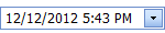
<dx:ASPxDateEdit ID="dateEdit" runat="server" EditFormat="Custom" Date="2009-11-02 09:23"
Width="190" Caption="ASPxDateEdit">
    <TimeSectionProperties>
        <TimeEditProperties EditFormatString="hh:mm tt" />
    </TimeSectionProperties>
    <CalendarProperties>
        <FastNavProperties DisplayMode="Inline" />
    </CalendarProperties>
</dx:ASPxDateEdit>
Run Time
using DevExpress.Web;
...
protected void Page_Load(object sender, EventArgs e)
{
    ASPxDateEdit dateEdit = new ASPxDateEdit();
    dateEdit.ID = "ASPxDateEdit1";
    Page.Form.Controls.Add(dateEdit);

    dateEdit.EditFormat = EditFormat.Custom;
    dateEdit.Date = DateTime.Today;
    dateEdit.Caption = "Test date edit";
    dateEdit.CalendarProperties.FastNavProperties.DisplayMode = FastNavigationDisplayMode.Inline;
    dateEdit.TimeSectionProperties.Visible = true;
    dateEdit.TimeSectionProperties.TimeEditProperties.EditFormatString = "hh:mm tt";
    dateEdit.DisplayFormatString = "dd/MM/yyyy hh:mm tt";
}
Shared Drop-Down Calendar
Use the PopupCalendarOwnerID property to share a date editor’s popup calendar between several date editors. This allows you to decrease the rendered HTML size.
<dx:ASPxDateEdit ID="dtmDate1" runat="server" Date="2018-12-30" ...>
</dx:ASPxDateEdit>

<dx:ASPxDateEdit ID="dtmDate2" runat="server" PopupCalendarOwnerID="dtmDate1">
</dx:ASPxDateEdit>

<dx:ASPxDateEdit ID="dtmDate3" runat="server" PopupCalendarOwnerID="dtmDate1">
</dx:ASPxDateEdit>
Null Prompt Text
The date editor displays a prompt text (NullText) when the editor’s value is null and the editor is not focused. The prompt text disappears when the editor receives focus.
<dx:ASPxDateEdit ID="DateEdit" runat="server" NullText="mm/dd/yyyy" >
    ...
</dx:ASPxDateEdit>
Edit Format
The EditFormat property allows you to specify how the editor displays its value in the edit box.
The ASPxDateEditor provides the following formats:
View | Affected Properties |
|---|---|
| EditFormat=”Time” |
| EditFormat= “Date” |
| EditFormat=”DateTime” |
| EditFormat=”Custom” |
<dx:ASPxDateEdit ID="dateEdit" runat="server" EditFormat="Custom" Date="2009-11-02 09:23" >
    ...
</dx:ASPxDateEdit>
Display Format
Use the DisplayFormatString property to specify a format pattern used to display the editor value when the control is in browse mode.
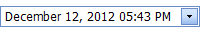
<dx:ASPxDateEdit ID="dateEdit" runat="server" DisplayFormatString="dd/MM/yyyy hh:mm tt" >
    ...
</dx:ASPxDateEdit>
Masked Input
The ASPxDateEditor supports masked input (UseMaskBehavior). In this mode, the editor uses the EditFormatString property value as a mask.
<dx:ASPxDateEdit ID="dateEdit" runat="server" UseMaskBehavior="true" EditFormatString="MMMM dd, yyyy" >
    ...
</dx:ASPxDateEdit>
Minimum and Maximum Dates Customization
You can define the earliest and the latest date an end-user can select in the drop-down calendar (MinDate and MaxDate).
<dx:ASPxDateEdit ID="dateEdit" runat="server" MinDate="2009-11-01" MaxDate="2009-11-20" >
    ...
</dx:ASPxDateEdit>
Set the ShowOutOfRangeWarning property to true to display a warning message when an end-user types a date that is out of the specified date range.

Validation
The ASPxDateEdit control allows you to validate its value on the client and server side.
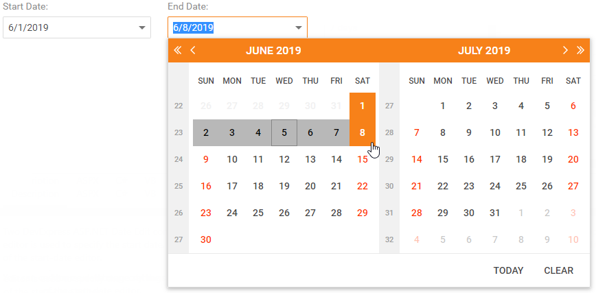
Date Range Picker
You can combine two ASPxDateEdit controls to implement a date range picker functionality. The first date editor specifies the range’s start date, the second - the range’s end date. Assign the start-date editor’s ID to the end-date editor’s StartDateEditID property to link editors.
<dx:ASPxDateEdit ID="deStart" ClientInstanceName="deStart" runat="server">
    ...
</dx:ASPxDateEdit>

<dx:ASPxDateEdit ID="deEnd" ClientInstanceName="deEnd" runat="server">
    <DateRangeSettings StartDateEditID="deStart"></DateRangeSettings>
    ...
</dx:ASPxDateEdit>
Month-Year Picker Mode
The Month-year Picker mode allows you to specify a date component an end user can select: a day, a month or a year. You can click the header to change the calendar view (fast navigation). Use the following settings to specify the date selection and restrict the available calendar views:
Property | Description |
|---|---|
Specifies a date component an end user can select (a day, month or year). | |
Specifies the initial calendar view. | |
Specifies the earliest available calendar view. For example, if the CalendarFastNavProperties.MaxView property is set to “Months”, the picker displays the months of a particular year and January is the earliest available Calendar view item. |
<dx:ASPxDateEdit runat="server" ID="dateEdit2" PickerType="Months">
    <CalendarProperties>
        <FastNavProperties InitialView="Years" MaxView="Years" />
    </CalendarProperties>
</dx:ASPxDateEdit>
Button Collection
The ASPxDateEdit control allows you to create custom buttons. The editor stores its default and custom buttons in the ASPxButtonEditBase.Buttons collection. A custom button is an EditButton instance. Use the ASPxButtonEditBase.ButtonClick event to handle a button click.
<dx:ASPxDateEdit ID="txt_dueDate" runat="server" ...>
    <Buttons>
        <dx:EditButton Enabled="true" Text="TestButton">
        </dx:EditButton>
    </Buttons>
    <ClientSideEvents
        ButtonClick="function (s,e) {
          if(e.buttonIndex == 0)
              // your code
    }" />
</dx:ASPxDateEdit>