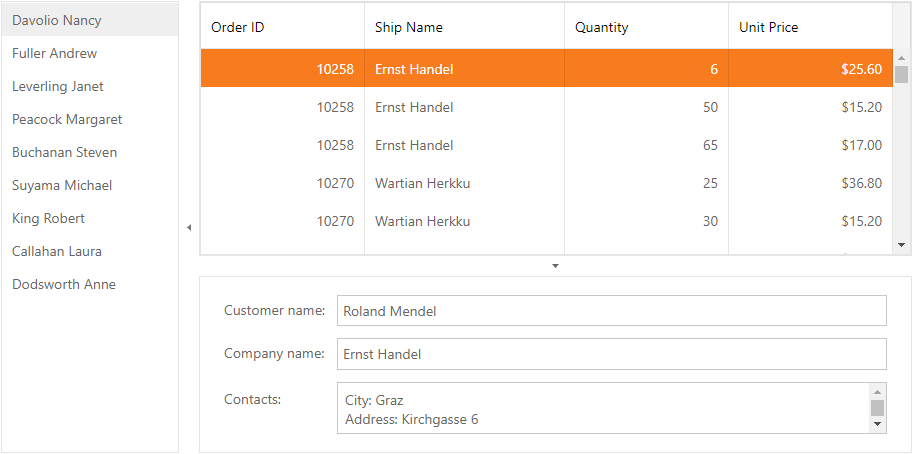
ASPxSplitter Class
Represents a splitter control.
Namespace: DevExpress.Web
Assembly: DevExpress.Web.v25.2.dll
NuGet Package: DevExpress.Web
Declaration
public class ASPxSplitter :
    ASPxWebControl,
    IRequiresLoadPostDataControl,
    IEndInitAccessorContainer,
IControlDesignerRemarks
The ASPxSplitter control allows you to easily organize the web page content layout by dividing it into several content panes and control the manner in which the panes can be resized and collapsed/expanded by end-users.

Create a Splitter Control
Design Time
The ASPxSplitter control is available on the DX.25.2: Navigation & Layout toolbox tab in the Microsoft Visual Studio IDE.
Drag the control onto a form and customize the control’s settings, or paste the control’s markup in the page’s source code.
<dx:ASPxSplitter ID="splitter" runat="server">
    <Panes>
        <dx:SplitterPane>
            <ContentCollection>
                <dx:SplitterContentControl runat="server">
                    <dx:ASPxNavBar runat="server" AllowSelectItem="True" Target="contentUrlPane"
                        ID="navBar">
                        <Groups>
                            <dx:NavBarGroup Text="Sample Pages">
                                <Items>
                                    <dx:NavBarItem NavigateUrl="SamplePages/Page1.aspx" Text="Page 1">
                                    </dx:NavBarItem>
                                    <dx:NavBarItem NavigateUrl="SamplePages/Page2.aspx" Selected="True" Text="Page 2">
                                    </dx:NavBarItem>
                                    <dx:NavBarItem NavigateUrl="SamplePages/Page3.aspx" Text="Page 3">
                                    </dx:NavBarItem>
                                </Items>
                            </dx:NavBarGroup>
                        </Groups>
                    </dx:ASPxNavBar>
                </dx:SplitterContentControl>
            </ContentCollection>
        </dx:SplitterPane>
        <dx:SplitterPane>
            <ContentCollection>
                <dx:SplitterContentControl runat="server">
                    <div class="exampleContent">Right container</div>
                </dx:SplitterContentControl>
            </ContentCollection>
        </dx:SplitterPane>
    </Panes>
</dx:ASPxSplitter>
Run Time
using DevExpress.Web;
...
protected void Page_Load(object sender, EventArgs e) {
    ASPxSplitter splitter = new ASPxSplitter();
    splitter.ID = "splitter";

    ASPxNavBar navBar = new ASPxNavBar();
    navBar.ID = "navBar";
    navBar.AllowSelectItem = true;
    navBar.Target = "contentUrlPane";
    NavBarGroup navBarGroup = new NavBarGroup("Sample");
    navBarGroup.Items.AddRange(new List<NavBarItem>() {
        new NavBarItem { Text = "Page 1", NavigateUrl = "SamplePages/Page1.aspx"},
        new NavBarItem { Text = "Page 2", NavigateUrl = "SamplePages/Page2.aspx", Selected = true},
        new NavBarItem { Text = "Page 3", NavigateUrl = "SamplePages/Page3.aspx"},
    });
    navBar.Groups.Add(navBarGroup);

    SplitterPane pane1 = new SplitterPane();
    pane1.Controls.Add(navBar);
    splitter.Panes.Add(pane1);

    SplitterPane pane2 = new SplitterPane();
    pane2.Controls.Add(new LiteralControl("Right Container"));
    splitter.Panes.Add(pane2);

    Page.Form.Controls.Add(splitter);
}
Note
DevExpress controls require that you register special modules, handlers, and options in the Web.config file. You can change this file or switch to the Design tab in the Microsoft Visual Studio IDE to automatically update the Web.config file. Note that this information is automatically registered if you use the DevExpress Template Gallery to create a project.
The ASPxSplitter control is made up of a tree of panes represented by SplitterPane objects. Panes at the top level (level 0) are called root panes. Panes that have a parent pane are called child panes. All root panes are stored in the splitter control’s ASPxSplitter.Panes collection. Child panes are stored in the parent pane’s SplitterPane.Panes collection. This enables you to create a hierarchical pane structure of any complexity, if required.
The orientation of root panes is specified by the ASPxSplitter.Orientation property of the ASPxSplitter control. Child panes are automatically arranged with the opposite orientation of their immediate parent pane.
The visibility and the visual order of panes within their containers can be controlled by the SplitterPane.Visible and SplitterPane.VisibleIndex properties of pane objects. Each pane is capable of displaying a content web page specified by the SplitterPane.ContentUrl property. You can use the SplitterPane.ScrollBars property to control which scrollbars should appear within a pane.
Individual panes are isolated from each other using specific split bars called separators. The separators provide end-users with the following capabilities to modify the layout of the ASPxSplitter control on the client side:
- Resizing Panes - End-users can drag a separator to resize the adjacent panes. The availability of the pane resizing feature is controlled by the control’s ASPxSplitter.AllowResize property and the SplitterPane.AllowResize) property of pane objects.
- Collapsing Panes in the Backward Direction - End-users can click a separator’s collapse backward button, to collapse the left/top pane backwards. The availability of the backward pane collapsing feature is controlled by the control’s ASPxSplitter.ShowCollapseBackwardButton property and the SplitterPane.ShowCollapseBackwardButton property of pane objects.
- Collapsing Panes in the Forward Direction - End-users can click a separator’s collapse forward button, to collapse the left/top pane forwards. The availability of the forward pane collapsing feature is controlled by the control’s ASPxSplitter.ShowCollapseForwardButton property and the SplitterPane.ShowCollapseForwardButton property of pane objects.
The ASPxSplitter control offers you complete customization of root panes, child panes and separators styles (for instance, see the properties available via the control’s ASPxSplitter.Styles property and via a pane object’s SplitterPane.PaneStyle and SplitterPane.CollapsedStyle properties).
Note
The ASPxSplitter control provides you with comprehensive client-side functionality implemented using JavaScript code:
- The control’s client-side equivalent is represented by the ASPxClientSplitter object.
- On the client side, the client object can be accessed directly by the name specified via the ASPxSplitter.ClientInstanceName property.
- The available client events can be accessed by using the ASPxSplitter.ClientSideEvents property.
The client-side API is always available for this control.