ASPxDataView Class
An ASPxDataView control.
Namespace: DevExpress.Web
Assembly: DevExpress.Web.v25.2.dll
NuGet Package: DevExpress.Web
Declaration
Remarks
The ASPxDataView control is designed to display data in a tabular layout, and supports the following common features:
- Paginate data using the built-in pager.
- Programmatic access to the data view control model to set properties, respond to changes in the active page, etc.
- The ability to perform round-trips to the server using the AJAX-based callback technology.
- Customizable appearance through themes, user-defined images, styles, and user-defined templates.
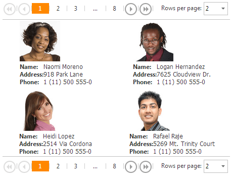
This control is shown in the image below:

Create a DataView Control
Design Time
The ASPxDataView control is available on the DX.25.2: Data & Analytics toolbox tab in the Microsoft Visual Studio IDE.
Drag the control onto a form and customize the control’s settings, or paste the control’s markup in the page’s source code.
<dx:ASPxDataView ID="dataView" runat="server" DataSourceID="XmlDataSource1" ClientInstanceName="ClientDataView">
    <SettingsTableLayout RowsPerPage="1" />
    <ItemStyle Height="100%" />
    <ItemTemplate>
        <dx:ASPxImage ID="imgCover" runat="server" ImageUrl='<%# Eval("PhotoUrl") %>' Width="140px" Height="140px" />
    </ItemTemplate>
</dx:ASPxDataView>
<asp:XmlDataSource ID="XmlDataSource1" runat="server" DataFile="~/App_Data/Contacts.xml" XPath="//Contact" />
Run Time
Web Form (.aspx):
<asp:XmlDataSource ID="XmlDataSource1" runat="server" DataFile="~/App_Data/Contacts.xml" XPath="//Contact" />
Web Form (.aspx.cs / .aspx.vb):
using DevExpress.Web;
...
public partial class DataView_Page : System.Web.UI.Page
{
    protected void Page_Load(object sender, EventArgs e) {

        ASPxDataView dataView = new ASPxDataView();
        dataView.ID = "dataView";
        Page.Form.Controls.Add(dataView);
        dataView.ClientInstanceName = "ClientDataView";
        dataView.SettingsTableLayout.RowsPerPage = 1;
        dataView.ItemStyle.Height = System.Web.UI.WebControls.Unit.Percentage(100);
        dataView.ItemTemplate = new MyItemTemplate();
        dataView.DataSourceID = "XmlDataSource1";
        dataView.DataBind();
    }

    class MyItemTemplate : ITemplate {
        public void InstantiateIn(Control container)
        {
            Control control = container.TemplateControl.LoadControl("WebUserControl.ascx");
            container.Controls.Add(control);
        }
    }
}
Web User Control (.ascx):
<%@ Control Language="C#" AutoEventWireup="true" CodeFile="WebUserControl.ascx.cs" Inherits="DataView_WebUserControl" %>

<dx:ASPxPanel ID="ASPxPanel" runat="server">
    <PanelCollection>
        <dx:PanelContent runat="server">
            <dx:ASPxImage ID="imgCover" runat="server" ImageUrl='<%# Eval("PhotoUrl") %>' Width="140px" Height="140px" />
        </dx:PanelContent>
    </PanelCollection>
</dx:ASPxPanel>
Note
DevExpress controls require that you register special modules, handlers, and options in the Web.config file. You can change this file or switch to the Design tab in the Microsoft Visual Studio IDE to automatically update the Web.config file. Note that this information is automatically registered if you use the DevExpress Template Gallery to create a project.
The ASPxDataView control supports standard data binding. That is, it can obtain data from any object which implements the IEnumerable or IDataSource interface. Data items are represented by the DataViewItem objects. These objects are stored within a collection of the DataViewItemCollection type, which can be accessed via the control’s ASPxDataView.Items property.
The ASPxDataView control provides the ability to paginate data by using the embedded pager. The number of items that can be displayed at one time is specified by the DataViewTableLayoutSettings.ColumnCount and ASPxDataView.RowPerPage properties. These properties specify the number of columns and rows within a view. The pagination is allowed if the ASPxDataViewBase.AllowPaging property is set to true. Otherwise, if this property is set to false, the control displays the content of all the pages.
The number of pages is returned by the ASPxDataViewBase.PageCount property. The active (selected) page is identified by its index via the ASPxDataViewBase.PageIndex property. This property can also be used to select the desired page in code.
The appearance of items displayed by the ASPxDataView control can be customized, using the template technology (the ASPxDataView.ItemTemplate property). The contents of templated items can be defined via data binding expressions.
You can customize the ASPxDataView appearance when its content is empty, by using the ASPxDataViewBase.EmptyDataText, ASPxDataViewBase.EmptyDataTemplate, and ASPxDataViewBase.EmptyDataStyle properties.
Now, the control’s layout can be defined. Set the ASPxDataView.Layout property to the Layout.Flow of the Layout.Table value, to display the control’s data in either flow mode or as a fixed table, to fill the available page area.
Note
The ASPxDataView control provides you with comprehensive client-side functionality, implemented using JavaScript code:
- The control’s client-side equivalent is represented by the ASPxClientDataView object.
- On the client side, the client object can be accessed directly by the name specified via the ASPxDataViewBase.ClientInstanceName property.
- The available client events can be accessed by using the ASPxDataView.ClientSideEvents property.
The client-side API is always available for this control.