ASPxTitleIndex Class
Represents an ASPxTitleIndex server control.
Namespace: DevExpress.Web
Assembly: DevExpress.Web.v25.2.dll
NuGet Package: DevExpress.Web
Declaration
public class ASPxTitleIndex :
    ASPxDataWebControl,
    IRequiresLoadPostDataControl,
IControlDesignerRelated API Members
The following members return ASPxTitleIndex objects:
Remarks
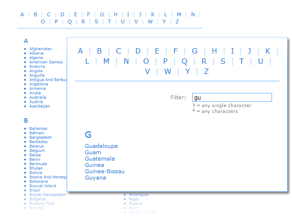
The ASPxTitleIndex class represents a server control that displays its data as a sorted and grouped list of data items (titles or links).
The data that is displayed within the ASPxTitleIndex control can be either contained within the control itself (unbound mode) or obtained from a non-hierarchical data source (bound mode).
- In unbound mode, the control maintains its data items in its ASPxTitleIndex.Items collection. In this case, each data item is represented by an instance of the TitleIndexItem class. A data item’s characteristics (such as a caption text, navigation location, tooltip text and the value of the group to which the item belongs) are defined by specific properties of this class (the TitleIndexItem.Text, TitleIndexItem.NavigateUrl, TitleIndexItem.Description and TitleIndexItem.GroupValue).
In bound mode, the control uses its ASPxDataWebControl.DataSourceID property to bind to a data source. In this case, characteristics of data items are taken from the data source’s data fields mapped via specific data binding properties (the ASPxTitleIndex.TextField, ASPxTitleIndex.NavigateUrlField, ASPxTitleIndex.DescriptionField and ASPxTitleIndex.GroupingField).
Note
If individual data fields have the same names as the TitleIndexItem class’ properties defining a data item’s major characteristics (the Text and NavigateUrl), the ASPxTitleIndex control takes data from these fields automatically without the necessity to map them via the corresponding data binding properties.
During data binding, a specific ASPxTitleIndex.ItemDataBound event is generated which will allow information from any desired data field to be obtained and processed as required. If needed, you can use this event to group data by any bound field’s values.
The ASPxTitleIndex control allows its data items to be indexed and easily navigated via a specific index panel. The index panel’s settings can be customized via the ASPxTitleIndex.IndexPanel property. So, the index panel’s visibility and position are specified via the IndexPanel.Visible and IndexPanel.Position properties. The IndexPanel.Behavior property controls how the ASPxTitleIndex control responds to clicks on items displayed within the index panel. By default, the index panel’s items are represented by the first characters of the automatically parsed data item titles (caption texts). In order to add the custom index characters to the index panel, or organize the index panel items in the desired manner (for example insert line feeds at arbitrary positions), the IndexPanel.Characters property can be used. If grouping by specific values is applied within the ASPxTitleIndex control (via the ASPxTitleIndex.GroupingField or TitleIndexItem.GroupValue property), these grouping values are displayed as the index panel’s items, and used to group the control’s data.
The ASPxTitleIndex control can display a specific filter box element, which allows data items to be easily located by typing the initial part of the caption into the filter box’s editor. Different settings of the filter box can be customized by using the ASPxTitleIndex.FilterBox property.

The ASPxTitleIndex control allows its displayed information to be broken into several columns. Columns are represented by the TitleIndexColumn class instances which are contained within the ASPxTitleIndex.Columns collection of the control. The number of columns can be easily defined via the ASPxTitleIndex.ColumnCount property.
The ASPxTitleIndex control’s data items can be displayed either in groups (items within a group are represented into one column, while groups can be arranged into multiple columns within the control) or in categories (categories are displayed one under another, and can display multiple item columns). This behavior is controlled by the ASPxTitleIndex.Categorized property.
The ASPxTitleIndex control offers you complete style customization of its different elements such as data items, index panel, columns, links, etc (for instance, see the ASPxTitleIndex.ItemStyle, ASPxTitleIndex.IndexPanelStyle, ASPxTitleIndex.ColumnStyle, ASPxTitleIndex.LinkStyle properties).
Additionally, you can use the template technology to get unlimited control over the contents of data items, group headers and column separators. You can specify these templates via the ASPxTitleIndex.ItemTemplate, ASPxTitleIndex.GroupHeaderTemplate and ASPxTitleIndex.ColumnSeparatorTemplate properties.
Note that round trips to the server initiated when the IndexPanel.Behavior property is set to the IndexPanelBehavior.Filtering value can be performed either using standard postbacks (the whole page is refreshed) or the newly implemented AJAX-based callback technology. In this case, the ASPxTitleIndex.EnableCallBacks property of the ASPxTitleIndex control can be used to specify which technology to use when posting back to the server.
Note
The ASPxTitleIndex control provides you with a comprehensive client-side functionality implemented using JavaScript code:
- The control’s client-side equivalent is represented by the ASPxClientTitleIndex object.
- On the client side, the client object can be accessed directly by the name specified via the ASPxTitleIndex.ClientInstanceName property.
- The available client events can be accessed by using the ASPxTitleIndex.ClientSideEvents property.
The client-side API is always available for this control.