ASPxDockPanel Class
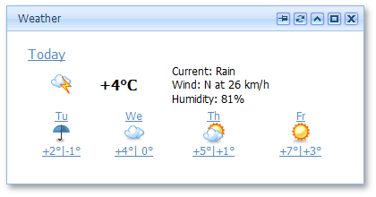
A panel control that acts as a movable window.
Namespace: DevExpress.Web
Assembly: DevExpress.Web.v25.2.dll
NuGet Package: DevExpress.Web
Declaration
Related API Members
The following members return ASPxDockPanel objects:
Remarks
The ASPxDockPanel control is a window that can be dragged around the Web page and docked in zones.

Create a DockPanel Control
Design Time
The ASPxDockPanel control is available on the DX.25.2: Navigation & Layout toolbox tab in the Microsoft Visual Studio IDE.
Drag the control onto a form and customize the control’s settings, or paste the control’s markup in the page’s source code.
<dx:ASPxDockPanel runat="server" ID="dockPanel" HeaderText="2D Bubble" ShowCloseButton="false" ClientInstanceName="ClientDockPanel">
    <ContentCollection>
        <dx:PopupControlContentControl>
            <dx:ASPxImage ID="ASPxImage" runat="server" Height="140px" ImageUrl="~/Docking/Images/Charts/2DBubble.png" />
        </dx:PopupControlContentControl>
    </ContentCollection>
</dx:ASPxDockPanel>
Run Time
using DevExpress.Web;
...
protected void Page_Load(object sender, EventArgs e) {
    ASPxDockPanel dockPanel = new ASPxDockPanel();
    dockPanel.ID = "dockPanel";
    dockPanel.ClientInstanceName = "ClientDockPanel";

    dockPanel.HeaderText = "2D Bubble";
    dockPanel.ShowCloseButton = false;

    ASPxImage image = new ASPxImage();
    image.ID = "ASPxImage";
    image.Height = 140;
    image.ImageUrl = "~/Docking/Images/Charts/2DBubble.png";

    dockPanel.Controls.Add(image);
    Page.Form.Controls.Add(dockPanel);
}
Note
DevExpress controls require that you register special modules, handlers, and options in the Web.config file. You can change this file or switch to the Design tab in the Microsoft Visual Studio IDE to automatically update the Web.config file. Note that this information is automatically registered if you use the DevExpress Template Gallery to create a project.
An ASPxDockPanel object has a unique identifier specified via the ASPxDockPanel.PanelUID property. This property can be used to obtain a panel at runtime on the server (ASPxDockManager.FindPanelByUID) or client (ASPxClientDockManager.GetPanelByUID and ASPxClientDockZone.GetPanelByUID) side. If the panel is docked, the ASPxDockPanel.OwnerZone and ASPxDockPanel.OwnerZoneUID properties can be used to obtain the panel’s owner.
A panel may consist of the following elements:
- A header which can display an image (PopupControlImages.Header), text (ASPxPopupControlBase.HeaderText) and a specific close button, which when clicked, closes the panel. End-users can move a panel within the page by dragging the window’s header, if the ASPxDockPanel.AllowDragging property is set to
true. The header’s visibility is controlled by the ASPxPopupControlBase.ShowHeader property. The ASPxPopupControlBase.DragElement property is used to specify the panel section that is available for drag and drop operations. - A footer which can display an image (PopupControlImages.Footer), text (ASPxPopupControlBase.FooterText) and size grip (PopupControlImages.SizeGrip). The footer’s visibility is controlled by the ASPxPopupControlBase.ShowFooter property.
- A content area which can display a content text (ASPxPopupControlBase.Text) and which allows different visual elements to be added through the ASPxPopupControlBase.Controls property. A panel’s content can also be visualized by an external web page specified via the ASPxPopupControlBase.ContentUrl property.
Note
A popup element (i.e., ASPxPopupControl or ASPxDockPanel) cannot contain another popup element inside.
Note
The ASPxDockPanel height and width (accessible by the ASPxWebControl.Height and ASPxWebControl.Width properties) cannot be set as a percentage. Set the dimensions in pixels to correctly display the control in all browsers.
The ASPxDockPanel enables you to specify the dock states available for the current panel, using the ASPxDockPanel.AllowedDockState property.
Using a dock panel’s ASPxDockPanel.ForbiddenZones property, you can specify disallowed zones for the panel - the zones to which the panel cannot be docked. It is also possible to provide different appearances for the allowed and forbidden zone states, by using a dock zone’s DockZoneStyles.DockingAllowedStyle and DockZoneStyles.DockingForbiddenStyle properties. These appearances are used to highlight zones during panel dragging and to indicate whether a particular zone is allowed or disallowed for panel docking.
The ASPxDockPanel has the capability to load the content of a panel on demand. Several content loading modes are available via the settings of the ASPxDockPanel.LoadContentViaCallback property.
Note
The ASPxDockPanel control provides you with comprehensive client-side functionality, implemented using JavaScript code:
- The control’s client-side equivalent is the ASPxClientDockPanel object.
- On the client side, the client object can be accessed directly, by the name specified via the ASPxPopupControlBase.ClientInstanceName property.
- The available client events can be accessed, using the ASPxDockPanel.ClientSideEvents property.
The control’s client-side API is enabled if the ASPxPopupControlBase.EnableClientSideAPI property is set to true, or the ASPxPopupControlBase.ClientInstanceName property is defined, or any client event is handled.