ASPxGridLookup Class
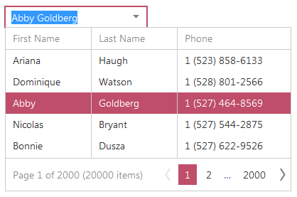
An editor that allows a user to easily select values from a dropdown grid containing lookup items.
Namespace: DevExpress.Web
Assembly: DevExpress.Web.v25.2.dll
NuGet Package: DevExpress.Web
Declaration
Remarks
ASPxGridLookup is a data-bound control that combines the functionality of the ASPxDropDownEdit and ASPxGridView controls. The ASPxGridView control is seamlessly embedded into the editor’s dropdown window, providing the editor with powerful customizable data-processing and data-representation functionality. End-users can change the editor’s value by simply selecting a row in the dropdown grid, or input new values into the editor’s edit box.

To populate the built-in ASPxGridView with data, the ASPxGridLookup control should be bound to a data source using the ASPxGridLookup.DataSourceID or ASPxGridLookup.DataSource property.
The ASPxGridLookup control provides the ASPxGridLookup.Columns collection to store the columns of the built-in ASPxGridView. Data columns can be created automatically for each field in the data source when ASPxGridLookup is rendered, or created manually. This is controlled by the ASPxGridLookup.AutoGenerateColumns property. If this property is set to true, ASPxGridLookup renders each field from the data source as a data column within the built-in ASPxGridView (the order of columns is the same as the order of fields in the data source). To manually control which columns are to appear in the dropdown ASPxGridView, set the ASPxGridLookup.AutoGenerateColumns property to false. In this case, you should manually add data columns to the ASPxGridLookup.Columns collection and bind them to the corresponding data source fields.
The ASPxGridLookup editor supports single and multiple selection of list items within the dropdown grid through the ASPxGridLookup.SelectionMode property. Each selected item is displayed within the ASPxGridLookup’s edit box, based upon a pattern defined by the ASPxGridLookup.TextFormatString property. This property contains indexed placeholders (such as “{0}”, “{1}”, etc.) which correspond to the indexes of visible columns whose values should be displayed within the edit box (placeholders can be combined with fixed literals).
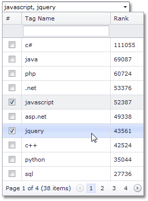
When multiple selection is used, the texts of selected rows are joined in the edit box using a special separator specified by the ASPxGridLookup.MultiTextSeparator property. (See online demo Multiple Record Selection)
ASPxGridLookup allows data to be filtered within a dropdown grid by typing text in the editor’s input box. Use the ASPxGridLookup.IncrementalFilteringMode property to specify the editor’s filter mode. (See online demo Incremental Filtering)
The ASPxGridView embedded into the ASPxGridLookup control’s dropdown window can be fully customized via settings exposed by the editor’s ASPxGridLookup.GridViewProperties property.
Note
When the ASPxGridLookup’s ASPxEdit.Enabled property is set to false, the embedded ASPxGridView isn’t bound to data and a dropdown window isn’t rendered. This behavior is designed to reduce unnecessary markups when the editor is disabled. Thus, if you need a disabled ASPxGridLookup bound to data, use the ASPxEditBase.ClientEnabled property.
Note
The client-side equivalent of this editor control is represented by the ASPxClientGridLookup object. The editor’s client-side API is enabled if the ASPxEditBase.EnableClientSideAPI property is set to true, the ASPxEditBase.ClientInstanceName property is defined, or any client event is handled. Available client events can be accessed via the ASPxGridLookup.ClientSideEvents property.
Note
The embedded ASPxGridView control caches its object properties. It can cause an exception when you use XPO or custom objects. To learn more, see the ASPxGridView.EnableRowsCache property description.
Refer to the ASPxGridLookup - Overview topic to learn more about the ASPxGridLookup control’s features.
Limitation
- When the
ASPxGridLookupeditor’s value changes, the editor sends a callback to the server to synchronize its value with the internal ASPxGridView control’s selection. Because of this, the server-side ValueChanged event fires before the client-side ValueChanged event.
Example
This example illustrates how to implement multiple item selection within ASPxGridLookup, using the corresponding functionality of the built-in grid (ASPxGridView).
In this sample, the ASPxGridLookup.SelectionMode property is set to GridLookupSelectionMode.Multiple. To select items, users can click check boxes within the dropdown grid or enter tag names separated with a semicolon into the editor’s edit box.
To display check boxes within a drop-down grid, create a command column within the editor’s ASPxGridLookup.Columns collection, and set the column’s GridViewCommandColumn.ShowSelectCheckbox property to true. In addition, set the editor’s ASPxGridViewSettings.ShowFilterRow property to true to allow users to filter items within the drop-down grid.
You can allow users to enter tag names into the editor’s edit box directly. To implement this functionality, specify the ASPxGridLookup.TextFormatString property, which defines the column (“TagName”) whose values should be entered within the edit box. Symbols defined with the ASPxGridLookup.MultiTextSeparator property (“, “) are used as a value separator. List items (grid rows) that correspond to the entered tag names are selected automatically when the value is submitted (for instance, when a user presses the Enter key or invokes the drop-down window).

    protected void Page_Load(object sender, EventArgs e) {
        GridLookup.GridView.Width = GridLookup.Width;
    }