ASPxListBox Class
A list box control.
Namespace: DevExpress.Web
Assembly: DevExpress.Web.v26.1.dll
Declaration
public class ASPxListBox :
    ASPxListEdit,
    IListBoxColumnsOwner,
    IMultiSelectListEdit,
    IControlDesigner,
    IListEditPropertyDescriptorsOwner,
IListEditServerModeOwnerRemarks
The ASPxListBox control allows you to display a list of items that users can select.
Create a List Box
Design Time
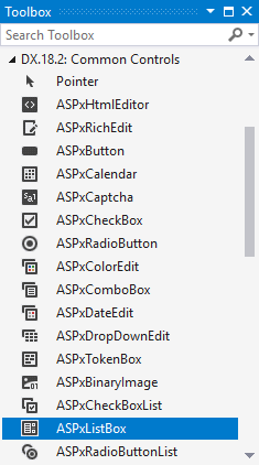
The ASPxListBox control is available on the DX.26.1: Common Controls toolbox tab in the Microsoft Visual Studio IDE.
Drag the control onto a form and customize the control’s settings, or paste the control’s markup in the page’s source code.
<dx:ASPxListBox ID="ASPxListBox1" runat="server">
    <Items>
        <dx:ListEditItem Text="Item 1" Value="Item 1" />
        <dx:ListEditItem Text="Item 2" Value="Item 2" />
        <dx:ListEditItem Text="Item 3" Value="Item 3" />
    </Items>
</dx:ASPxListBox>
Run Time
protected void Page_Load(object sender, EventArgs e) {
    ASPxListBox listBox = new ASPxListBox();
    listBox.ID = "ASPxListBox1";
    form1.Controls.Add(listBox);
    listBox.Items.Add(new ListEditItem("Item 1"));
    listBox.Items.Add(new ListEditItem("Item 2"));
    listBox.Items.Add(new ListEditItem("Item 3"));
}
Client-Side API
The ASPxListBox‘s client-side API uses JavaScript and is exposed by the ASPxClientListBox object.
Availability | Set the ASPxEditBase.EnableClientSideAPI property to |
Client object type | |
Access name | |
Events |
Bind to Data
The editor stores its items in the ASPxListEdit.Items collection, which allows you to access an individual item and specify its features (ListEditItem).
You can use the ASPxListEdit.DataSourceID property to bind the ASPxListBox to a data source. Use the following properties to specify the editor’s item characteristics (image, text, and value):
Name | Description |
|---|---|
Specifies the data source field that contains the image location for the editor’s items. | |
Specifies the data source field that contains text to display in the editor. | |
Specifies the data source field that contains values for the editor’s items. |
<dx:ASPxListBox ID="ASPxListBox1" runat="server"
    DataSourceID="SqlDataSource1" ValueField="ProductName" TextField="ProductName">
</dx:ASPxListBox>
<asp:SqlDataSource ID="SqlDataSource1" runat="server" ...></asp:SqlDataSource>
See also: Bind to Data
Item Load Modes
The ASPxListBox supports the following item load modes:
Load Mode | Description | Affected Properties |
|---|---|---|
Default | The editor loads items and executes all data operations (for instance, scrolling and filtering) on the client without a round trip to the server. | EnableCallbackMode=”False” |
On-Demand | You can use callbacks to load items from the server on demand. For instance, the editor can dynamically load items as a user scrolls the list. | EnableCallbackMode = “True” |
Dynamic | You can manually populate a list with the required items based on the filter criteria and a user’s scroll action. | EnableCallbackMode=”True” |
<dx:ASPxListBox ID="ASPxListBox1" runat="server" DataSourceID="SqlDataSource1"
    EnableCallbackMode="true" CallbackPageSize="30" >
    <Columns>
        <dx:ListBoxColumn FieldName="OrderID" />
        <!--...-->
    </Columns>
</dx:ASPxListBox>
See also: Item Load Modes
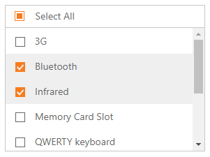
Multiple Selection
The ASPxListBox allows you to select multiple list items (SelectionMode).
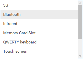
SelectionMode=”Single”
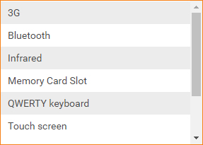
SelectionMode=”Multiple”
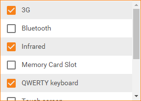
SelectionMode=”CheckColumn”
<dx:ASPxListBox ID="ASPxListBox1" runat="server" SelectionMode="CheckColumn" ...>
    <!--...-->
</dx:ASPxListBox>
See also: Multi-Selection Mode
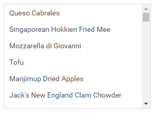
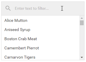
Filtering
The ASPxListBox can filter data while a user types the filter string in the filter editor.
Set the ListBoxFilteringSettings.ShowSearchUI property to true to display the search editor.
<dx:ASPxListBox ID="ASPxListBox1" runat="server"
    DataSourceID="SqlDataSource1"  ValueField="ProductName" TextField="ProductName">
    <FilteringSettings ShowSearchUI="true" />
</dx:ASPxListBox>
You can filter items by multiple words and columns, or use diacritic characters in the filter string.
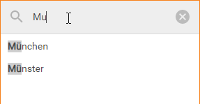
<dx:ASPxListBox ID="ASPxListBox1" runat="server"
    ValueField="Name" TextField="Name" DataSourceID="GermanCitiesDataSource">
    <ClientSideEvents ItemFiltering="onItemFiltering" CustomHighlighting="onCustomHighlighting" />
    <FilteringSettings ShowSearchUI="true" />
</dx:ASPxListBox>
See more: Custom Filtering
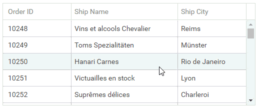
Multi-Column Mode
The ASPxListBox allows you to display data in multiple columns when the editor is in data-bound mode.
In design mode, invoke the Designer… and select the Columns… item from the smart tag menu to add/configure a column and specify the column’s field name.
Alternatively, you can use the ASPxListBox.Columns property to access the editor’s column collection and specify the ListBoxColumn.FieldName property for each column.
You can also specify the header caption, width, visibility state, and other settings for columns.
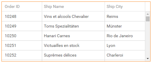
<dx:ASPxListBox ID="ASPxListBox1" runat="server" DataSourceID="SqlDataSource1">
    <Columns>
        <dx:ListBoxColumn FieldName="OrderID" />
        <!--...-->
    </Columns>
</dx:ASPxListBox>
See also: List Editors in Multi-Column Mode
Item Appearance Customization
The ASPxListBox allows you to customize item appearance.
You can handle the ItemTextCellPrepared and ItemRowPrepared events to specify style settings for individual cells and rows.
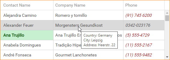
<style type="text/css">
    .phone {
        color: #9C0006;
        font-style: italic;
    }
    .owner {
        color: #006100;
        background-color: #C6EFCE;
        font-weight: bold;
    }
</style>
<dx:ASPxListBox ID="ASPxListBox1" runat="server" DataSourceID="CustomersDataSource" ValueField="CustomerID"
                ValueType="System.String"  OnItemTextCellPrepared="ASPxListBox1_ItemTextCellPrepared"
                OnItemRowPrepared="ASPxListBox1_ItemRowPrepared">
    <Columns>
        <dx:ListBoxColumn FieldName="ContactName" />
        <dx:ListBoxColumn FieldName="CompanyName" />
        <dx:ListBoxColumn FieldName="Phone" />
    </Columns>
</dx:ASPxListBox>
You can also use the ASPxListBox.ItemStyle property (ListBoxItemStyle) to define the common item style and the ASPxListBox.ItemImage property (ImageProperties) to specify common image settings.
Built-in Validation
The ASPxListBox supports the client-side and server-side validation.
The control allows you to define validation rules in the following ways:
The ValidationSettings.RequiredField property allows you to mark the editor as required.
The ValidationSettings.RegularExpression property allows you to validate the editor’s value based on a regular expression.
Validation events validate the editor’s input data on the client or server.
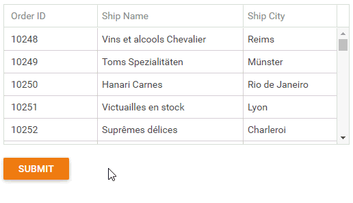
<dx:ASPxListBox ID="ASPxListBox1" runat="server" DataSourceID="SqlDataSource1">
    <Columns>
        <dx:ListBoxColumn FieldName="OrderID" />
        <dx:ListBoxColumn FieldName="ShipName" />
        <dx:ListBoxColumn FieldName="ShipCity" />
    </Columns>
    <ValidationSettings ErrorTextPosition="Bottom" Display="Dynamic">
        <RequiredField IsRequired="True" ErrorText="Select an item!" />
    </ValidationSettings>
</dx:ASPxListBox>
See also: Validation