ButtonEdit Class
A text editor with embedded buttons.
Namespace: DevExpress.Xpf.Editors
Assembly: DevExpress.Xpf.Core.v25.2.dll
NuGet Package: DevExpress.Wpf.Core
Declaration
Related API Members
The following members return ButtonEdit objects:
Remarks
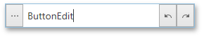
ButtonEdit editors are text editors that allow you to display buttons within the edit box.
Tip
The ButtonEdit class inherits its features from the TextEdit class.
Refer to the TextEdit class description for information on derived features and API.
Create a ButtonEdit
Use the BaseEdit.EditValue property to specify the editor’s value:

<Window ...
    xmlns:dxe="http://schemas.devexpress.com/winfx/2008/xaml/editors">

<dxe:ButtonEdit EditValue="Hello World!"/>
Handle the BaseEdit.EditValueChanged event to get a notification when the editor’s value is changed. To validate the new value, handle the BaseEdit.Validate event.
Embedded Buttons
Default Button
The editor initially displays one button (the default button). The default button visibility is specified by the ButtonEdit.AllowDefaultButton property.
When a user clicks the default button, the editor fires the ButtonEdit.DefaultButtonClick event.
<dxe:ButtonEdit x:Name="buttonEdit1"
                AllowDefaultButton="True"
                DefaultButtonClick="buttonEdit1_DefaultButtonClick"/>
Custom Buttons
You can create ButtonInfoBase descendants (ButtonInfo, SpinButtonInfo, ImageButtonInfo, DeleteButtonInfo, or LoadingIndicatorButtonInfo) and add them to the ButtonEdit.Buttons collection to display additional buttons:

<dxe:ButtonEdit AllowDefaultButton="False">
    <dxe:ButtonEdit.Buttons>
        <dxe:ButtonInfo Command="ApplicationCommands.Copy" GlyphKind="User">
            <dxe:ButtonInfo.ContentTemplate>
                <DataTemplate>
                    <dx:DXImage Source="{dx:DXImage 'SvgImages/Edit/Copy.svg'}" Height="20" Width="20"/>
                </DataTemplate>
            </dxe:ButtonInfo.ContentTemplate>
        </dxe:ButtonInfo>
        <dxe:ButtonInfo Command="ApplicationCommands.Cut" GlyphKind="User">
            <dxe:ButtonInfo.ContentTemplate>
                <DataTemplate>
                    <dx:DXImage Source="{dx:DXImage 'SvgImages/Edit/Cut.svg'}" Height="20" Width="20"/>
                </DataTemplate>
            </dxe:ButtonInfo.ContentTemplate>
        </dxe:ButtonInfo>
        <dxe:ButtonInfo Command="ApplicationCommands.Paste" GlyphKind="User">
            <dxe:ButtonInfo.ContentTemplate>
                <DataTemplate>
                    <dx:DXImage Source="{dx:DXImage 'SvgImages/Edit/Paste.svg'}" Height="20" Width="20"/>
                </DataTemplate>
            </dxe:ButtonInfo.ContentTemplate>
        </dxe:ButtonInfo>
    </dxe:ButtonEdit.Buttons>
</dxe:ButtonEdit>
Handle the CommandButtonInfo.Click event or specify a command to get a notification when the editor’s custom button is clicked.
Set the ButtonInfoBase.IsDefaultButton property to true if you want your custom button to act like the editor’s default button.
Null Value Button
You can add a null value button that allows users to clear an editor value.
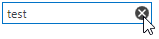
Use one of the following techniques to add the delete button:
Set the ButtonEdit.NullValueButtonPlacement (or ButtonEditSettings.NullValueButtonPlacement for the in-place
ButtonEdit) property toEditBoxto display the delete button in the editor’s edit box.Add a DeleteButtonInfo class instance to the editor’s ButtonEdit.Buttons (ButtonEditSettings.Buttons for the in-place
ButtonEdit) collection. In this case, you can fully customize the delete button’s behavior and appearance. To set the default button’s behavior, set the DeleteButtonInfo.IsDefault property totrue.
Retrieve Buttons from ViewModel
You can load a set of custom buttons from a ViewModel and display them in the ButtonEdit. Use the ButtonEdit.ButtonsSource property to specify a collection of objects providing information to generate and initialize buttons for the current ButtonEdit. The ButtonTemplate property specifies the data template used to render buttons from the collection.
<dxe:ButtonEdit.ButtonTemplate>
    <DataTemplate>
        <ContentControl>
            <dxe:ButtonInfo
                Command="{Binding Command}"
                Content="{Binding Content}"
                IsLeft="{Binding IsLeft}" />
        </ContentControl>
    </DataTemplate>
</dxe:ButtonEdit.ButtonTemplate>
If you want to declare several data templates and apply one of them according to your own logic, use the ButtonEdit.ButtonTemplateSelector property.
Look and Feel
If the ShowText property is set to false, the edit box is hidden and only editor buttons are displayed (see the image below). If no buttons are visible, the editor displays an empty region.

The ShowEditorButtons property specifies whether the editor should display its buttons.
Edit Options
Set the IsTextEditable property to false to prevent end users from editing an editor’s text values.
If the IsTextEditable property is set to false, end users are not allowed to change, select, and copy the text displayed in the edit box, but can click editor buttons (if any).
Appearance Customization
Tip
Refer to the following topic for more information: Appearance Customization.
Example
The following example shows how to create a ButtonEdit with the Clear button that clears the editor's value.
<dxe:ButtonEdit x:Name="buttonEdit" Width="100"
                AllowDefaultButton="False">
    <dxe:ButtonEdit.Buttons>
        <dxe:ButtonInfo Content="Clear" Click="ButtonInfo_Click" />
    </dxe:ButtonEdit.Buttons>
</dxe:ButtonEdit>
private void ButtonInfo_Click(object sender, RoutedEventArgs e) {
    buttonEdit.EditValue = string.Empty;
}
Related GitHub Examples
The following code snippets (auto-collected from DevExpress Examples) contain references to the ButtonEdit class.
Note
The algorithm used to collect these code examples remains a work in progress. Accordingly, the links and snippets below may produce inaccurate results. If you encounter an issue with code examples below, please use the feedback form on this page to report the issue.